
Brand Studies: Content Studio/Creative Loft
A strategic brand breakdown built from the inside out.
This is not Pinterest trend forecasting.
Not aesthetic-only studio branding.
And not a “pretty space, hope it books” strategy.
This Brand Study was created to show how content studios and creative lofts can move beyond visuals alone and into intentional positioning. Every decision inside this study is rooted in clarity — how the space functions, who it serves, and what experience it’s designed to support.
This is a strategic brand build designed to position content studios as bookable, intentional businesses — not just beautiful backdrops.
This study is for content studio and creative loft owners who want their brand to reflect the experience they actually offer.
The Industry Reality: Aesthetic Space vs. Bookable Brand
The content studio industry lives at an intersection of beauty and utility.
On one side, there’s aesthetic-led studio branding — spaces that photograph beautifully but communicate very little. The visuals are polished, the feed is cohesive, and the vibe is clear… but the purpose isn’t. These studios often feel interchangeable, relying on looks alone to do the heavy lifting.
On the other side, there’s strategy-led studio positioning — brands that lead with clarity. The use cases are defined. The audience is clear. The value of the space is understood before someone ever checks availability.
Both exist.
Both attract different renters.
But branding should match the level of intention behind the space.
When a studio is designed with purpose — for specific workflows, creative needs, or types of projects — the brand must communicate that. Without clarity, potential renters may admire the space without understanding why or how to book it.
This isn’t about choosing between beauty and strategy.
It’s about ensuring your branding reflects what the space actually offers — so the right clients can recognize themselves in it.
Brand Concept Overview: Golden Hour Studio
To anchor this study, we created a conceptual brand: Golden Hour Studio.
Golden Hour Studio represents a content studio built with intention — not just to look good on camera, but to function seamlessly for the people who use it.
Brand Positioning
Golden Hour Studio is positioned as:
Elevated, not exclusive
Experience-forward, not aesthetic-only
Professional without feeling sterile or corporate
The brand communicates calm confidence. It doesn’t over-explain or oversell. Instead, it sets clear expectations about what the space is designed for and who it serves.
This is a studio that understands its role as a creative container — one that supports focus, flow, and collaboration.
Who This Brand Is Built For
Golden Hour Studio is designed for:
Content studio owners building a sustainable rental business
Creative loft operators serving repeat clients, not one-off bookings
Multi-use spaces welcoming photographers, videographers, creators, brands, and small teams
The brand assumes its audience is thoughtful, prepared, and intentional — and it meets them at that level.
Golden Hour Studio isn’t trying to appeal to everyone.
It’s designed to resonate deeply with the right renters — the ones who value clarity, professionalism, and a well-considered creative environment.
Brand Voice & Tone
For content studios and creative lofts, language does more than describe a space — it sets expectations.
Before someone checks availability, asks about pricing, or walks through the door, your words shape how they understand the experience you’re offering.
Brand Voice
Golden Hour Studio’s voice is:
Clear — information is easy to find and easy to understand
Confident — the brand speaks with assurance, not hesitation
Inviting — renters feel welcomed, not intimidated
Professional, not performative — no hype, no over-polish
The voice reflects a studio that knows its value and doesn’t need to exaggerate it.
Brand Tone
The tone is intentionally:
Descriptive, not salesy — the space is explained, not pitched
Assured, not over-explained — clarity without justification
Warm without being casual — friendly, but still business-forward
This balance allows the brand to feel human while maintaining credibility — especially important when working with brands, teams, and professionals.
Why It Matters
People book spaces they understand.
Clear language removes friction before pricing ever enters the conversation. It helps potential renters quickly determine:
If the space fits their needs
How it’s intended to be used
Whether it aligns with their workflow
When expectations are set early, inquiries are more aligned — and bookings feel easier on both sides.
Typography System: Why This Works
Typography in this brand system isn’t decorative.
It’s structural.
Every type choice was made to support clarity, professionalism, and restraint — so the space itself remains the focal point.
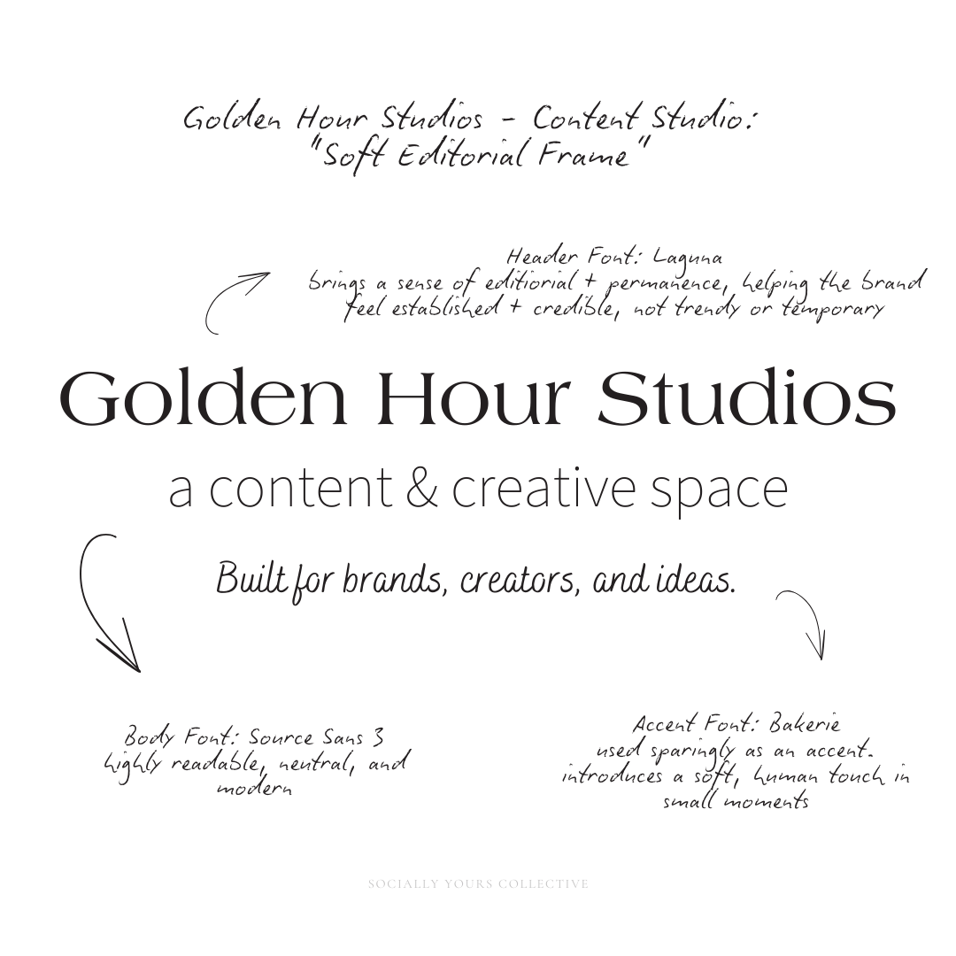
Header Typography: Laguna
Laguna is used for headlines and key moments of emphasis.
Its refined serif structure brings a sense of editorial polish and permanence, helping Golden Hour Studio feel established and credible — not trendy or temporary. Laguna sets the tone without overpowering the visuals, reinforcing the studio’s elevated positioning.
Used intentionally, it signals that this is a professional environment designed for serious creative work.
Body Typography: Source Sans 3
Source Sans 3 anchors the system with clarity and ease.
It’s highly readable, neutral, and modern — making it ideal for booking details, space descriptions, usage guidelines, and long-form information. The font is quiet in the background, allowing the content to be understood without distraction.
This ensures that practical information feels accessible and confident — especially important for commercial clients and teams who need clarity before committing.
Accent Typography: Bakerie
Bakerie is used sparingly as an accent.
It introduces a soft, human touch in small moments — directional cues, subtle callouts, or brief emphasis — without becoming performative or overly stylized. Its role is to add warmth, not personality overload.
By limiting its use, the brand maintains cohesion while still feeling inviting.
Together, these typefaces create balance: Readability for booking and logistics, Professionalism for brand, agency, and commercial clients, Editorial restraint that keeps the space as the hero.
Nothing competes for attention.
Everything works in service of understanding.
If the space is the statement, typography should frame it. Not compete with it.
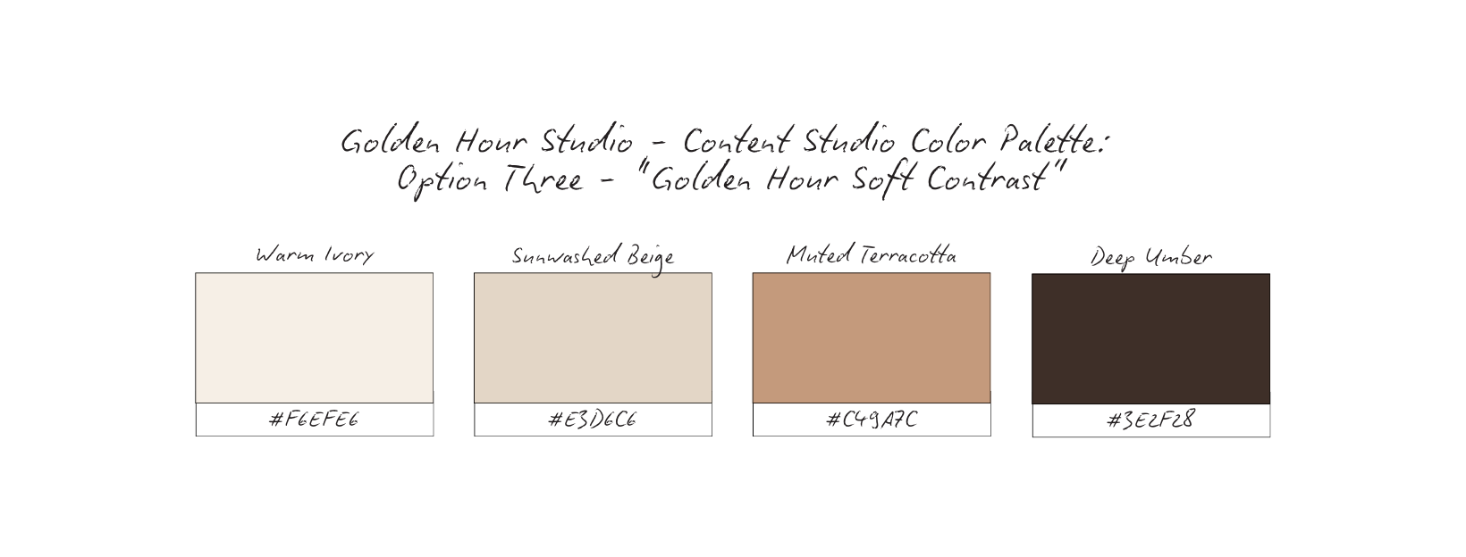
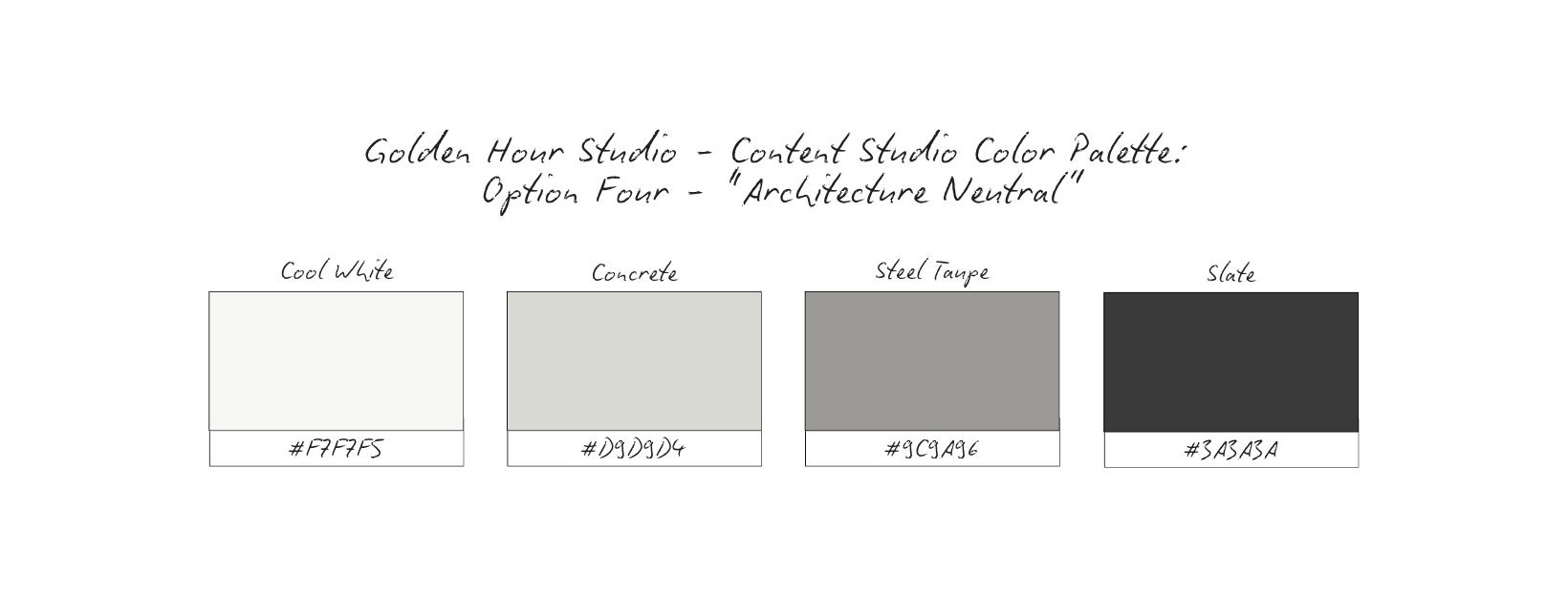
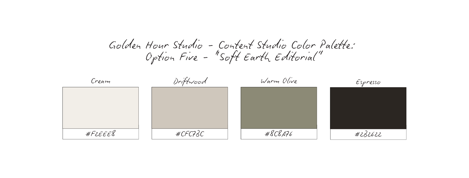
Color Palette Psychology
Color in a content studio brand isn’t about standing out louder — it’s about setting the right mood and removing friction.
For rental-based, multi-use creative spaces, the palette has to do a lot of quiet work:
support different types of projects, photograph well in varied lighting, and feel elevated without locking the space into a single aesthetic.
Before locking in a final direction, here are several palette options that all align with Golden Hour Studio’s positioning — flexible, professional, and experience-forward.
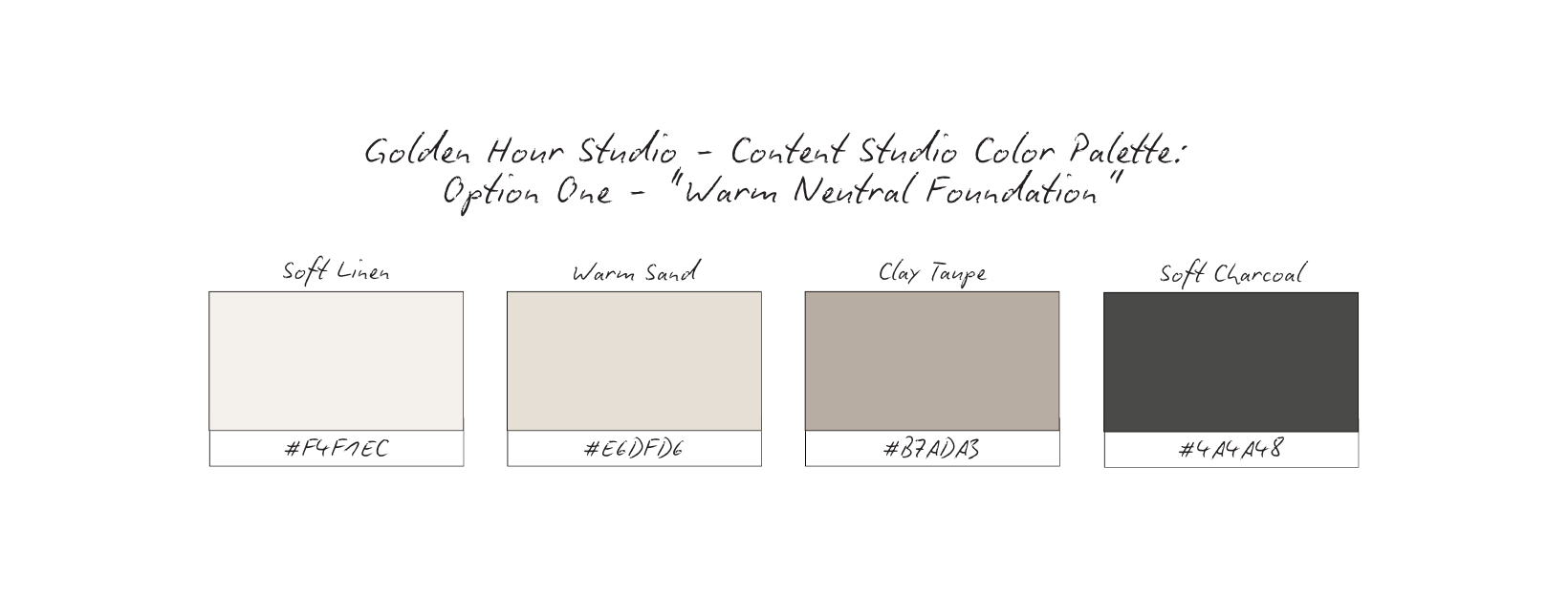
Vibe: Calm, grounded, welcoming
Why it works: Mirrors natural light and neutral interiors, allowing the studio to adapt to many creative styles without visual conflict.
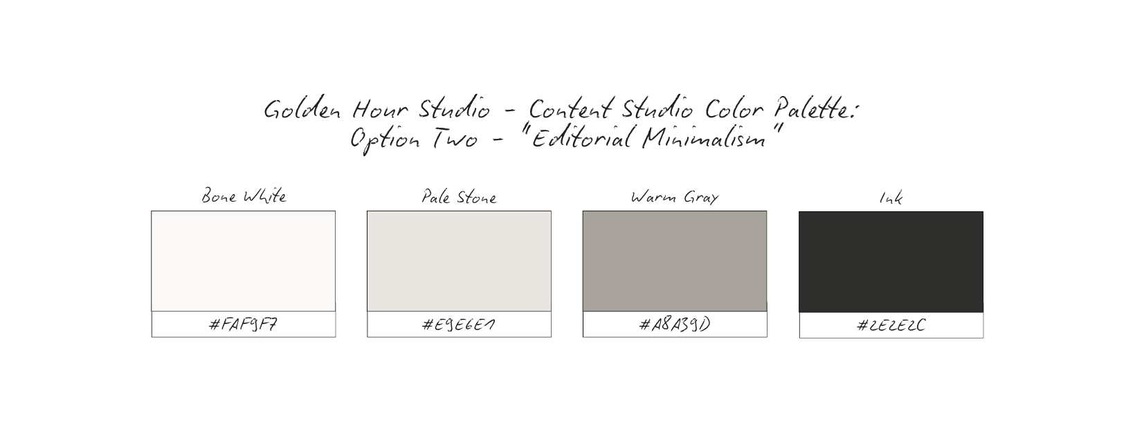
Vibe: Clean, professional, restrained
Why it works: Supports clarity and structure. It feels credible to commercial clients and agencies while staying visually quiet enough to let imagery shine.
Vibe: Warm, creative, subtly expressive
Why it works: Nods to the emotional warmth of golden hour without becoming trendy or theme-heavy. It adds character while remaining flexible.
Vibe: Modern, structured, professional
Why it works: Leans architectural and works well for studios hosting brand shoots, teams, and commercial productions that need a clean visual baseline.
Vibe: Natural, composed, quietly luxurious
Why it works: Feels organic without leaning ““boho”. It supports lifestyle, product, and editorial shoots equally well.
Across all options, the guiding principles remain the same: Neutral > novelty, Timeless > trendy, Mood-setting > attention-grabbing.
The right palette doesn’t compete with the space, it extends it.
For Golden Hour Studio, the goal wasn’t to decorate the brand — it was to support the space.
The Architectural Neutral palette (option #4) was selected because it mirrors how high-functioning creative spaces actually operate: quietly, intentionally, and with room to adapt.
The Cool White creates visual openness and clarity. It reflects light beautifully and allows photography, video, and branding work to take center stage without interference.
Concrete grounds the palette with subtle texture. This tone references architecture and materiality, reinforcing the studio’s physical presence without feeling heavy.
Steel Taupe adds depth and structure. It bridges warmth and coolness, making the brand feel balanced and professional rather than stark.
Slate provides contrast and authority. Used sparingly, it anchors typography and navigation elements without overwhelming the visual field.
Why It Works for Content Studios
This palette succeeds because it prioritizes function over flair:
It photographs consistently in varied lighting
It adapts to multiple creative styles and client aesthetics
It feels credible to brands, agencies, and commercial teams
It avoids trend fatigue and visual dating
Rather than imposing a mood, Architectural Neutral creates a framework — one that allows the work inside the space to define the atmosphere.
Golden Hour Studio’s brand feels: Stable, not styled. Professional, not sterile. Flexible, not vague.
The palette supports repeat bookings by signaling reliability and intention — qualities renters subconsciously look for when choosing a space to create in.
Content Strategy Breakdown
Before considering layout, color, or grid rhythm, this brand study defines what content is responsible for communicating.
For content studios and creative lofts, content isn’t about volume or trend participation, it’s about reducing uncertainty and helping potential renters understand the space quickly and confidently.
Each format plays a distinct role.
Reels→Space-in-Motion, Experience Preview
Reels are used to show how the space feels when it’s in use.
Rather than fast cuts or trend-led audio, Focus on: Natural movement through the space, Light changing throughout the day, Real setups, breakdowns, and transitions.
This gives potential renters a preview of the experience — not just the look. Reels answer the unspoken question: “Can I see myself working here?”
Carousels → Clarity, Use Cases, Education
Carousels do the heavy lifting.
They are used to: Clarify how the space is intended to be used, Outline booking expectations and workflows, Educate renters on what’s included (and what’s not).
This is where confusion is removed. Instead of relying on DMs to explain logistics, carousels create clarity upfront — saving time and aligning expectations.
Static Imagery → Mood, Credibility, Restraint
Static posts establish tone.
These images are quiet, composed, and intentional — designed to reinforce professionalism rather than chase attention. They signal that the studio values restraint and consistency, which builds credibility with commercial clients and brands.
Static imagery reminds viewers that the space is reliable, not performative.
Stories → Availability, Context, Trust-building
Stories support real-time connection.
They’re used for: Availability updates, Context behind bookings or setups, Small behind-the-scenes moments that build familiarity.
Stories keep the brand present without pressure. They show that the studio is active, organized, and responsive — qualities renters care about even if they don’t articulate them.
Each format has a clear job: Reels invite exploration, Carousels create understanding, Static imagery reinforces credibility, Stories maintain trust and continuity.
Nothing exists as filler. Every post contributes to clarity.
When content is built this way, the brand feels intentional — and potential renters feel confident moving from interest to inquiry.
High-Converting Content Ideas For Dietitians & Nutritionists
Space Walkthrough Series
Type: Reel
What it is: Slow, intentional walk-throughs of the studio showing layout, ceiling height, windows, and flow. No fast cuts, no trending audio.
Why it converts: Motion helps renters understand scale and usability better than static images. When people can mentally place their project in the space, decision-making becomes easier and faster. This builds desire and spatial clarity.
Micro CTA: Save this for your next shoot.
“Is This Space Right For…” Use Cases
Type: Carousel
What it is: Each slide answers a specific renter scenario (brand shoots, content days, workshops, headshots, etc.).
Why it converts: Removes the guesswork by clearly defining who the space is best suited for. Clear positioning attracts aligned renters and filters out misaligned inquiries. This builds confidence and alignment.
Micro CTA: Swipe to see if this fits your project.
Light Studies by Time of Day
Type: Static or Reel
What it is: Side-by-side images or clips showing the same area of the studio at different times of day.
Why it converts: Lighting is a major booking factor of photographers and creators. When renters know exactly when the space works best, they’re more likely to commit. This builds planning clarity and trust.
Micro CTA: Bookmark this for lighting reference.
Setup → Shoot → Reset Moments
Type: Reel + Stories
What it is: Clips of the studio being prepared, used, and reset. No faces required.
Why it converts: Shows respect for the space and how it’s cared for between bookings. Signals professionalism and reliability, which matters for commercial clients. This builds credibility and reassurance.
Micro CTA: Watch the process.
What’s Included / What’s Not
Type: Carousel
What it is: Clean, neutral slides outlining amenities, access, and boundaries.
Why it converts: Clear expectations reduce confusion and repetitive DMs. Transparency builds trust and speeds up booking decisions. This builds authority and respect.
Micro CTA: Save this before inquiring.
Quiet Detail Shots
Type: Static Post
What it is: Close-ups of textures, corners, materials, shadows, and light. No text-heavy overlays.
Why it converts: Luxury is communicated through restraint, not explanation. High-quality detail signals a high-quality experience. This builds brand recognition and desire.
Micro CTA: Pause here.
Renter Reflections (Non-Testimonial)
Type: Static + Carousel
What it is: Short reflections about how the space felt to work in. No star ratings, no hype language.
Why it converts: Emotion-driven insight feels more authentic than traditional testimonials. Reduces emotional risk for first-time renters. This builds trust and relatability.
Micro CTA: Swipe to see the experience.
Availability Windows & Seasonal Rhythm
Type: Stories
What it is: Simple updates on open dates, seasonal shifts, or limited availability.
Why it converts: Keeps the studio top-of-mind without pushing sales. Soft urgency encourages action without pressure. It builds consistency and momentum.
Micro CTA: Tap to check availability.
How the Space Is Meant to Be Used
Type: Carousel
What it is: Guidelines around flow, capacity, and intended use — framed as care, not rules.
Why it converts: Positions the studio as intentional, not transactional. Aligned renters feel more confident booking when expectations are clear. This builds respect and longevity.
Micro CTA: Save if clarity matters to you.
This content system: answers questions before they’re asked, Filters for aligned renters, Builds trust before inquiry. The result? A studio that feels easy to understand, safe to book, and worth returning to.
Grid Logic & Visual Rhythm
Intention Space, Not Empty Aesthetic
This grid is intentionally restrained.
Not because the studio lacks character, but because the space itself is the hero.
By limiting visual clutter, overlays, and competing messages, Golden Hour Studio allows each image to communicate atmosphere, scale, and possibility without interruption. There’s no over-explaining. No constant visual resets. Every post has room to breathe.
This isn’t a feed built to impress at a glance.
It’s built to help people imagine working here.
Repetition Builds Recognition
The grid relies on consistent visual cues:
Soft, natural light as the anchor, Neutral architectural tones, Repeating elements (windows, seating, styling racks, hands, materials), A steady balance between styled stillness and lived-in moments.
This repetition isn’t accidental, it trains the viewer’s eye.
Over time, followers don’t need to read the name to recognize the studio. The light, the pacing, and the restraint become the brand. Recognition is built through familiarity, not novelty.
That’s how a rental-based business stays memorable without chasing trends.
Space Signals Professionalism
White space and visual restraint do something subtle but powerful: they slow people down.
Instead of scrolling past, viewers pause because the feed feels calm, considered, and intentional. That pause mirrors the experience the studio promises: a space where things are thought through, prepared, and ready for real work.
This grid doesn’t feel rushed and neither does the booking experience it represents.
Experience-First, Always
Notice how the grid alternates between:
Atmosphere space imagery, Behind-the-scenes setup moments, Clear expectation-setting posts, Subtle brand statements that guide renters without pressure.
There’s no filler content.
Each post exists to either: Clarify how the space is used, Build trust before inquiry, Reduce booking friction, Reinforce the experience renters can expect.
The result is a feed that feels cohesive without being repetitive and informative without feeling transactional.
Because people book spaces they understand. This grid helps potential renters quickly grasp: What Golden Hour Studio feels like, What kind of projects it supports best, How intentional the experience will be once they arrive.
The structure removes uncertainty before pricing, availability, or logistics ever enter the conversation.
The result is a brand presence that feels elevated, trustworthy, and bookable. This is exactly what creators, photographers, and teams want when choosing a space they’ll work in.
Why This Brand Works
Golden Hour Studio works because every decision reinforces one clear idea:
the space is intentional — and so is the experience.
Nothing in the brand exists in isolation.
The typography frames the space without competing with it.
The color palette supports mood and adaptability, not distraction.
The voice sets expectations clearly before a single inquiry is made.
The content strategy prioritizes understanding over performance.
Together, these elements create cohesion.
Instead of asking renters to figure it out, the brand does the work for them — communicating who the space is for, how it’s meant to be used, and what kind of experience they can expect.
That clarity is what builds trust before the booking form is ever opened.
What This Means For Your Brand
If you own a content studio or creative loft, this study highlights an important shift:
Your brand isn’t just marketing the space.
It’s pre-qualifying the renter.
When your branding is intentional: You attract clients who respect the space, You reduce back-and-forth questions, You spend less time explaining and more time booking
Clarity allows you to raise the level of your clientele without raising your volume.
It filters in aligned projects — and filters out the ones that don’t fit.
This is how a studio moves from “available to rent” to “chosen with confidence.”
The Result
Golden Hour Studio becomes more than a beautiful backdrop.
It becomes: A space that feels considered before anyone walks in, An experience renters trust before they inquire, A brand that signals professionalism without over-selling
The feed doesn’t chase attention.
The website doesn’t over-explain.
The brand doesn’t compete — it positions.
And because everything aligns, the studio doesn’t just look bookable…
it feels like the obvious choice.
This study isn’t meant to give you answers overnight.
It’s meant to give you clarity.
If this resonated, take a moment to ask yourself:
Does your brand reflect how you actually work — or just what you post?
From here, you can go a few different directions:
Explore more Brand Studies to see how positioning shifts across industries
Reflect on your own brand systems — what’s intentional, what’s reactive, what’s outdated
Work with me if you’re ready to align your brand with your thinking, not just your aesthetics
Follow along for upcoming Industry Spotlights, where I break down brands from the inside out, every Saturday
No pressure. No urgency tactics.
Just the next right step, when you’re ready.