
Brand Studies: Dietitian & Nutritionists
A strategic brand breakdown built on evidence, trust, and long-term care.
This is not diet culture branding.
Not wellness trends dressed up as expertise.
Not aesthetic food photos or influencer-style “what I eat in a day” content.
This Brand Study is a strategic brand build, designed to show what it looks like when a nutrition brand is positioned with clinical credibility, emotional safety, and professional clarity.
Every decision inside this study—from typography to color psychology to content structure—was made to support evidence-based care, not algorithms.
This study is for dietitians and nutritionists who want their brand to reflect calm authority, ethical practice, and client trust, and performance or persuasion.
The Industry Reality: Nutrition Expert vs Wellness Influencer
The nutrition space is crowded—and not everything in it carries the same weight.
Right now, two very different approaches coexist online:
Wellness-Influencer-Style Nutrition Content
This content is often: Aesthetic-driven and lifestyle-focused, Built around relatability, routines, and personal experience, Designed to inspire, motivate, or entertain
It tends to attract audiences looking for aspiration, identity, or quick takeaways.
Credentialed, Evidence-Based Nutrition Care
This work is different.
It’s grounded in: Education, licensure, and ethical responsibility, Client safety, nuance, and long-term outcomes, Trust built over time—not instant transformation
It attracts people who are seeking guidance, regulation, and support, not trends.
Both exist.
Both attract different audiences.
But branding should match the level of responsibility you hold.
When your work involves behavior change, health outcomes, and client trust, your brand can’t rely on the same visual language or content shortcuts as influencer-led wellness.
The disconnect many dietitians and nutritionists feel online isn’t a content problem—it’s a positioning problem.
And that’s exactly what this Brand Study is designed to address.
Brand Concept Overview: Clearwell Nutrition
To ground this study in something real, we built a concept brand: Clearwell Nutrition.
Clearwell is positioned as a quietly authoritative nutrition practice—one that prioritizes evidence, clarity, and care over trends or performance.
Brand Positioning Summary
Clearwell Nutrition is built on:
Calm, credible authority — confidence without urgency or fear-based messaging
Evidence-forward thinking — grounded in science, ethics, and professional responsibility
Professional, human, and grounded — never cold, never performative
This brand doesn’t try to persuade loudly.
It reassures consistently.
Who This Brand Is Built For
Clearwell Nutrition is designed for:
Registered dietitians and licensed nutrition professionals
Practitioners who work with nuance, not quick fixes
Providers focused on long-term outcomes, client safety, and sustainable care
It’s for professionals who want their brand to reflect the way they actually practice:
measured, thoughtful, and rooted in trust.
Brand Voice & Tone
In nutrition, how you say something matters just as much as what you say.
Before a client trusts your guidance, they need to feel safe in your presence—seen, respected, and not judged. Clearwell Nutrition’s voice is designed to create that safety first.
Brand Voice Characteristics
Clearwell’s voice is:
Calm — steady, measured, and never reactive
Reassuring — grounded in care, not urgency
Clear — precise without being overwhelming
Non-judgmental — supportive of all bodies, histories, and starting points
The voice avoids extremes. It doesn’t shame, sensationalize, or oversimplify.
Brand Tone
The tone is intentionally:
Educational, not prescriptive — information is shared to empower, not control
Supportive, not alarmist — no fear-based language or “fix it now” framing
Confident without being clinical or cold — professional, but human
This tone mirrors how responsible nutrition care actually works: collaborative, thoughtful, and grounded in trust.
Why This Matters
Clients don’t change because they feel pressured.
They change because they feel safe enough to engage.
When your brand language communicates calm authority and care, motivation follows naturally.
Typography System: Why This Works
Typography in healthcare-adjacent work isn’t about personality.
It’s about clarity, credibility, and care.
For Clearwell Nutrition, every type choice was made to support long-form education, professional trust, and accessibility—without feeling clinical or cold.
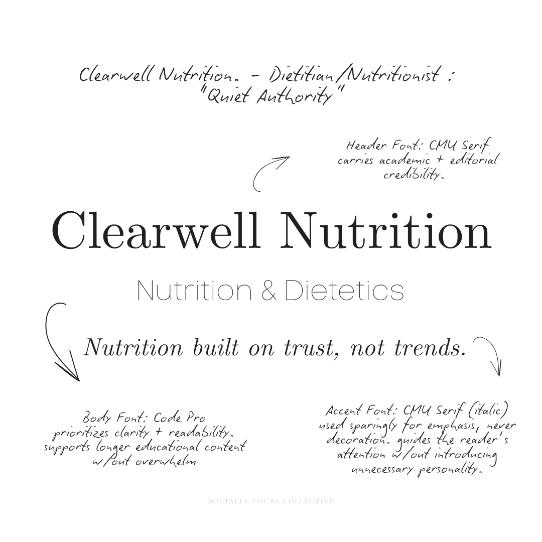
Header Typography: CMU Serif
CMU Serif was chosen for headings because it carries academic and editorial credibility.
It subtly references the world of research, publishing, and evidence-based work—making it a natural fit for a nutrition brand grounded in science.
This reinforces Clearwell’s positioning as: Thoughtful, Knowledgeable, Rooted in evidence, not trends
Body Typography: Code Pro
Code Pro was selected for body text because it prioritizes clarity and readability.
As a clean, modern sans-serif, it supports longer educational content without overwhelming the reader. It’s important when communicating nuanced or sensitive health information.
This choice allows the content to feel: Accessible, Easy to digest, Calm and professional
Accent Usage: CMU Serif Italic
CMU Serif Italic is used sparingly for emphasis—never decoration.
It adds softness and rhythm to the layout while staying within the same typographic family as the headers. This keeps the system cohesive and intentional, guiding the reader’s attention without introducing unnecessary personality.
Accents are used to: Highlight key ideas, Introduce sections, Create visual pauses in longer text
Together, this typographic system: Supports readability for long-form education, Signals credibility and professionalism, Maintains accessibility and clarity across platforms
Nothing here competes for attention.
Everything works in service of trust.
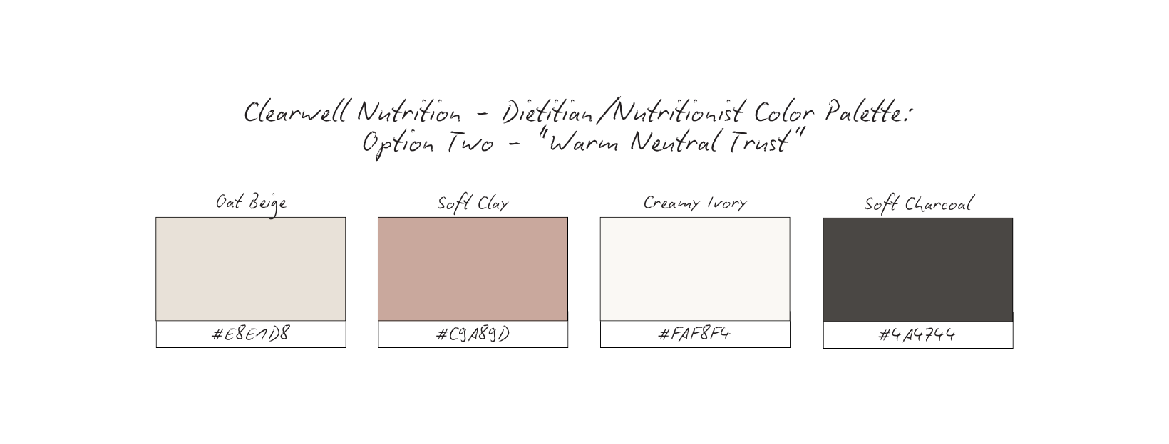
Color Palette Psychology
Before locking in a final direction, multiple palette options were explored.
Each one was intentionally designed to support trust, professionalism, and emotional safety within a nutrition-focused brand. None of these palettes are “wrong.” Each could work depending on the practitioner’s scope, setting, and client relationship.
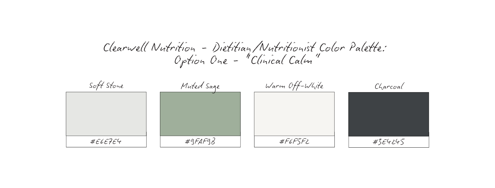
Vibe: Evidence-based, steady, reassuring
Why it works: Feels clinical without being cold. Excellent for medical-adjacent credibility and regulated care environments.
Vibe: Human, calming, non-judgmental
Why it works: Emotionally safe. Reduces intimidation around nutrition and body-related conversations while still feeling professional.
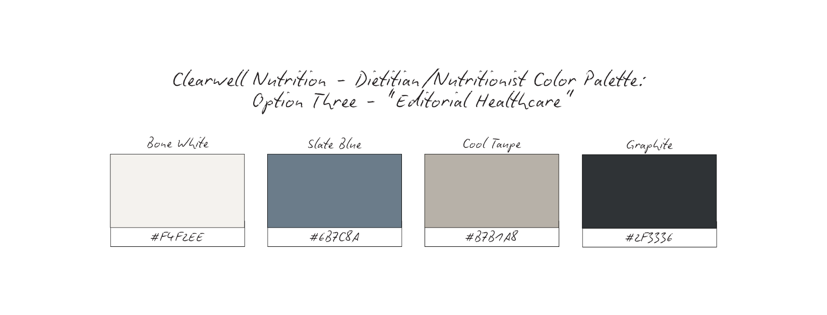
Vibe: Intelligent, composed, quietly authoritative
Why it works: Feels like an academic journal meets modern healthcare. Ideal for dietitians who publish, educate, or lead.
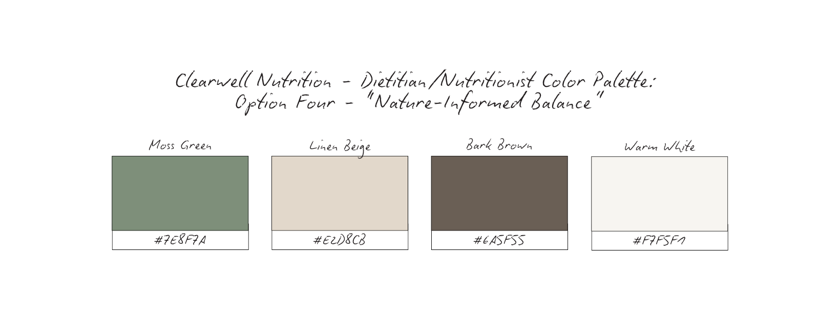
Vibe: Grounded, restorative, whole-person care
Why it works: Connects nutrition to sustainability and long-term balance without slipping into influencer wellness aesthetics.
Vibe: Clean, clarity-first, low stimulation
Why it works: Reduces visual noise and nervous system activation—ideal for sensitive client journeys.
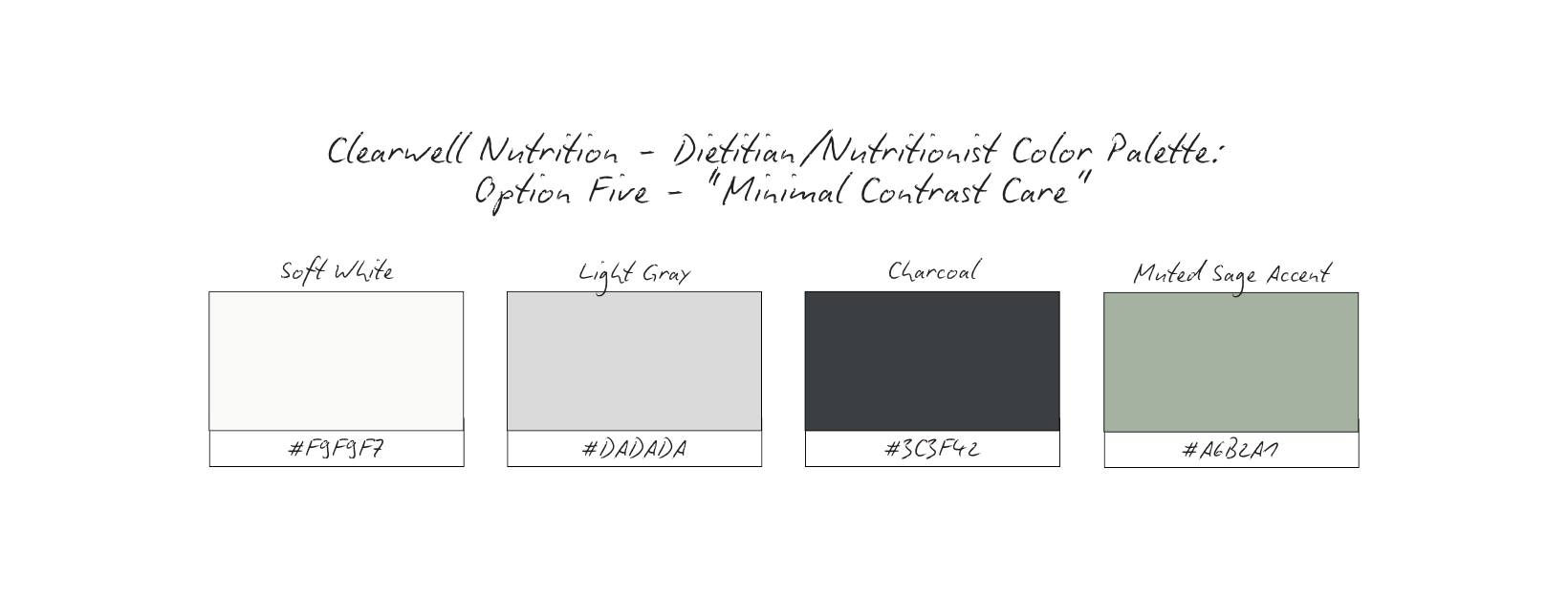
But one palette stood out as the most aligned with Clearwell Nutrition’s core positioning.
The Minimal Contrast Care palette was chosen because it prioritizes regulation over stimulation.
The minimal contrast creates a sense of calm before any words are read. The Soft whites and light grays reduce visual noise and mental fatigue. The Charcoal anchors the brand with quiet authority and professionalism. Muted sage introduces a subtle cue of health and balance—without signaling trends or urgency
Together, these tones communicate steadiness, clarity, and emotional safety.
By keeping the visual environment regulated and restrained, the brand allows the content—education, guidance, and care—to lead.
This isn’t a palette designed to grab attention.
It’s designed to hold it, quietly and consistently.
Content Strategy Breakdown
For Clearwell Nutrition, content isn’t created to persuade or perform.
It’s created to educate clearly, reassure consistently, and build trust over time.
This strategy prioritizes credibility first, visibility second.
Every format plays a specific role, ensuring the brand supports long-term client relationships rather than chasing attention or urgency.
Reels: Reassurance + Accessibility
Reels are used to humanize the practitioner and lower the barrier to care.
Rather than trends, shock-value claims, or fear-based hooks, Clearwell’s reels focus on: Calm explanations, Gentle reframes, Behind-the-scenes practitioner thinking
This allows potential clients to experience how the nutritionist approaches care before ever booking. Visibility comes from clarity and steadiness, not stimulation.
Carousels: Education + Authority
Carousels carry the intellectual weight of the brand.
They are used to: Explain nutrition concepts simply, Address common misconceptions without alarm, Provide context around evidence-based care
This is where long-form authority lives. The goal isn’t to overwhelm or “prove expertise,” but to articulate information thoughtfully and ethically.
Carousels position Clearwell Nutrition as a trusted guide, not a source of quick answers.
Static Posts: Stability + Presence
Static posts anchor the brand visually and emotionally.
They communicate: Consistent values, Professional boundaries, Reassuring reminders around care, pace, and process
These posts create visual pauses in the feed, reinforcing a sense of steadiness and reliability.
Stories: Intimacy + Ongoing Care
Stories support trust-building in real time.
They show: Context behind decisions, Daily rhythms of practice, Presence without pressure
Stories aren’t used to push offers or urgency. They’re used to maintain connection and reinforce that care is ongoing, not transactional.
Together, these formats create balance: Reels invite approachability, Carousels establish authority, Static posts create stability, Stories sustain trust.
Nothing exists in isolation. Each format supports the others, creating a cohesive system where the brand feels calm, credible, and emotionally safe.
This approach reflects how ethical nutrition care actually works —
thoughtfully, patiently, and with long-term outcomes in mind.
High-Converting Content Ideas For Dietitians & Nutritionists
“How I Think About Nutrition” Series
Type: Carousel
What it is: Breaking down how you approach care, assessment, and recommendations without giving plans or protocols.
Why it converts: Clients don’t just choose credentials; they choose how you think. This positions you as a strategic, reflective partner.
Micro CTA: Save this if you’re looking for a nutrition approach that’s thoughtful, not reactive.
Myth Clarification (Not Myth Busting)
Type: Static Post or Carousel
What it is: Softly reframing common misconceptions without dramatic language or fear tactics.
Why it converts: Clarification feels safer than confrontation. It attracts clients who value nuance.
Micro CTA: Share this with someone who’s tired of confusing nutrition advice.
“What’s a First Appointment Is Actually Like”
Type: Reel or Carousel
What it is: Walking through the experience step-by-step to remove uncertainty.
Why it converts: Unknowns create hesitation. Transparency lowers the barrier to booking.
Micro CTA: Save this for when you’re considering working with a dietitian.
Behind-the-Scenes Decision Making
Type: Reel
What it is: Sharing how you evaluate information, research, or client context (without violating scope or privacy).
Why it converts: This hows expertise without over-teaching. It humanizes authority.
Micro CTA: Follow for more insight into how nutrition care actually works.
Scope & Boundaries Education
Type: Carousel
What it is: Clear explanation of what you do, what you don’t, and why that matters for care quality.
Why it converts: Boundary clarity attracts better-fit clients and filters misaligned ones.
Micro CTA: Save this if you value ethical, professional care.
Client Reassurance Statements
Type: Static Post
What it is: Affirming, non-judgmental messages that normalize uncertainty, setbacks, or slow progress.
Why it converts: People book when they feel understood, not evaluated.
Micro CTA: If this resonated, you’re not alone. This space is for you.
Evidence-in-Context Posts
Type: Carousel
What it is: Explaining how evidence informs care decisions without overwhelming or quoting studies excessively.
Why it converts: Shows credibility while remaining accessible.
Micro CTA: Save this if you want evidence explained with care, not pressure.
Practice Philosophy Statements
Type: Static post or Carousel
What it is: Clear articulation of your values around care, pace, and ethics.
Why it converts: Clients choose practitioners whose philosophy aligns with their needs.
Micro CTA: Follow if this approach to nutrition feels aligned with you.
“Who This Is For / Who This Isn’t For”
Type: Carousel
What it is: Clearly stating who benefits most from your approach.
Why it converts: Being specific increases conversion by reducing friction and mismatch.
Micro CTA: Save this if you’re looking for care that’s built for the long term.
Grid Logic & Visual Rhythm
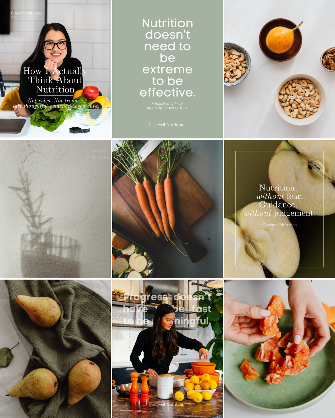
Calm Structure, Not Visual Noise
This grid is intentionally restrained.
Not because there’s nothing to say — but because nutrition is already a saturated, emotionally charged space.
Clearwell Nutrition uses visual quiet as a strategic choice. By limiting contrast, exaggeration, and over-stimulation, the grid allows each message to land without triggering urgency or fear.
No dramatic transformations. No chaotic “before & afters.” No trend-driven visuals competing for attention.
This isn’t a feed designed to alarm. It’s designed to regulate.
Repetition Builds Trust
The grid relies on consistent visual cues:
Soft, neutral color fields
Natural food still life (unstyled, unforced)
Human presence in calm, grounded moments
Typography-led statements with breathing room
This repetition is intentional.
In health-adjacent services, consistency doesn’t feel boring — it feels safe. Over time, the viewer’s nervous system learns what to expect. The feed becomes familiar, predictable, and reassuring.
That predictability is what builds trust before a client ever books a session.
Spacing Signals Professionalism
White space and controlled pacing do something subtle but powerful:
they slow people down.
Instead of reacting emotionally to content, viewers are invited to absorb it. This mirrors the practitioner’s role — thoughtful, steady, and grounded in long-term care rather than quick outcomes.
The grid reflects how an evidence-based nutrition professional actually works:
with patience, clarity, and intention.
Message-First, Always
Notice how the grid alternates between:
Educational reframes, Gentle myth-disrupting statements, Process-focused visuals, Quiet reassurance over results
There’s no filler content.
Every post exists to either:
Reduce fear, Clarify misinformation, Reinforce professional boundaries, Build confidence in the process
The brand isn’t trying to motivate through pressure — it’s guiding through understanding.
Because in nutrition, people don’t convert when they feel overwhelmed.
They convert when they feel safe.
This grid helps viewers quickly understand:
What Clearwell Nutrition stands for, How it approaches care, Why consistency matters more than intensity
The result is a brand presence that feels steady, credible, and trustworthy — exactly what clients look for when choosing a nutrition professional they’re willing to listen to and stay with long-term.
Why This Brand Works
Clearwell Nutrition works because every decision is aligned — not optimized for attention, but for trust.
The typography prioritizes readability and authority, supporting long-form education without feeling clinical.
The color palette lowers visual intensity, signaling safety, steadiness, and professionalism.
The imagery avoids extremes, focusing instead on process, presence, and real-life context.
The content strategy educates without overwhelming and reassures without diluting expertise.
Nothing in this brand is accidental — but nothing is loud either.
That balance is what makes it effective.
In an industry where fear-based messaging and aesthetic wellness trends often blur the line between guidance and pressure, Clearwell Nutrition stands apart by being calm, consistent, and evidence-forward.
The brand doesn’t ask clients to trust it immediately.
It earns trust through clarity, repetition, and restraint.
And in health-adjacent work, that’s what matters most.
What This Means For Your Brand
If you’re a dietitian or nutrition professional, your brand doesn’t need to convince — it needs to reassure.
This study shows that you don’t need: Extreme claims, Visual overload, Trend participation, Constant “results” content
What you do need is alignment between how you practice and how you present yourself.
When your brand reflects: Thoughtful care over urgency, Education over persuasion, Process over performance
Clients feel safer engaging with you.
They understand what you offer.
They trust your boundaries.
And they’re more likely to stay — not just start.
Your brand should feel like an extension of your clinical approach, not a marketing mask you put on to be visible online.
The Result
Clearwell Nutrition becomes more than a nutrition brand.
It becomes a steady presence in a noisy space.
A source of clarity instead of confusion.
A guide clients trust because nothing feels rushed, exaggerated, or performative.
A brand that communicates:
“You’re not behind. You’re not failing. And you don’t need extremes to move forward.”
When every detail aligns — from typography to pacing to message — the brand doesn’t rely on urgency to convert.
It builds confidence.
It builds credibility.
And it builds long-term client relationships rooted in trust.
This study isn’t meant to give you answers overnight.
It’s meant to give you clarity.
If this resonated, take a moment to ask yourself:
Does your brand reflect how you actually work — or just what you post?
From here, you can go a few different directions:
Explore more Brand Studies to see how positioning shifts across industries
Reflect on your own brand systems — what’s intentional, what’s reactive, what’s outdated
Work with me if you’re ready to align your brand with your thinking, not just your aesthetics
Follow along for upcoming Industry Spotlights, where I break down brands from the inside out, every Saturday
No pressure. No urgency tactics.
Just the next right step, when you’re ready.