

Brand Studies: Jewelry & Ear Piercing
A strategic brand breakdown built from the inside out.
Most jewelry and piercing brands are built around products.
The newest drop.
The trend.
The accessory itself.
But the strongest brands in this space operate differently.
They aren’t just selling jewelry.
They’re helping people shape: identity, self-expression, personal style, and the way they present themselves to the world.
This is not a guide on how to sell more earrings. Not trend forecasting.
Not “post aesthetic photos and hope people buy.”
And not branding built purely around aesthetics without emotional depth.
This is a strategic brand build designed to position jewelry and ear piercing brands as curated styling experiences, not interchangeable accessory shops.
Because modern adornment is no longer just decoration. It’s intentional.
The placement, styling, and feeling matters.
And the brands that understand that create much deeper connection and loyalty.
This study explores how jewelry and ear piercing brands can build identities rooted in curation, self-expression, and intentional styling through voice, visuals, content, and experience.
This study is for jewelry and piercing brands who want their brand to reflect more than the products themselves:
the identity, emotion, and personal expression behind how they’re worn.
The Industry Reality: Accessories vs. Intentional Adornment
The jewelry and piercing industry is highly visual.
Most brands compete through:
trends, styling aesthetics, product drops, curated imagery, and visual appeal alone
And visually, many of those brands are beautiful.
But over time, purely aesthetic positioning becomes difficult to differentiate.
When every brand focuses only on:
what’s trendy, what’s shiny, what’s “cute” or fashionable…
the products start to feel interchangeable.
Product-First Jewelry Brands
Many jewelry and piercing brands are built around:
constant new arrivals, trend cycles, accessory-focused marketing, and fast-moving aesthetics
The focus stays on the item itself.
The jewelry is treated as:
decoration, an add-on, and a product to purchase quickly.
And while this can generate attention, it often creates brands that feel temporary or trend-dependent.
Identity-Led Styling Brands
Curated piercing and styling brands operate differently.
They position jewelry as part of:
personal identity, intentional styling, self-expression, and visual storytelling.
The focus shifts from:
“What should I buy?”
to:
“How do I want to present myself?”
That changes how the audience experiences the brand.
The jewelry becomes:
curated, placed intentionally, and emotionally connected to the wearer.
Not just aesthetically pleasing.
Ear Styling Changes the Conversation.
Modern ear piercing brands are no longer only selling piercings.
They’re creating:
curated ear compositions, placement strategies, styling experiences, and personalized adornment.
The service becomes: part styling consultation, part self-expression, and part identity-building experience.
And branding should reflect that depth.
Both types of brands can succeed.
Both attract different audiences.
But branding should match the role you want your brand to play.
If your goal is to build:
long-term loyalty, emotional connection, recognizable styling identity, elevated positioning…
your brand cannot rely on aesthetics alone.
It needs to communicate: intentionality, curation, identity, and experience.
Jewelry and piercing brands begin to understand that: people are not only buying adornment.
They’re buying:, expression, feeling, identity, and the experience of becoming more themselves.
And the brands that communicate that clearly become far more memorable than brands built on trends alone.
Brand Concept Overview: The Curated Ear
To explore how a modern jewelry and piercing brand can move beyond product-based marketing, this study is anchored in a concept brand:
The Curated Ear
Ear Styling & Piercing Studio
Adornment, intentionally placed.
The name itself communicates the core positioning shift:
This is not simply about jewelry.
It’s about: curation, placement, styling, and identity.
The brand positions ear styling as something intentional and personal, not random decoration.
Every piercing, every stack, and every piece is treated as part of a larger visual composition.
Brand Positioning
The Curated Ear is built around four defining principles:
Intentional Styling Over Trend Cycles
The brand is not built around constantly chasing trends or product drops.
Instead, it focuses on:
timeless styling, personal curation, balance and placement, and long-term wearability.
The emphasis is on creating styling that feels personal, not disposable.
Adornment as Self-Expression
The jewelry is positioned as more than an accessory.
It becomes part of: identity, mood, confidence, and self-presentation.
The brand understands that adornment is emotional.
People are not simply buying jewelry.
They are shaping how they want to feel and be perceived.
Editorial, But Approachable
The visual direction feels elevated and refined, while still remaining welcoming.
The brand avoids:
intimidating luxury language, overly polished perfection, and trend-heavy chaos.
Instead, it creates a calm, curated atmosphere where:
styling feels intentional, individuality feels celebrated, and the client feels seen
Experience-Led Branding
The Curated Ear positions piercing as an experience, not just a transaction.
The process includes:
consultation, placement consideration, anatomy-aware styling, and personalized recommendations.
This transforms the service into something collaborative and highly personal.
Who This Brand Is Built For
This concept brand is designed for:
ear piercing studios
curated jewelry brands
fine jewelry stylists
modern adornment brands
piercing artists focused on styling and identity
Who This Brand Is Not Built For
The Curated Ear is intentionally not designed for:
fast-fashion jewelry brands
trend-only accessory marketing
mass-product positioning
impulsive “shop the drop” branding
generic piercing studios without styling direction
The Curated Ear is not built around selling jewelry.
It’s built around helping people curate:
identity, expression, visual balance, and intentional self-presentation
The strongest brands in this space understand:
Adornment is never just decoration.
It’s personal.
Brand Voice & Tone
For The Curated Ear, the brand voice is not built around selling products.
It’s built around: curation, self-expression, styling, and personal identity.
In modern piercing and jewelry brands, the emotional experience matters just as much as the product itself.
The language should make the audience feel: considered, expressive, intentional, and understood.
Brand Voice
The Curated Ear communicates with a voice that feels:
Editorial - The language is thoughtful, visually aware, and intentional. It reflects the same level of care as the styling itself. Nothing feels rushed or overly promotional. The brand speaks as if it’s curating an experience, not pushing a sale.
Observant - The voice notices details. It pays attention to: placement, balance, proportion, personal style, and individuality. The language feels aware of nuance, which reinforces the idea that styling is personal.
Refined, Without Feeling Cold - The tone feels elevated and intentional, but never intimidating. The brand avoids: overly trendy language, loud marketing language, and excessive luxury posturing. Instead, it communicates confidence quietly. The audience should feel: welcomed, inspired, and guided. Not pressured.
Expressive, But Controlled - The Curated Ear allows emotion to exist through: atmosphere, styling language, thoughtful phrasing, and visual storytelling. But the brand never becomes overly dramatic or performative. The restraint is what makes it feel modern.
Brand Tone
The tone adapts depending on the content, while staying grounded in intentionality.
Descriptive, Not Pushy - The brand describes: how styling feels, why placement matters, what makes a stack balanced, and how jewelry changes expression. Rather than relying heavily on: urgency, hard selling, and aggressive promotion.
Personal, Not Overly Casual - The tone feels human and conversational, but still curated. It avoids: excessive slang, trend-heavy captions, and trying too hard to sound relatable. The communication feels calm and self-assured.
Confident Through Simplicity - The brand does not over-explain itself. It trusts: restraint, spacing, thoughtful wording, and minimal language. This mirrors the styling philosophy itself: small details create impact.
Why It Matters
Jewelry and piercing brands operate in emotional territory.
People use adornment to: express identity, mark transitions, shape self-image, and feel more like themselves. That means the language cannot feel transactional. It has to feel: intentional, and personal, and emotionally aware.
Clients are not just choosing jewelry. They’re choosing: how they want to feel, how they want to present themselves, and what parts of themselves they want to emphasize.
Every piece of communication should reinforce one idea: “Nothing here is random.” Every placement. Every stack. Every detail. Considered intentionally.
That’s what transforms jewelry from an accessory… into identity.
Typography System: Why This Works
For The Curated Ear, typography is designed to reflect one core principle: intentional restraint.
This brand is built around: curation, placement,. balance, and identity through detail…
so the typography system must feel: refined, modern, editorial, and quietly expressive.
Nothing should feel loud or overly decorative.
Like a curated ear stack, the typography relies on:
proportion, spacing, subtle contrast, and intentional composition.
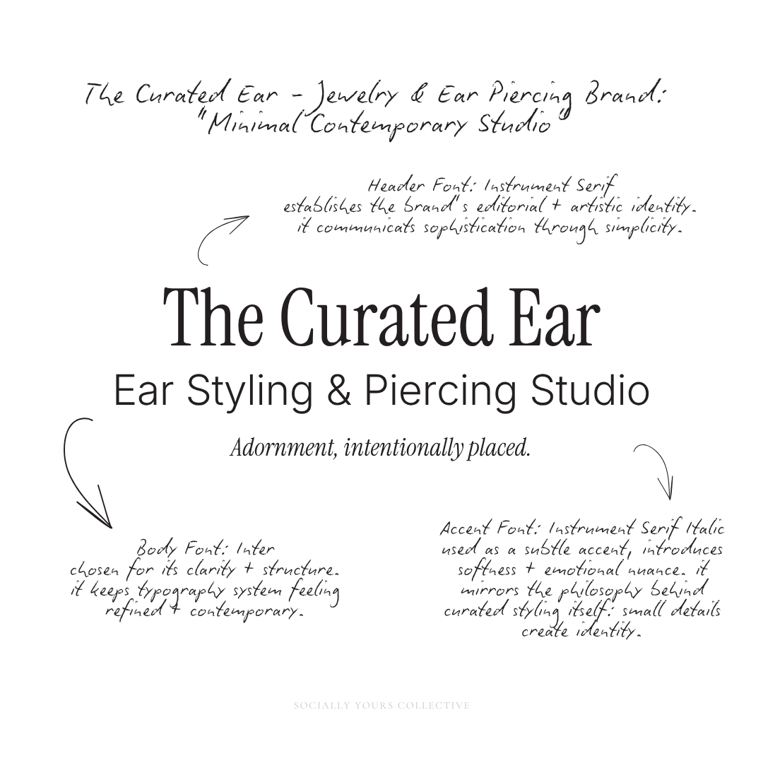
Header Typography: Instrument Serif
Instrument Serif establishes the brand’s editorial and artistic identity.
Unlike traditional luxury serifs that can feel overly formal, Instrument Serif feels more contemporary and emotionally restrained.
It mirrors the feeling of:
• modern gallery branding, editorial fashion layouts, and curated design studios
Used in:
campaign statements, carousel covers, styling reflections, educational headlines
the typography creates atmosphere without overpowering the content.
It communicates:
curated sophistication through simplicity.
Body Typography: Inter
Inter provides clarity and structure throughout the brand system.
It allows educational and descriptive content to remain easy to follow while supporting the brand’s modern aesthetic.
It’s highly effective for:
styling notes, placement education, consultation information, captions, product descriptions
Accent Typography: Instrument Serif Italic
The italic variation introduces softness and emotional nuance.
Rather than using decorative scripts or dramatic typography, emphasis is created subtly through:
italics, spacing, scale, and placement.
This mirrors the philosophy behind curated styling itself:
small details create identity.
Accent typography is used to highlight:
reflective phrases, styling observations, emotional statements, and placement details
without disrupting the overall visual calm of the brand.
This typography system creates a visual rhythm that feels:
minimal, expressive, editorial, and intentional.
Nothing feels excessive. Nothing competes for attention.
Every typographic choice reinforces the same idea:
intentionality creates sophistication.
Just like a curated ear stack, the typography system depends on:
balance, spacing, restraint, and thoughtful composition.
No element exists purely to stand out.
Each detail supports the overall feeling of the brand:
considered, personal, refined, and quietly expressive.
“The most refined brands understand that subtle details create the strongest identity.”
Color Palette Psychology
For The Curated Ear, color is used to create:
emotional tone, visual restraint, styling atmosphere, and editorial cohesion.
Because jewelry and piercing brands already contain:
shine, metal, texture, layering, visual detail…
the palette should support the styling, not compete with it.
This brand is not built around loud color.
It’s built around:
mood, contrast, and intentional composition.
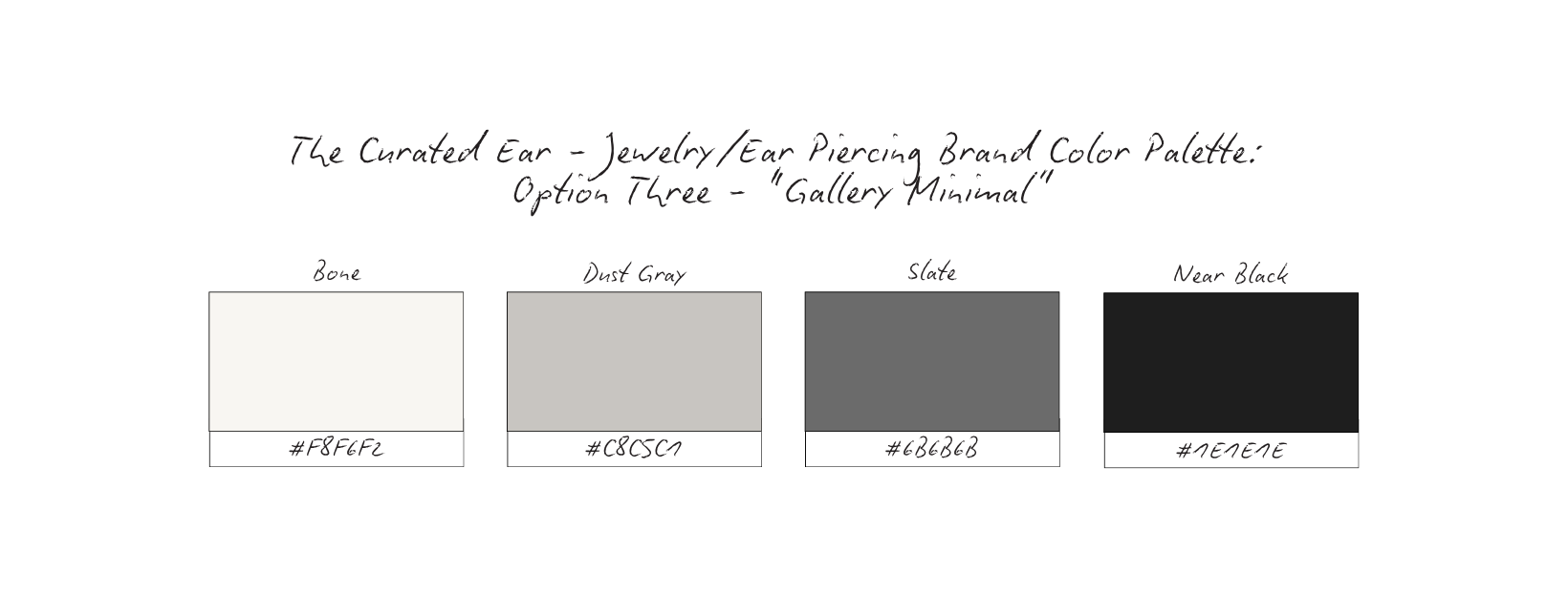
For The Curated Ear, several palette directions were explored before selecting a final system.
Each palette below supports a slightly different emotional direction while staying aligned with the core brand positioning:
curated > chaotic, identity > trend, atmosphere > decoration.
Emotional Cue: Modern, restrained, editorial.
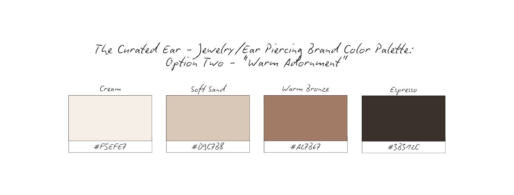
Emotional Cue: Warm, personal, intimate.

Emotional Cue: Architectural, ultra-modern, cool.
Emotional Cue: Organic, tactile, styling-focused.
Emotional Cue: Luxury, polished, fashion-forward.
The strongest jewelry and piercing brands don’t rely on color for attention.
They rely on: atmosphere, restraint, styling detail, emotional tone.
When the styling is intentional…
the palette only needs to support the experience,
not overpower it.
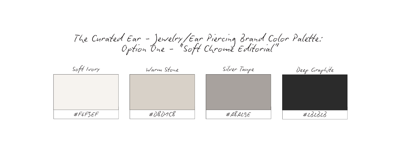
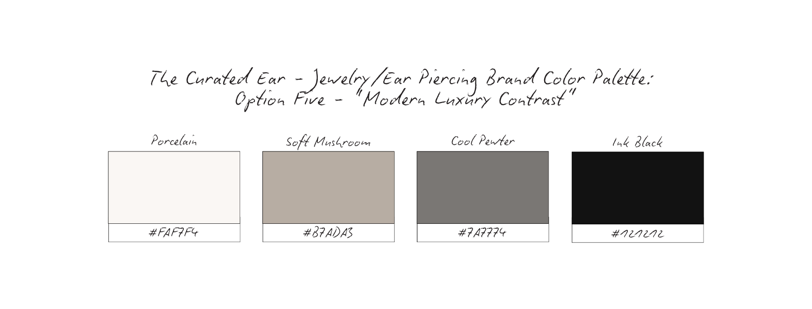
Why The Palette Works: Soft Chrome Editorial
The Soft Chrome Editorial palette was selected to reinforce one central idea:
adornment should feel intentional, not overwhelming.
For The Curated Ear, color is not used to compete for attention.
It’s used to create: atmosphere, restraint, styling clarity, and emotional tone.
The palette supports the jewelry, instead of trying to outshine it.
Inspired by Metal, Skin, and Light
The palette draws directly from the natural environment of curated ear styling:
silver jewelry, soft skin tones, reflected light, shadow, and texture.
The combination of: ivory, stone, silver-gray, and graphite…
creates a visual system that feels: modern, tactile, editorial, quietly luxurious.
Nothing feels overly polished or artificial.
The palette reflects real materials and real styling environments.
Modern Editorial Energy
The cool undertones create a strong editorial feeling without becoming cold or clinical.
This is important because the brand sits between:
fashion, beauty, personal identity, and modern styling culture.
The palette mirrors the feeling of:
jewelry editorials, gallery-inspired branding, contemporary fashion publications, curated studio spaces.
It feels refined through restraint.
Jewelry Becomes the Focus
Because jewelry already contains: shine, reflection, layering, texture…
the surrounding palette must remain controlled.
The soft neutrals allow:
metal finishes to stand out naturally,
placement details to remain visible, and ear stacks to feel balanced and intentional.
The palette creates space for: the styling itself to become the visual centerpiece.
Contrast Creates Sophistication
The Deep Graphite adds grounding and contrast throughout the brand system.
This prevents the palette from feeling: flat, overly delicate, or visually washed out.
The darker tone introduces: structure, readability, and visual hierarchy…
while still maintaining softness overall.
Why This Palette Fits The Curated Ear
This palette perfectly reflects the emotional positioning of the brand:
curated, identity-led, modern, restrained, and expressive through detail.
Nothing feels loud. Nothing feels trend-dependent.
Everything feels: considered, intentional, quietly personal…
which mirrors the experience of curated adornment itself.
The strongest styling brands understand that sophistication is often created through restraint.
This palette doesn’t compete for attention.
It creates the atmosphere where: styling, placement, texture, and identity can speak clearly on their own.
“When styling is intentional, the smallest details become the most memorable.”
Content Strategy Breakdown
For The Curated Ear, content is not created just to showcase jewelry.
It’s created to communicate:
identity, styling perspective, intentional placement, and personal expression.
The strongest brands in this space are not built around products alone.
They’re built around curation.
The content should make the audience feel: inspired, expressive, visually understood, and emotionally connected to the styling itself.
Reels: Styling as Identity
Reels focus on the movement and experience of adornment.
Instead of only showing products individually, the content highlights:
ear stack styling, placement combinations, jewelry layering, styling transitions, or curation process moments.
The goal is not simply: “look at this jewelry.”
It’s: “look at how this styling changes the feeling.”
Reels create emotional atmosphere while reinforcing the idea that placement shapes identity.
Carousels: Education + Styling Perspective
Carousels are used to teach and guide styling decisions.
Rather than relying only on aesthetics, the brand explains:
why certain placements work together, how balance changes an ear stack,
jewelry pairing logic, anatomy-aware styling, or healing and styling considerations.
This transforms the content from: “shopping inspiration”
into: “curated styling education.”
The audience begins learning how to think about adornment more intentionally.
Static Imagery: Editorial Restraint
Static posts act as visual pauses throughout the grid.
The imagery focuses on:
close-up ear compositions, texture and shine, shadows and skin detail,
minimalist styling moments, or emotionally atmospheric photography.
These posts are intentionally restrained.
The styling is allowed to breathe.
This reinforces the brand’s editorial and modern identity while slowing the audience down visually.
Stories: Process + Personal Expression
Stories bring intimacy and personality into the brand experience.
They are used for:
styling consultations, jewelry selection moments,
healing updates, placement sketches, behind-the-scenes studio moments, and client styling decisions.
Stories make the audience feel included in the process of curation.
The brand becomes less transactional and more collaborative.
Each format supports a different layer of the brand experience:
Reels → emotional styling atmosphere
Carousels → intentional education
Static posts → editorial identity
Stories → personal connection + process
Together, the content creates a brand that feels:
expressive, elevated, modern, emotionally intentional…
without becoming visually overwhelming.
Bonus: The Curated Ear does not post content simply to display products.
It posts content to communicate taste, styling philosophy, identity, and intentionality.
The audience begins to associate the brand not just with jewelry,
but with a specific way of styling and seeing.
That distinction builds recognition.
The feed no longer feels like a jewelry catalog.
It feels like a curated styling studio, an editorial experience, and a visual identity resource.
The audience doesn’t just scroll looking for products.
They return for inspiration, styling perspective, and the feeling the brand creates around adornment itself.
High-Converting Content Ideas For Jewelry & Ear Piercing Brands
Each content pillar is designed to reinforce one central idea: Adornment is intentional.
These pillars are not built around constantly selling products.
They are built around: styling perspective, emotional connection, identity, and curated self-expression.
Every post should make the audience feel like they are learning how to style more intentionally, express themselves visually, or curate details thoughtfully.
Ear Stack Breakdowns
Type: Carousel
What it is: Detailed breakdowns of curated ear stacks (jewelry combinations, placement choices, balance and spacing, mixed metal styling, anatomy-aware decisions)
Why it converts: It teaches the audience how to think about styling, not just copy a look. This builds authority, trust, and saves.
Micro CTA: Save this for your next ear styling appointment.
Placement Education
Type: Carousel or Reel
What it is: Educational content explaining: placement names, anatomy considerations, how placement changes balance, or why certain piercings work together.
Why it converts: It positions the brand as thoughtful and expert-led rather than purely aesthetic. This builds credibility, education, and trust.
Micro CTA: Which placement are you adding next?
Styling Perspective Reels
Type: Reel
What it is: Slow, editorial-style styling clips (jewelry layering, stack transitions, close-up movement, styling adjustments, texture + shine details).
Why it converts: It creates emotional atmosphere and identity-based inspiration. This builds desire, emotional connection, and brand recognition.
Micro CTA: Your ear stack says more than you think.
“Why This Works” Styling Breakdowns
Type: Carousel
What it is: Explaining why a certain stack feels: balanced, elevated, edgy, soft, cohesive.
Why it converts: The audience begins understanding styling logic instead of consuming visuals passively. This builds authority, retention, and saves.
Micro CTA: Save this styling breakdown for later.
Jewelry Pairing Guides
Type: Static or Carousel
What it is: Pairing: textures, metals, hoop sizes, gemstone tones, minimalist vs statement pieces.
Why it converts: It simplifies styling decisions while reinforcing the brand’s curatorial perspective. This builds trust and practical value.
Micro CTA: Which pairing feels most like you?
Healing + Process Content
Type: Reel or Story
What it is: Healing timelines, piercing aftercare, jewelry changes, consultation process, placement mapping.
Why it converts: It makes the brand feel collaborative, thoughtful, and experience-led. This builds trust, transparency, and comfort.
Micro CTA: Save this before your next piercing appointment.
Styling Reflections / Identity Posts
Type: Carousel or Static
What it is: Short reflective statements around: self-expression, adornment, confidence, identity, personal style.
Why it converts: It creates emotional depth beyond products and services. This builds connection, brand identity, and loyalty.
Micro CTA: Adornment should feel personal.
Client Styling Features
Type: Static, Reel, or Story
What it is: Curated client stacks with: placement explanations, styling notes, jewelry reasoning, or before/after evolution.
Why it converts: It reinforces the collaborative nature of the brand. This builds social proof, inspiration, and trust.
Micro CTA: Every stack tells a different story.
Micro Styling Lessons
Type: Static or Carousel
What it is: Quick educational insights like “Why smaller hoops balance this placement”, “How spacing changes the stack”, or “Mixing metals without overwhelming the ear”.
Why it converts: Highly saveable and easy to consume while reinforcing expertise. This builds authority, retention, and engagement.
Micro CTA: Small styling shifts change everything.
The Curation Process
Type: Story + Reel Combo
What it is: Showing: placement sketching, jewelry selection, stack planning, consultation conversations, styling decision-making.
Why it converts: It reinforces that nothing about the brand is random. This builds intentionality, emotional trust, and premium positioning.
Micro CTA: Curated with intention from start to finish.
Each pillar supports a different layer of the brand experience:
Education → understanding
Styling → inspiration
Process → trust
Reflection → emotional connection
Curation → brand identity
Together, the content creates a feed that feels modern, intentional, editorial, and emotionally aware.
The audience no longer sees the brand as a :jewelry account.”
They experience it as a styling perspective, a curated identity brand, and a modern adornment studio.
The content doesn’t just showcase jewelry. It teaches people how to express themselves through it.
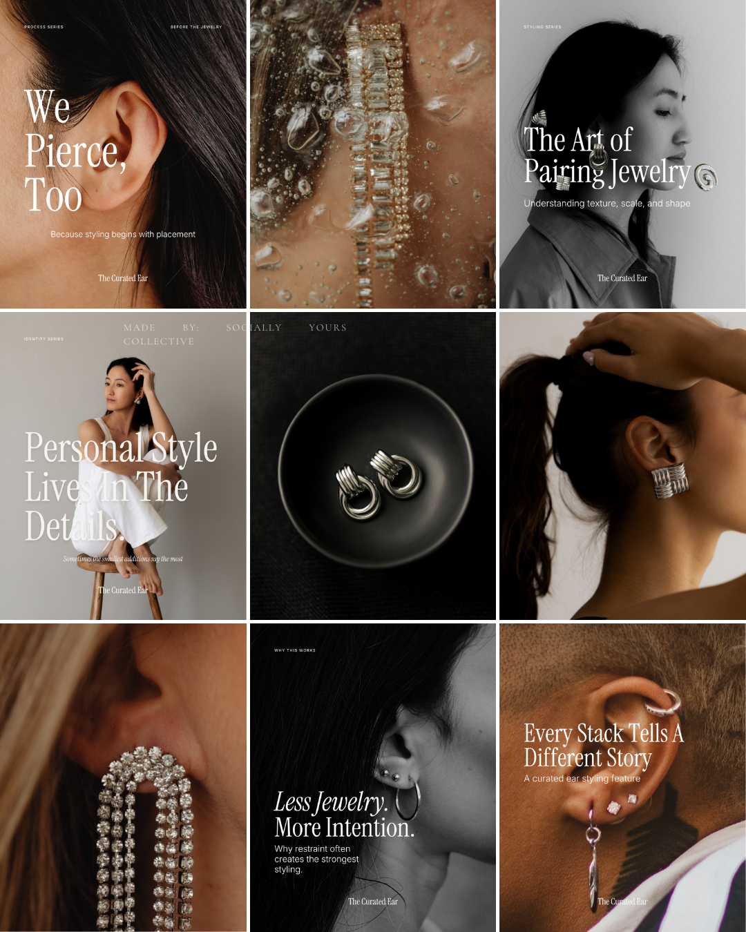
Grid Logic & Visual Rhythm
Curation Over Consumption
This grid is intentionally designed to feel more like a styling publication than a jewelry storefront.
Rather than overwhelming the viewer with constant product imagery, the content alternates between:
educational styling insights, identity-driven reflections,
client features, process-focused content, editorial product photography
This creates a feed that feels curated and considered rather than transactional.
The audience isn't simply browsing jewelry. They're learning how to think about styling.
The Ear Is The Anchor
Notice how the grid repeatedly returns to one visual subject: the ear.
Not logos. Not product flat lays. Not promotional graphics.
The ear becomes the brand's visual anchor.
Throughout the grid we see:
bare ears, styled ears, client stacks, placement examples, and close-up styling details.
This repetition trains the audience to immediately associate the content with The Curated Ear.
Over time, recognition is built through consistency rather than visual noise.
Editorial Covers Create Structure
The text-led covers act as visual signposts throughout the feed.
Posts such as:
We Pierce, Too.
The Art of Pairing Jewelry
Personal Style Lives In The Details.
Less Jewelry. More Intention.
Every Stack Tells A Different Story.
create moments of pause.
Rather than relying on constant educational graphics, the brand uses editorial statements to establish perspective.
These covers make the feed feel less like content and more like a collection of ideas.
Product Imagery Is Used Sparingly
One of the strongest decisions within this grid is restraint.
Jewelry appears throughout the feed, but rarely as isolated product promotion.
Instead, products are shown through:
styling context, composition, texture, placement, or editorial photography.
The result is a brand that feels experience-led rather than inventory-led.
The audience becomes interested in the styling philosophy before they become interested in specific pieces.
Contrast Creates Rhythm
The visual rhythm relies heavily on contrast.
The feed alternates between:
black and white imagery
warm skin tones
close-up details
wider editorial portraits
text-heavy covers
image-led moments
This creates movement without sacrificing consistency.
Every post feels connected, but no two posts feel identical.
White Space Creates Breathing Room
Many jewelry brands feel crowded because every post competes for attention.
This grid does the opposite.
Typography is given room to breathe. Subjects are allowed space within the frame.
Jewelry is often surrounded by negative space rather than clutter.
This restraint creates a feeling of confidence and sophistication.
The feed doesn't ask for attention. It earns it.
Identity Before Product
Perhaps the most important strategic decision in this grid is that it prioritizes identity over inventory.
The content repeatedly reinforces:
self-expression, personal style, intentional curation, placement decisions, individuality
The jewelry becomes part of a larger conversation.
It is not the entire conversation.
This distinction elevates the brand from a jewelry business to a styling authority.
People are rarely drawn to jewelry alone. They're drawn to what jewelry represents.
Confidence. Identity. Expression. Personal style.
This grid understands that. Rather than constantly asking: "What should I buy?"
the content encourages viewers to ask: "What feels like me?"
That subtle shift creates deeper emotional connection and stronger brand loyalty.
As a result, The Curated Ear feels less like a piercing studio or jewelry retailer and more like a modern styling destination.
The feed communicates expertise without intimidation, education without overwhelm, luxury without exclusivity, and style without trend-chasing.
The result is a brand presence that feels editorial, intentional, and deeply personal.
Exactly what modern ear styling and piercing brands should aspire to become.
Why This Brand Works
The Curated Ear succeeds because it understands something many jewelry and piercing brands overlook:
People aren't simply looking for jewelry. They're looking for a reflection of themselves.
The brand moves beyond products and services and instead focuses on:
identity, self-expression, personal style, and intentional curation.
This creates a deeper emotional connection than traditional product-focused marketing.
It Positions Styling As The Product
Many brands sell jewelry. The Curated Ear sells perspective.
The content consistently reinforces:
why placement matters, how balance affects a stack, the role of anatomy, and the importance of thoughtful styling.
This transforms the brand from a retailer into a trusted guide.
Clients aren't simply purchasing jewelry.
They're investing in expertise.
It Creates Desire Through Education
The strongest brands teach people how to see differently.
Throughout the content, viewers learn:
why certain stacks feel balanced, how pairing affects cohesion, and how placement shapes the overall composition.
Education becomes part of the customer experience.
And when education is done well, trust follows naturally.
It Makes Curation Feel Personal
Nothing about the brand feels one-size-fits-all.
The repeated emphasis on: anatomy, consultation, personal style, and intentional placement reinforces that every ear is different.
Every client receives a unique outcome.
This creates a feeling of personalization that is increasingly valuable in modern beauty and fashion spaces.
It Uses Restraint As A Differentiator
The visual identity avoids trend-heavy graphics, excessive decoration, and constant promotional messaging.
Instead, the brand relies on thoughtful typography, editorial photography, negative space, and controlled color palettes.
This restraint creates sophistication. The feed feels calm, curated, and confident.
It Balances Expertise With Emotion
The Curated Ear teaches. But it also inspires.
The content balances: educational insights, styling philosophy, client features, and reflective messaging.
As a result, the audience learns something while also feeling something.
That combination creates stronger brand affinity than education alone.
What This Means For Your Brand
Whether you're a piercing studio, jewelry brand, stylist, or service provider, there is a larger lesson here:
Products are rarely the most interesting part of a brand.
People remember perspective, experience, identity, and emotional connection.
Stop Leading With Features
Many brands focus exclusively on products, services, pricing, and inventory.
But audiences connect more deeply when brands explain why something matters, how something feels, and what it represents.
The Curated Ear demonstrates that education and perspective can become powerful differentiators.
Build Around Transformation
People don't purchase jewelry because they need jewelry.
They purchase confidence, self-expression, personal style, and a feeling.
The same principle applies to almost every industry.
Your audience is rarely buying the thing itself.
They're buying the outcome attached to it.
Create A Point Of View
One of the strongest aspects of this brand study is that it has a clear perspective.
It believes styling should be intentional, placement matters, personal expression matters, and curation creates sophistication.
That perspective becomes recognizable over time.
And recognizable brands grow faster than generic ones.
Use Content To Teach Your Philosophy
The most memorable content doesn't just share information. It teaches people how to think.
Every post within this concept brand reinforces the same core belief:
Intentional choices create stronger results.
The more consistently your content reinforces your philosophy, the stronger your positioning becomes.
The Result
The Curated Ear becomes more than a piercing studio.
It becomes a styling authority. More than a jewelry brand.
A trusted perspective. More than a service provider.
A destination for people who value intentional self-expression.
The audience quickly understands what the brand believes, how it approaches styling, who it serves, and why it feels different.
There is very little confusion. And clarity is one of the most powerful branding tools available.
The final brand feels:
editorial without being intimidating, educational without being overwhelming,
luxurious without feeling exclusive, and modern without chasing trends.
Most importantly, it feels intentional.
Every image. Every placement. Every message.
Curated with purpose.
Because the strongest brands aren't built by adding more.
They're built by choosing what matters most.
This study isn’t meant to give you answers overnight.
It’s meant to give you clarity.
If this resonated, take a moment to ask yourself:
Does your brand reflect how you actually work — or just what you post?
From here, you can go a few different directions:
Explore more Brand Studies to see how positioning shifts across industries
Reflect on your own brand systems — what’s intentional, what’s reactive, what’s outdated
Work with me if you’re ready to align your brand with your thinking, not just your aesthetics
Follow along for upcoming Industry Spotlights, where I break down brands from the inside out, every Saturday
No pressure. No urgency tactics.
Just the next right step, when you’re ready.