

Brand Studies: floral Brands
A strategic brand breakdown built from the inside out.
Floristry is often reduced to aesthetics.
Beautiful bouquets.
Soft lighting.
A feed full of flowers.
But beautiful work alone doesn’t communicate artistry, perspective, or emotional intention.
This is not Pinterest bouquet inspiration.
Not color palette moodboards without meaning.
Not “post pretty flowers and hope people order.”
This is a strategic brand build designed to position florists as artists, designers, and emotional storytellers — not interchangeable flower shops.
In this study, we’ll explore how florists can build brands that communicate creative perspective, thoughtful design, and the emotional weight of the moments their work helps shape.
Because flowers aren’t just arrangements.
They mark celebration, grief, love, apology, and memory.
And the brands behind them should reflect that depth.
This study is for florists who want their brand to reflect their creative perspective, design philosophy, and the moments their work helps people remember.
The Industry Reality: Pretty Arrangements vs. Artistic Positioning
Floristry is one of the most visually beautiful industries online.
Feeds filled with roses, ranunculus, garden stems, and romantic palettes can feel inspiring — but they can also make many floral brands look interchangeable.
The difference rarely comes down to talent.
More often, it comes down to positioning.
Aesthetic-Led Florist Brands
These brands focus primarily on visual output.
The work is beautiful, but the brand itself remains vague.
Common characteristics include:
Beautiful bouquets and styled photos
Generic captions and minimal storytelling
Messaging centered around product rather than perspective
Competing on price, convenience, or availability
Because many florists share similar imagery, these brands can struggle to create long-term recognition or loyalty.
Clients may choose based on timing, location, or price rather than connection.
Design-Led Floral Brands
Design-led brands communicate a point of view, not just a product.
The arrangements still matter — but the brand also expresses the thinking, philosophy, and emotion behind the work.
These brands often feature:
A clear artistic perspective
Storytelling around moments and occasions
A recognizable design philosophy
Clients who choose them specifically for their style
Instead of competing for attention, these florists attract clients who already feel aligned with their work.
Both exist.
Both approaches exist in the industry.
Both attract different customers.
But branding should reflect the role you want your work to play.
If you want to be known for artistry, perspective, and meaningful design, your brand must communicate more than beautiful flowers.
When a florist communicates their design perspective, something shifts.
Clients stop asking for “a bouquet.”
They start asking for your work.
And that difference is what builds recognition, trust, and long-term loyalty.
Brand Concept Overview: Velvet Stem Florals
To make this study tangible, we’ll anchor the strategy in a concept brand:
Velvet Stem Florals.
This fictional brand represents the type of florist who approaches their work as design, storytelling, and emotional craft — not simply product creation.
The goal of this concept is to demonstrate how a floral brand can communicate artistry, intention, and perspective through every part of its identity.
Brand Positioning
Velvet Stem Florals is built around the idea that flowers carry emotion.
The brand’s approach to floristry centers on:
Emotion-forward floral design
Artistic arrangements that still feel approachable
Romantic expression without falling into cliché
Seasonal, natural, and thoughtfully composed work
Rather than presenting flowers as products, Velvet Stem Florals presents them as part of meaningful moments — celebrations, gatherings, milestones, and everyday beauty.
The brand identity reflects this philosophy by balancing soft romance with quiet artistic authority.
Who This Brand Is Built For
Velvet Stem Florals represents florists who approach their craft with intention.
This type of brand resonates most with:
Independent florists building a recognizable design identity
Studio-based floral designers
Floral artists serving weddings, events, and everyday arrangements
These florists want their work to be recognized not only for its beauty — but for its distinct point of view.
Who This Brand Is Not Built For
This concept brand is intentionally not designed for:
Mass-delivery flower services
Fast-turn, volume-first businesses
Generic bouquet shops competing on convenience or price
Those businesses serve a different purpose in the industry.
Velvet Stem Florals instead represents florists who want their brand to feel artful, intentional, and emotionally resonant.
Brand Voice & Tone
In floristry, visuals often take center stage.
But language quietly shapes how people interpret what they see.
The way a florist describes their work can transform a bouquet from a simple arrangement into something more meaningful — a gesture, a memory, a moment held in flowers.
For Velvet Stem Florals, language is designed to feel romantic, reflective, and intentional, while still remaining grounded and approachable.
Brand Voice
The brand voice reflects the emotional and artistic nature of floral design.
Velvet Stem Florals speaks in a way that feels:
Romantic — honoring the emotional weight of the moments flowers mark
Thoughtful — expressing care and intention in every arrangement
Observant — noticing small seasonal details and natural beauty
Artistic but grounded — poetic without feeling distant or abstract
The voice mirrors the way a florist sees the world: through color, texture, seasonality, and feeling.
Brand Tone
While the voice defines the brand’s personality, tone shapes how that voice appears in everyday communication.
Velvet Stem Florals maintains a tone that is:
Descriptive, not salesy
Emotional without being dramatic
Confident without feeling precious or overly delicate
The goal is to make clients feel invited into the experience of the flowers, rather than pressured to purchase them.
Why This Matters
Flowers mark moments people remember. Birthdays. Weddings. Grief. Celebration. Apology. Love.
Language shapes how those moments feel before the flowers even arrive.
When a brand communicates with care and emotional awareness, clients begin to trust the florist not only with their order — but with the moment itself.
Because clients aren’t just ordering stems.
They’re trusting someone with a memory.
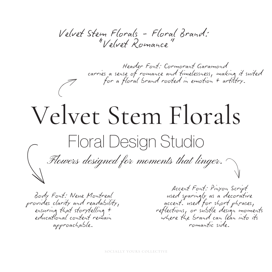
Typography System: Why This Works
For Velvet Stem Florals, typography functions the same way floral design does: through balance, softness, and restraint.
The goal is not to compete with the flowers themselves, but to frame them in a way that feels editorial, thoughtful, and quietly romantic.
Header Typography: Cormorant Garamond
Cormorant Garamond is used for primary headlines and key brand moments.
Its elegant serif structure carries a sense of romance and timelessness, making it naturally suited for a floral brand rooted in emotion and artistry.
The subtle contrast and graceful curves feel reminiscent of classic editorial typography, reinforcing the idea that Velvet Stem Florals approaches floral design as a creative discipline rather than simple retail.
This font allows headlines to feel poetic without becoming ornamental.
Body Typography: Neue Montreal
Neue Montreal anchors the brand’s longer-form communication.
As a modern sans-serif, it provides clarity and readability, ensuring that storytelling and educational content remain approachable.
The simplicity of the sans-serif balances the softness of the serif header, creating a structure where:
the serif expresses emotion and elegance
the sans-serif provides clarity and grounding
This pairing allows the brand to feel refined without becoming overly delicate or difficult to read.
Accent Typography: Pinyon Script
Pinyon Script appears sparingly as a decorative accent.
It is used for short phrases, reflections, or subtle design moments where the brand can lean into its romantic side.
Because script fonts can easily overwhelm a design, its role is intentionally limited — functioning more like a handwritten flourish than a primary typeface.
This restraint preserves the brand’s editorial tone while still allowing moments of softness and personality.
Together, these three typefaces create a clear hierarchy:
Cormorant Garamond introduces elegance and artistic presence
Neue Montreal maintains readability and balance
Pinyon Script adds a delicate emotional accent
The result is a typography system that feels romantic, refined, and quietly confident — allowing the flowers themselves to remain the visual centerpiece.
Floristry is visual poetry. Typography should echo that — not overpower it.
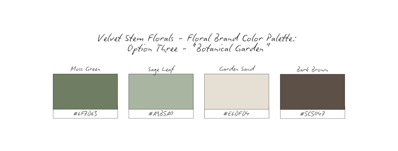
Color Palette Psychology
For florists, color plays a unique role in brand identity.
Unlike many industries, the product itself already carries natural color, texture, and variation. Because of this, the brand palette must remain supportive and restrained, allowing the flowers to remain the focal point.
If the brand colors compete with the arrangements, the result can feel chaotic rather than curated.
For Velvet Stem Florals, several palette directions were explored before selecting a final system.
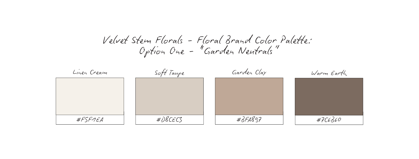
Emotional Cue: Feels natural, calm, and organic, mirroring the quiet elegance of seasonal flowers and hand-tied bouquets.
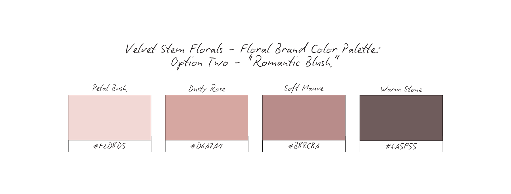
Emotional Cue: Leans into the romantic and sentimental side of floristry, making it particularly suited for weddings, events, and emotional storytelling.
Emotional Cue: Evokes garden environments, seasonal abundance, and natural growth.
Emotional Cue: Feels artistic, romantic, and slightly dramatic, aligning with a florist brand that wants to feel elevated and editorial.
Why Palette Choice Matters for Floral Brands
Flowers already carry color.
The brand palette should therefore provide contrast and atmosphere, not competition.
When the brand color system remains restrained:
Floral arrangements stand out naturally
Photography remains cohesive across seasons
The brand feels calm and curated rather than chaotic
This allows the florals themselves to remain the visual centerpiece.
Nature > novelty
Seasonality > trend
Atmosphere > decoration
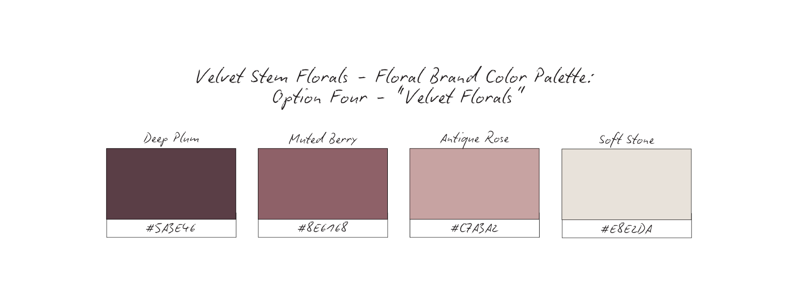
Why The Palette Works: Velvet Florals
After exploring several palette directions, Velvet Florals was chosen as the primary color system for Velvet Stem Florals.
This palette captures the brand’s romantic and artistic identity while allowing the flowers themselves to remain the visual centerpiece.
Deep Plum — a rich, velvety tone that adds depth and quiet sophistication
Muted Berry — a soft floral tone that echoes natural petals without feeling overly sweet
Antique Rose — a romantic neutral that brings warmth and softness to the palette
Soft Stone — a light grounding tone that keeps the palette balanced and breathable
Together, these tones feel lived-in rather than styled. Familiar rather than flashy.
Why It Works for Floral Brands
Velvet Florals reflects the emotional nature of floral design.
Instead of relying on bright or trend-driven colors, the palette leans into depth, softness, and romance — creating a brand atmosphere that feels intentional and timeless.
These tones evoke: velvet petals, evening garden light, romantic interiors, the softness of preserved moments
The darker anchor color provides contrast, while the lighter tones allow floral arrangements to remain the focus.
Florists work with one of the most colorful mediums in the design world.
Because of this, the brand palette must frame the flowers rather than compete with them.
The Velvet Florals palette works because it:
complements natural floral colors
provides warmth without visual noise
maintains consistency across changing seasonal blooms
reinforces the romantic and artistic positioning of the brand
The result is a color system that feels luxurious, emotional, and quietly memorable.
Nature > novelty
Seasonality > trend
Atmosphere > decoration
Content Strategy Breakdown
For Velvet Stem Florals, content is not created simply to display bouquets.
It exists to communicate design perspective, seasonal awareness, and the emotional nature of floristry.
Before visual aesthetics come into play, the strategy establishes the role each format plays in shaping how the brand is understood.
The goal is not constant promotion — it is creative presence.
Reels: Design Process + Studio
Reels offer a window into the creative process.
Rather than focusing only on finished arrangements, these short-form videos highlight the movement and rhythm behind floral design: selecting stems, building a bouquet, arranging color and texture, moments inside the studio.
These glimpses show the florist not just as a vendor, but as an artist at work.
Process-driven reels build appreciation for the craft and invite viewers to see the intention behind each arrangement.
Carousels:Education + Design Philosophy
Carousels create space for deeper storytelling.
They are used to share:
seasonal flower inspiration, design philosophy and floral techniques, behind-the-scenes decisions in arrangements, reflections on floral artistry.
This format allows the brand to communicate expertise without feeling instructional or overly technical.
Instead of simply showcasing flowers, carousels explain how and why designs come together.
Static Imagery: Arrangements as Art
Static posts serve as the gallery of the brand.
Each image presents floral work as a composition — emphasizing color, texture, and form.
The photography style remains consistent and restrained, allowing the arrangements themselves to carry the visual weight.
These images are not meant to overwhelm the viewer with quantity.
They exist to showcase intentional design.
Stories: Real-Time Presence
Stories bring immediacy and humanity to the brand.
They show the quieter moments that exist alongside finished work: studio preparation, stem deliveries, packing arrangements, daily rhythms of floral life.
Stories keep the brand connected to its audience while maintaining a sense of authenticity and accessibility.
When these formats work together, the feed no longer feels like a flower shop inventory.
Instead, it reads like an artist’s journal.
Viewers see: the craft behind the arrangements, the thought behind the design, the rhythm of the florist’s work.
This transforms the brand from a place to simply order flowers into a creative voice people recognize and trust.
High-Converting Content Ideas For Floral Brands
The Bouquet in Progress
Type: Reel
What it is: Short clips showing stems being selected, trimmed, and layered together to form a bouquet. Close-up textures of petals, foliage, and ribbon.
Why it converts: People love seeing how something beautiful comes together. Process reveals skill and intention. This builds trust, appreciation for craft, and artistic authority.
Micro CTA: Watch the bouquet come to life.
Seasonal Stem Spotlight
Type: Carousel
What it is: A series highlighting one flower currently in season. It’s texture, color, variations, and how it appears in arrangements.
Why it converts: Education around seasonality positions the florist as knowledgable and thoughtful. This builds authority, trust, and seasonal anticipation.
Micro CTA: Save this stem for your next arrangement.
Arrangement as Art
Type: Static
What it is: A single, carefully styled photography of a finished arrangement placed against a neutral background or natural setting.
Why it converts: Treating arrangements like art elevates the brand beyond “product.” This builds desire, brand recognition, and aesthetic credibility.
Micro CTA: Explore the arrangement.
Floral Reflections
Type: Static or Carousel
What it is: Text-led graphics or captions reflecting on the meaning of flowers, seasonal transitions, or the emotional moments flowers accompany.
Why it converts: Emotional storytelling connects floristry to life moments rather than simple purchases. This builds emotional trust and brand depth.
Micro CTA: Save this reflection.
Studio Day Moments
Type: Story
What it is: Quick glimpses into the studio: buckets of stems arriving, tools on the table, ribbon rolls, unfinished bouquets.
Why it converts: Stories humanize the florist and bring viewers into the daily rhythm of the studio. This builds connection, familiarity, and authenticity.
Micro CTA: Follow along for today’s studio moments.
Design Philosophy Series
Type: Carousel
What it is: Slides explaining elements of floral design: balance, texture movement, and color harmony.
Why it converts: It reveals the thinking behind the arrangements, positioning the florist as a designer rather than a vendor. This builds authority and creative credibility.
Micro CTA: Explore the design philosophy.
Client Moment Stories
Type: Reel or Carousel
What it is: A bouquet shown alongside the story of the moment it was created for: a wedding, a celebration, or a meaningful gift.
Why it converts: Connecting arrangements to real-life moments deepens emotional resonance. This builds trust, relatability, and emotional connection.
Micro CTA: See the story behind the flowers.
The Quiet Detail
Type: Static
What it is: Close-up images of petals, stems, ribbons, or floral textures that often go unnoticed.
Why it converts: These details communicate artistry and slow the viewer down. This builds brand recognition and artistic identity.
Micro CTA: Pause for the detail.
Together, these pillars create a balance between:
artistry
education
emotional storytelling
real-life studio presence
Instead of presenting flowers as inventory, the content reveals the creative world behind the arrangements.
The result is a feed that feels less like a shop window and more like an artist’s studio journal — one that clients want to return to again and again.
Grid Logic & Visual Rhythm
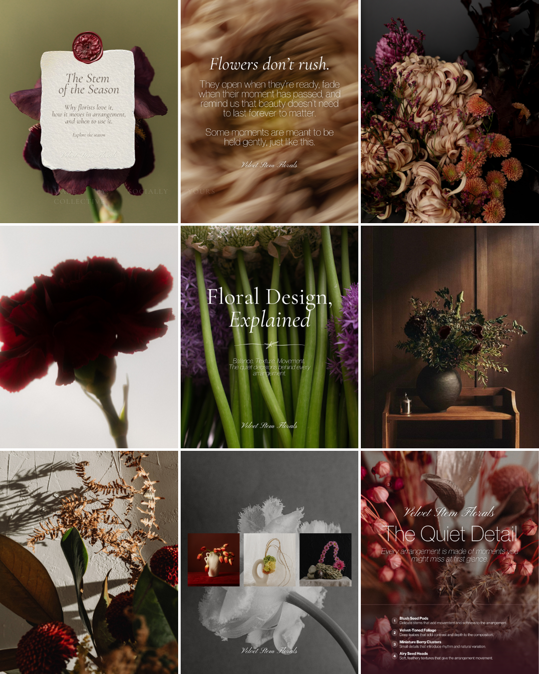
An Artist’s Feed, Not a Product Catalog
This grid is intentionally restrained.
Not because the work lacks richness — but because floral design already carries visual complexity.
By allowing space between posts and limiting excessive graphic elements, the feed lets each arrangement breathe. The flowers remain the focal point, not the design of the post itself.
There are no cluttered graphics, no constant visual resets, and no competing color palettes.
Instead, the feed moves slowly and deliberately, creating a sense of quiet confidence that reflects the pace of thoughtful floral design.
This isn’t a feed built to push product.
It’s built to showcase artistry.
Repetition Builds Recognition
The grid relies on consistent visual cues that create recognition over time:
warm, earthy tones
soft shadows and directional light
close-up botanical textures
editorial typography used sparingly
a balance between florals and reflective text-led posts
These visual anchors repeat throughout the grid, training the viewer’s eye to recognize the brand without needing to read the name.
Over time, the viewer begins to recognize the feeling of the feed before they recognize the account itself.
That emotional recognition is what turns a feed into a brand.
Stillness Signals Craft
Floristry is a slow art.
The grid mirrors that rhythm.
Instead of fast, high-energy content, the visual pacing invites viewers to slow down and look closer — at petals, textures, and compositions they might normally scroll past.
The stillness communicates care.
It suggests that the arrangements were designed thoughtfully, not assembled quickly.
This visual restraint signals artistry and professionalism without needing to say it directly.
Arrangement First, Always
Notice how the grid alternates between: finished floral arrangements, botanical close-ups and textures, reflective or poetic text-led graphics, educational floral design posts, behind-the-scenes glimpses of stems and materials.
This structure ensures that no single type of content dominates the feed.
Instead, each post plays a different role in communicating the florist’s perspective and craft.
There is no filler.
Each post exists to either: reveal the artistry behind the arrangements, deepen emotional connection, educate the audience about floral design, reinforce the brand’s aesthetic world.
Because floristry is both visual and emotional.
People don’t just choose a florist based on availability or price — they choose the one whose work feels aligned with the moment they’re celebrating.
This grid helps viewers quickly understand: the artistic perspective behind Velvet Stem Florals, the care and intention within each arrangement, the emotional atmosphere the brand creates.
The result is a brand presence that feels romantic, thoughtful, and artistically distinct — exactly the kind of presence that attracts clients looking for flowers that feel personal, not generic.
Why This Brand Works
Velvet Stem Florals works because it positions floristry as design and storytelling, not just product.
Many floral brands rely entirely on beautiful arrangements to communicate value. While the work may be stunning, the brand itself often remains interchangeable.
This brand takes a different approach.
Instead of letting the flowers do all the talking, the brand builds context around them — revealing the design philosophy, the seasonal awareness, and the emotional meaning behind the arrangements.
Every element reinforces this positioning:
a romantic but restrained color palette
typography that feels editorial and timeless
content that balances artistry, education, and reflection
a grid rhythm that highlights craft instead of quantity
Nothing in the brand competes with the flowers themselves.
Instead, the brand acts as a frame — elevating the work while giving viewers a deeper understanding of the perspective behind it.
The result is a florist brand that feels intentional, artistic, and emotionally resonant.
What This Means For Your Brand
If you’re a florist, your arrangements already contain artistry.
The question is whether your brand communicates that artistry clearly.
Many floral businesses focus primarily on posting finished bouquets, hoping the beauty of the flowers alone will attract the right clients.
But when the brand also communicates:
design philosophy
seasonal awareness
emotional storytelling
and the quiet details behind the work
the florist becomes more than a place to order flowers.
They become a creative voice.
This kind of positioning changes how clients approach the brand.
Instead of simply asking “How much is a bouquet?” they begin asking:
“Can you create something for this moment?”
That shift — from transaction to collaboration — is where long-term recognition and loyalty begin.
The Result
When floristry is positioned as artistry, the brand begins to attract a different kind of client.
Clients who: value design perspective, appreciate intentional craftsmanship, trust the florist’s creative decisions, and see flowers as part of meaningful moments.
The brand no longer feels like a shop competing for attention.
It feels like a studio with a point of view.
The feed becomes more than a gallery of arrangements — it becomes a visual journal of the florist’s work, process, and philosophy.
And over time, that consistency creates something powerful:
Recognition.
Not because the brand is louder than others.
But because it feels distinct, thoughtful, and unmistakably its own.
This study isn’t meant to give you answers overnight.
It’s meant to give you clarity.
If this resonated, take a moment to ask yourself:
Does your brand reflect how you actually work — or just what you post?
From here, you can go a few different directions:
Explore more Brand Studies to see how positioning shifts across industries
Reflect on your own brand systems — what’s intentional, what’s reactive, what’s outdated
Work with me if you’re ready to align your brand with your thinking, not just your aesthetics
Follow along for upcoming Industry Spotlights, where I break down brands from the inside out, every Saturday
No pressure. No urgency tactics.
Just the next right step, when you’re ready.