
Brand Studies: Lifestyle & Brand Photographers
A strategic brand breakdown built from the inside out.
This is not portfolio curation advice.
It’s not Instagram trend forecasting.
And it’s not “just post your work and hope it books.”
This brand study was built to challenge the idea that great imagery alone is enough.
Northfield Studio represents a different approach — one where photographers are positioned as creative partners, not interchangeable service providers. Where the brand reflects how you see, think, and guide clients through a visual process — not just the final images you deliver.
This is a strategic brand build designed to help photographers move beyond aesthetics and into authority, clarity, and trust.
This study is for photographers who want their brand to reflect how they see, think, and lead — not just what they shoot.
The Industry Reality: Portfolio-First vs. Positioning-First
In the photography industry, two types of brands tend to exist.
Portfolio-led brands lead with beautiful work.
Their imagery is strong, their edits are polished, and their feeds are visually impressive — but the messaging often stays vague. The audience sees what they shoot, but not how they think. This can lead to inconsistent inquiries, price shopping, and clients who love the look but don’t fully understand the value.
Positioning-led brands lead with perspective.
Their work is still beautiful — but it’s supported by clarity. Clear audience. Clear intention. Clear boundaries. These brands communicate not just what they create, but how they guide clients through the process and why their approach is different.
Both approaches exist.
Both attract different clients.
But branding should match the role you want to play.
If you want to be seen as a creative partner — not just a camera-for-hire — your brand needs to communicate leadership, thoughtfulness, and trust alongside your visuals.
Outcome:
Photographers feel seen, not corrected — and begin to understand why talent alone doesn’t always communicate value.
Brand Concept Overview: Northfield Studio
To ground this study, we anchor it in a tangible example: Northfield Studio.
This concept brand represents photographers who lead with intention — not noise. It’s built for creatives who understand that photography isn’t just about capturing moments, but about shaping perception, guiding experience, and telling stories with restraint.
Brand Positioning
Northfield Studio is positioned as:
Quiet confidence
Northfield Studio doesn’t compete for attention — it earns it. The brand feels assured, thoughtful, and steady, allowing the work and the perspective behind it to speak first.
Vision-led
Every decision is rooted in how the photographer sees the world. The brand centers perspective, taste, and discernment over volume or trends.
Editorial restraint with human warmth
Clean, considered visuals are balanced with presence and personality. Nothing feels cold or distant — just intentional.
Who This Brand Is Built For
Northfield Studio is designed for: Lifestyle photographers, brand photographers, creatives working with founders, small business and personal brands, photographers who value collaboration, trust, and long-term relationships.
This was not built for: high-volume, trend-driven shooting, one-size-fits all creative services, or brands that rely solely on aesthetics without context or leadership.
Northfield Studio exists to show what happens when photography brands are built with clarity first and visuals second.
Brand Voice & Tone
Before a client ever sees a portfolio, they experience the brand through language.
For photographers, this matters deeply. Because what clients are really hiring isn’t just technical skill — it’s perspective.
Brand Voice
Observant
The voice notices details others overlook. It reflects a photographer who pays attention — to light, emotion, context, and nuance.
Grounded
Nothing feels rushed or reactive. The language is steady, present, and rooted in experience rather than hype.
Thoughtful
Every word feels considered. The brand communicates intention, not impulse.
Assured without ego
Confidence shows through clarity — not self-promotion. The brand never needs to convince; it simply explains.
Brand Tone
Reflective, not performative
Content reads like insight, not spectacle. There’s no pressure to entertain — only to communicate clearly.
Descriptive, not salesy
The brand focuses on explaining process, perspective, and experience rather than pushing conversion.
Clear, not overly poetic
Language is expressive but grounded. It avoids vagueness, allowing clients to understand what working together actually feels like.
Why This Matters
Clients don’t just hire photographers — they hire perspective.
Tone determines whether someone trusts your eye, your taste, and your leadership before they ever scroll through your work. When language is aligned, clients arrive already confident in the experience you offer.
Typography System: Why This Works
Typography for Northfield Studio isn’t about decoration.
It’s about clarity, pacing, and trust.
Every type choice supports the same goal: allowing the imagery to lead while the language guides.
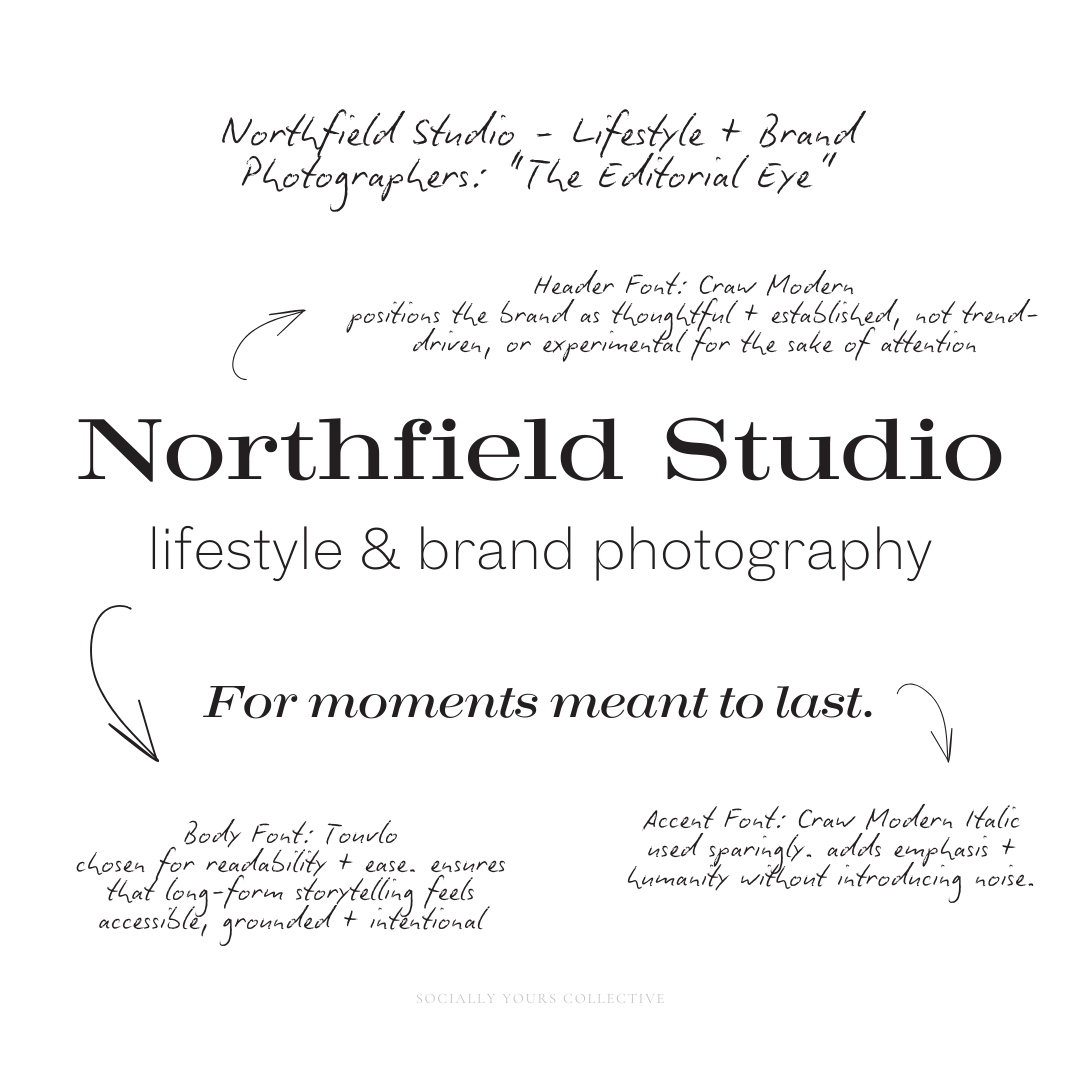
Header Typography: Craw Modern
Craw Modern sets the tone for the brand.
Its structure feels editorial without being rigid, giving Northfield Studio a sense of quiet authority and creative confidence. The letterforms feel considered and steady — strong enough to carry thought leadership, but restrained enough to never overpower the visuals.
This typeface positions the brand as thoughtful and established, not trend-driven or experimental for the sake of attention.
Body Typography: Touvlo
Touvlo was chosen for readability and ease.
It supports longer captions, educational carousels, and reflective copy without visual fatigue. The neutrality of the body type keeps the focus on the message, allowing ideas to unfold clearly and calmly.
This is where professionalism lives — ensuring that long-form storytelling feels accessible, grounded, and intentional.
Accent Typography: Craw Modern Italic
The italic variation of Craw Modern is used sparingly.
It adds emphasis and humanity without introducing visual noise. This accent appears in pull quotes, short reflections, or moments that benefit from softness — never as decoration, always as punctuation.
Because it’s a variation of the header font, it reinforces cohesion rather than distraction.
Together, this system supports:
Long-form storytelling by making written content easy to engage with
Editorial credibility through structure and restraint
Visual hierarchy that keeps imagery as the hero, not the type
Nothing competes for attention. Everything works in service of clarity.
When imagery leads, typography should support, not compete.
Color Palette Psychology
Tie visuals to emotion, trust, and long-term brand perception — not momentary attention.
For photographers, color isn’t decoration.
It’s atmosphere. It’s pacing.
It’s how a brand feels before a single image is studied.
This study explores several palette directions before intentionally selecting one that supports creative authority, trust-based collaboration, and brand longevity.
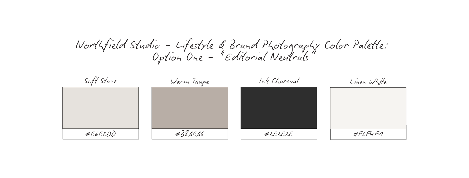
Emotional Impact: Calm, composed, timeless
Emotional Impact: Grounded, human, tactile
Emotional Impact: Minimal, restrained, confident
Emotional Impact: Inviting, calm, intentional
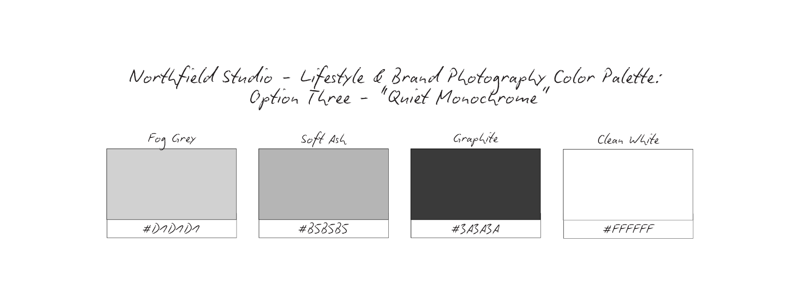
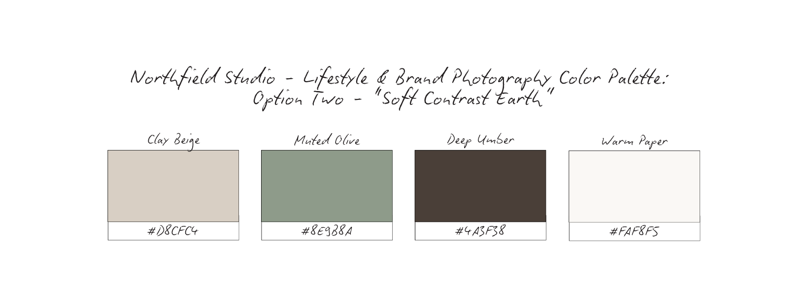
Why This Palette Works: Quiet Monochrome
Quiet Monochrome (option 3) was chosen not for visual drama — but for visual authority.
In an industry where imagery already carries emotional weight, the role of color is to support clarity, not compete for attention. This palette intentionally steps back so the work — and the photographer’s perspective — can lead.
Restraint Builds Trust
The soft greys and deep graphite tones create a sense of calm confidence.
Nothing feels rushed. Nothing feels performative.
This restraint signals maturity — the kind of brand that doesn’t need to convince, persuade, or over-explain. It trusts the viewer to slow down and engage.
For clients, this reads as professionalism before a word is spoken.
Monochrome Elevates the Work
By removing strong color influence, imagery becomes the focal point.
Skin tones, textures, light, and composition aren’t filtered through a brand color story — they stand on their own. This mirrors how editorial photography is presented: with space, intention, and respect for the image itself.
The brand frames the work instead of competing with it.
Neutral = Longevity
Quiet Monochrome is inherently timeless.
It doesn’t date. It doesn’t trend.
It doesn’t rely on seasonal palettes or aesthetic cycles.
This supports a brand built for long-term collaborations, repeat clients, and steady referrals — not short bursts of visibility.
Why It Works for Creative Services
For photographers, trust is visual before it’s verbal.
This palette reinforces: Creative authority, Emotional steadiness, Professional restraint
It communicates that Northfield Studio isn’t chasing attention — it’s curating perception.
Quiet Monochrome allows the brand to feel:
Focused without feeling cold, Elevated without feeling distant, Confident without being loud
When the visuals are quiet, the message becomes clearer.
And when the brand feels clear, clients feel safe choosing it.

Content Strategy Breakdown
Before deciding how content looks, this strategy defines what content does.
For Northfield Studio, content is not used to showcase volume, chase reach, or endlessly recycle finished work. It’s used to communicate perspective, establish authority, and signal who this photographer is for.
Every format plays a specific role. Nothing exists just to fill space.
Reels: Perspective, Process, Human Presence
Reels are used to introduce how the photographer sees and thinks.
Rather than relying on trends or fast edits, reels focus on:
Process over performance, Thoughtful commentary, Behind-the-scenes moments that reveal decision-making.
This allows potential clients to experience the photographer’s presence before ever booking. The goal isn’t virality — it’s resonance.
What this does: Creates connection, establishes creative leadership, and attracts aligned clients who value process as much as outcome.
Carousels: Education, Positioning, Creative Thinking
Carousels carry the depth of the brand.
They’re used to: Explain creative philosophy, Reframe common misconceptions about photograph, Articulate value beyond “pretty images”.
This is where Northfield Studio positions itself as a creative partner — not a service provider waiting for direction.
What this does: Builds authority, clarifies differentiation, and gives clients language for why this work feels different.
Static Imagery: Mood, Restraint, Credibility
Static posts are not portfolio dumps — they’re editorial selections.
Each image is chosen intentionally to: Reflect the brand’s visual rhythm, Communicate mood and tone, Reinforce restraint and confidence.
There’s no pressure to show everything. The brand trusts that less — chosen well — communicates more.
What this does: Signals professionalism, creative confidence, and a curated approach to storytelling.
Stories: Context, Availability, Relationship-building
Stories support presence without performance.
They’re used to share: Context behind shoots or decisions, Light, real-time moments, Availability and boundaries.
This keeps the brand human and accessible without diluting its editorial tone.
What this does: Builds familiarity and trust while maintaining authority and clarity.
Together, these formats create a cohesive system:
Reels invite alignment, Carousels deepen understanding, Static imagery reinforces perception, Stories maintain connection
Nothing is accidental. Nothing is filler.
This approach ensures content feels intentional, composed, and strategically aligned — not reactive or portfolio-dumped.
And that’s what allows Northfield Studio to attract clients who value vision, trust the process, and see photography as partnership — not just output.
High-Converting Content Ideas For Lifestyle & Brand Photographers
“How I See” Perspective Series
Type: Carousel
What it is: Short, thoughtful reflections on composition, light, timing, or storytelling. Minimal text. One strong idea per slide.
Why it converts: Clients don’t just hire photographers for skill. They hire them for vision.. This series makes your perspective legible. This builds authority, differentiation, and alignment.
Micro CTA: Save this if you care about how images are made, not just how they look.
Behind-the-Frame Process Moments
Type: Reel
What it is: Quiet BTS clips: adjusting light, stepping back to observe, reviewing frames, pausing before shooting.
Why it converts: It reveals intention without over-explaining. Viewers experience your presence before they ever book. This builds trust, calm, confidence, and desire.
Micro CTA: Explore the process behind the work.
“Not Every Frame Is Meant to Be Shown”
Type: Static
What it is: A single image paired with restrained copy about editing, restraint, or choosing what not to share.
Why it converts: Restraint signals confidence. This reframes photography as curation, not volume. This builds credibility, authority, and artistic leadership.
Micro CTA: Reflect on what you choose to share.
Client Collaboration Reflections
Type: Carousel
What it is: Post-shoot reflections focused on collaboration, trust, and creative alignment. Not deliverables or results.
Why it converts: It positions clients as partners, not transactions. This attracts clients who value shared vision. This builds alignment, trust, and long-term interest.
Micro CTA: Save this if collaboration matters to you.
Editorial Image as Mood Anchor
Type: Static
What it is: A single image with minimal copy — letting tone, texture, and emotion carry the message.
Why it converts: Silence and space slow the scroll. It invites interpretation instead of explanation. This builds desire, brand recognition, and visual authority.
Micro CTA: Explore the work.
“What Clients Don’t See”
Type: Carousel
What it is: Insight into planning, preparation, and decision-making — without revealing proprietary process.
Why it converts: Clients value effort they don’t have to manage. This makes invisible labor visible. This builds trust, professionalism, and perceived value.
Micro CTA: Save this for later.
Stories as Studio Presence
Type: Story
What it is: Light context: shoot days, travel moments, workspace details, availability updates.
Why it converts: Maintains presence without pressure. It humanizes without oversharing. This builds familiarity, accessibility, and consistency.
Micro CTA: Inquire when the timing feels right.
“Who This Work Is For” Statement
Type: Carousel
What it is: Clear positioning statements about ideal clients, creative fit, and boundaries.
Why it converts: Clarity repels misalignment and attracts respect. This is conversion through honesty. This builds alignment, authority, and long-term trust.
Micro CTA: Explore if this aligns with you.
These content ideas work because they:
Educate without overwhelming
Invite alignment instead of chasing attention
Communicate value before pricing
Build desire through restraint, not urgency
Nothing here asks for attention.
Everything here earns trust.
This is how a photographer’s content becomes a positioning tool, not just a portfolio.
Grid Logic & Visual Rhythm
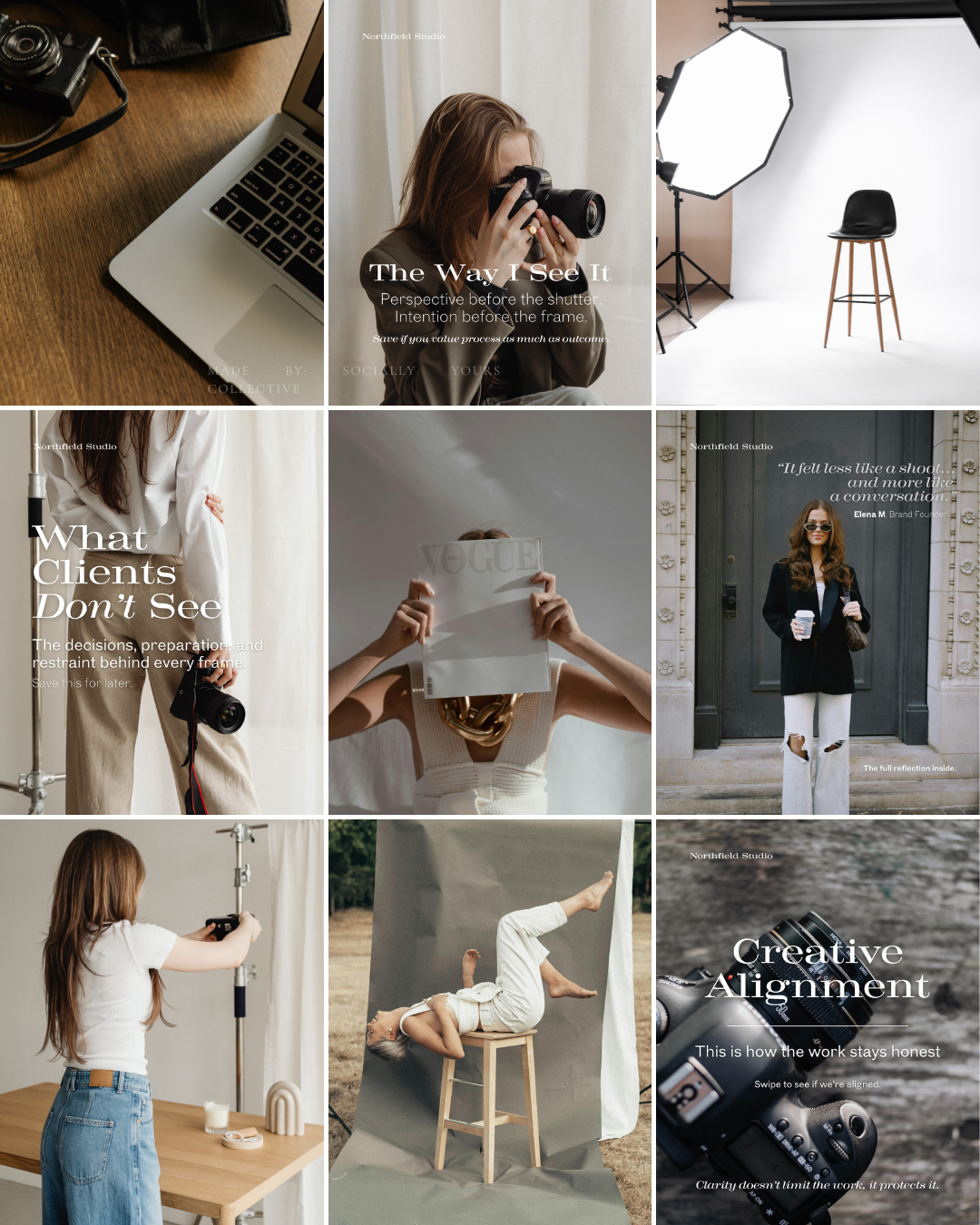
Perspective-Led Minimalism, Not Empty Space
This grid is intentionally restrained — not sparse, not decorative.
The minimalism here exists to protect perspective.
By avoiding visual clutter, excessive overlays, or trend-driven formatting, the grid gives each image and message space to land on its own. Nothing competes for attention. Nothing rushes the viewer.
This isn’t a feed built to impress at first glance.
It’s built to invite pause — which mirrors how Northfield Studio approaches photography itself.
Quiet visuals signal confidence. Confidence invites trust.
Repetition Builds Recognition
The grid relies on consistent visual cues that subtly train the viewer’s eye:
Soft, neutral color environments
Controlled, editorial typography
Repeating motifs (hands, cameras, studio setups, quiet human moments)
A balanced rhythm between imagery-led posts and text-led reflections
This repetition isn’t accidental — it’s cumulative.
Over time, the viewer doesn’t need dramatic shifts or bold trends to stay engaged. The familiarity becomes the identifier. The structure itself becomes the brand.
That’s how recognition is built without chasing relevance.
Spacing Signals Creative Authority
White space and restraint do something powerful here:
they slow the scroll.
Instead of demanding attention, the grid earns it. Viewers pause because the content feels intentional, not urgent. Considered, not performative.
This pacing reflects how Northfield Studio works:
Thoughtfully, Observationally, With respect for nuance and process
The grid doesn’t just show finished images — it communicates how the photographer sees.
Message-First, Always
Notice how the grid alternates between:
Perspective-led brand statements, Behind-the-scenes process moments, Client reflections and lived-in outcomes, Studio context and visual thinking
There’s no filler content.
Each post exists to do one of three things:
Clarify creative perspective, Build trust in the process, Reinforce leadership, not just talent.
This creates a feed that feels cohesive without being repetitive — and editorial without being distant.
Because people don’t just hire photographers for images — they hire them for how they see.
This grid helps potential clients quickly understand:
What Northfield Studio values
How it approaches collaboration
Why perspective leads the work — not trends, volume, or aesthetics alone
The result is a brand presence that feels grounded, thoughtful, and quietly authoritative — exactly what lifestyle and brand clients look for when choosing a creative partner, not just a service.
Why This Brand Works
Northfield Studio works because every element is aligned to one clear truth:
perspective is the product.
The typography doesn’t compete with the imagery — it supports it.
The color palette doesn’t chase emotion — it holds space for it.
The content doesn’t perform — it reflects.
Instead of relying on volume, trends, or visual shock, the brand builds trust through restraint and clarity. That restraint signals confidence. Confidence signals experience. And experience is what clients are actually buying.
This brand doesn’t ask to be chosen.
It makes the right clients feel understood.
By leading with perspective rather than portfolio, Northfield Studio positions itself as a creative partner — not a commodity. The brand communicates how the photographer sees before ever showing what they shoot.
That’s what turns interest into alignment.
What This Means For Your Brand
If you’re a photographer, this study isn’t asking you to do more.
It’s asking you to be clearer.
You don’t need: More content, Louder visuals, Constant reinvention.
You need alignment between: How you think, How you speak, How your work is presented.
When your brand reflects your process, clients arrive already trusting you. They understand your boundaries. They respect your perspective. They’re prepared for collaboration — not just deliverables.
This approach allows your brand to work before the inquiry comes in.
The Result
A brand that feels steady instead of scattered.
A feed that communicates authority without explanation.
Clients who choose you for your eye, not just your availability.
Northfield Studio doesn’t rely on trends to stay relevant.
It relies on clarity to stay remembered.
And that’s what turns a photographer into a trusted creative —
and a portfolio into a brand that lasts.
This study isn’t meant to give you answers overnight.
It’s meant to give you clarity.
If this resonated, take a moment to ask yourself:
Does your brand reflect how you actually work — or just what you post?
From here, you can go a few different directions:
Explore more Brand Studies to see how positioning shifts across industries
Reflect on your own brand systems — what’s intentional, what’s reactive, what’s outdated
Work with me if you’re ready to align your brand with your thinking, not just your aesthetics
Follow along for upcoming Industry Spotlights, where I break down brands from the inside out, every Saturday
No pressure. No urgency tactics.
Just the next right step, when you’re ready.