
Brand Studies: Makeup Education
A strategic brand breakdown built from the inside out.
Most makeup artists are taught to focus on the outcome.
The finished look.
The transformation.
The visual result.
But education-based makeup brands operate differently.
They aren’t built on what’s created, they’re built on what’s understood.
This is not a guide on how to improve your makeup skills.
Not a collection of trending looks.
Not a portfolio of before-and-afters.
And not “post your work and hope it sells.”
This is a strategic brand build designed to position makeup artists as educators and method-driven experts, not just service providers.
Because the most impactful makeup artists don’t just create results.
They teach people how to see, understand, and repeat them.
And that changes everything.
This study explores how makeup artists can build brands that communicate clarity, technique, and authority — through voice, visuals, and content structure.
This study is for makeup artists who want their brand to reflect more than their work: their method, their process, and the way they teach it.
The Industry Reality: Service Artists vs. Education-Based Brands
The makeup industry is highly visual.
For most artists, growth has been tied to what can be seen:
finished looks, transformations, product results, trending techniques
And for service-based work, that makes sense.
Clients are booking based on outcomes.
But education-based makeup brands operate differently.
They aren’t built on what’s created once.
They’re built on what can be understood and repeated.
Service-Based Makeup Artists
Many makeup artists build their brand around:
before-and-after transformations, trend-driven looks, product-focused content, portfolio-style posting
The focus is on showcasing the end result.
And while this attracts bookings, it often limits how the brand is perceived:
skill is visible, but thinking is not
results are clear, but process is hidden
This makes it harder to scale beyond services.
Education-Based Makeup Brands
Education-led artists position themselves differently.
Instead of only showing results, they focus on:
technique, breakdowns, repetition, teaching the “why” behind the look
Their content answers questions like:
Why does this placement work?
What changes the outcome?
How can this be recreated consistently?
Clients and students aren’t just watching.
They’re learning.
Both approaches work.
Both attract different audiences.
But branding should match the role you want your work to play.
If your goal is to build:
courses, programs, repeatable methods, scalable education
Your brand cannot rely on visuals alone.
It needs to communicate:
structure, clarity, and understanding.
Makeup artists begin to see that:
It’s not just about showing what you can do.
It’s about showing how and why it works.
Because when people understand your method…
they trust your expertise and they come back to learn more.
Brand Concept Overview: The Makeup Method
To explore how an education-led makeup brand is built, this study is anchored in a concept brand:
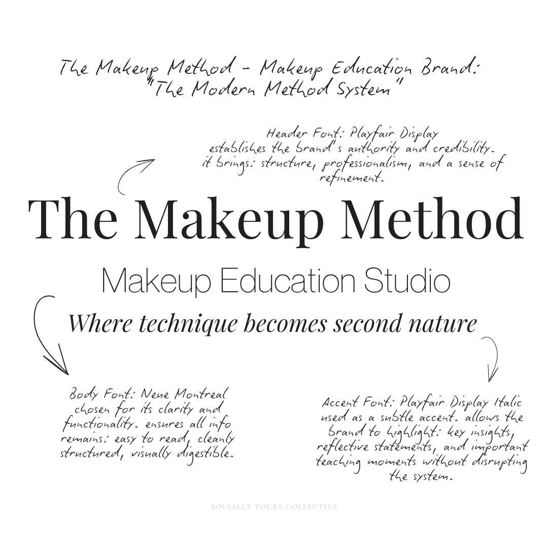
The Makeup Method
Makeup Education Studio
Where technique becomes second nature
The name itself establishes the core idea:
This isn’t about looks. It’s about method.
A structured, repeatable approach to makeup that can be taught, understood, and applied consistently.
Rather than positioning the artist as someone who creates transformations, the brand positions them as someone who teaches a system.
Brand Positioning
The Makeup Method is built on three defining principles:
Technique-led, not trend-led
The focus is on foundational skills, placement, and understanding — not fast-moving trends or viral looks.
Structured, repeatable education
Everything taught is designed to be replicated. The brand prioritizes clarity, sequence, and consistency.
Authority through simplicity
The brand doesn’t overwhelm. It simplifies. It removes confusion and replaces it with clear, teachable steps.
Who This Brand Is Built For
This concept brand is designed for makeup artists who want to:
teach their process, not just showcase it
build courses, programs, or digital education
position themselves as educators and experts
create repeatable, method-driven content
Who This Brand Is Not Built For
The Makeup Method is intentionally not designed for:
trend-focused, fast-paced beauty content
purely service-based artistry
product-heavy influencer positioning
“watch and admire” content without explanation
The Makeup Method isn’t just about doing makeup well.
It’s about making makeup understandable.
Because when technique is clear, confidence becomes repeatable.
And that’s what turns an artist into an educator.
Brand Voice & Tone
For The Makeup Method, the way the brand communicates is just as important as what it teaches.
Because if the goal is to educate…
the language has to feel clear, structured, and reliable.
This is not a voice built for entertainment.
It’s built for understanding.
Brand Voice
The brand voice reflects how a strong educator communicates:
Clear - Instructions are direct and easy to follow. There’s no unnecessary complexity or filler language.
Instructional - The tone guides, explains, and teaches — not just describes.
Structured - Information is delivered in a sequence that makes sense. Each idea builds on the last.
Confident without being intimidating - The brand speaks with authority, but never makes the audience feel behind or overwhelmed.
Brand Tone
Tone adjusts depending on the content, but remains consistent in how it supports learning.
Supportive, not performative - The brand is focused on helping the audience understand, not impressing them.
Direct, not overly casual - Clarity is prioritized over slang or trend-driven language.
Detailed, without overcomplicating - Enough depth to teach — without making things feel difficult or inaccessible.
Why It Matters
Makeup education requires trust.
People are learning: technique, placement, decision-making, consistency.
If the language feels confusing, rushed, or overly styled… the learning breaks down.
But when the voice feels: calm, clear, structured…
The audience feels capable.
Every piece of content should communicate one thing: “You can understand this.” Because when people believe they can understand your method… They trust you enough to learn from you.
And that’s what turns content into education and education into a scalable brand.
Typography System: Why This Works
For The Makeup Method, typography is designed to support one core goal: clear, structured learning.
Because this is an education-first brand, the typography must feel:
readable, organized, instructional, quietly elevated
Not overly stylized. Not trend-driven. Not distracting.
Header Typography: Playfair Display
The header font establishes the brand’s authority and credibility.
As an editorial serif, it brings:
structure, professionalism, a sense of refinement
It mirrors the feeling of well-produced educational material — something intentional, not rushed.
Used in:
lesson titles, key concepts, carousel covers, quote graphics
It communicates:
“This is something to learn from.”
Body Typography: Neue Montreal
Neue Montreal is selected for its clarity and functionality.
As a modern sans-serif, it creates balance against the serif while ensuring all information remains:
easy to read, cleanly structured, visually digestible
This is critical for:
step-by-step breakdowns, technique explanations, course-style content, longer educational captions
It allows the content to feel accessible without losing professionalism.
Accent Typography: Playfair Display Italic
The italic version of Playfair is used as a subtle accent.
Rather than introducing a decorative or script font, emphasis is created through:
contrast in tone, slight variation in form, refined emphasis
This allows the brand to highlight:
key insights, reflective statements, important teaching moments
Without disrupting the system.
This typography system creates a clear hierarchy:
Serif → authority and structure
Sans-serif → clarity and readability
Italic → emphasis without distraction
Nothing competes.
Nothing overwhelms.
Every element supports the same goal:
helping the audience understand.
“When people are learning, clarity matters more than decoration.”
Color Palette Psychology
For The Makeup Method, color is not used to stand out.
It’s used to support learning.
Because this is an education-first brand, the palette must:
keep focus on skin and placement, reduce visual noise, feel calm and structured, photograph beautifully across tones
Makeup already brings color.
The brand palette should frame it, not compete with it.
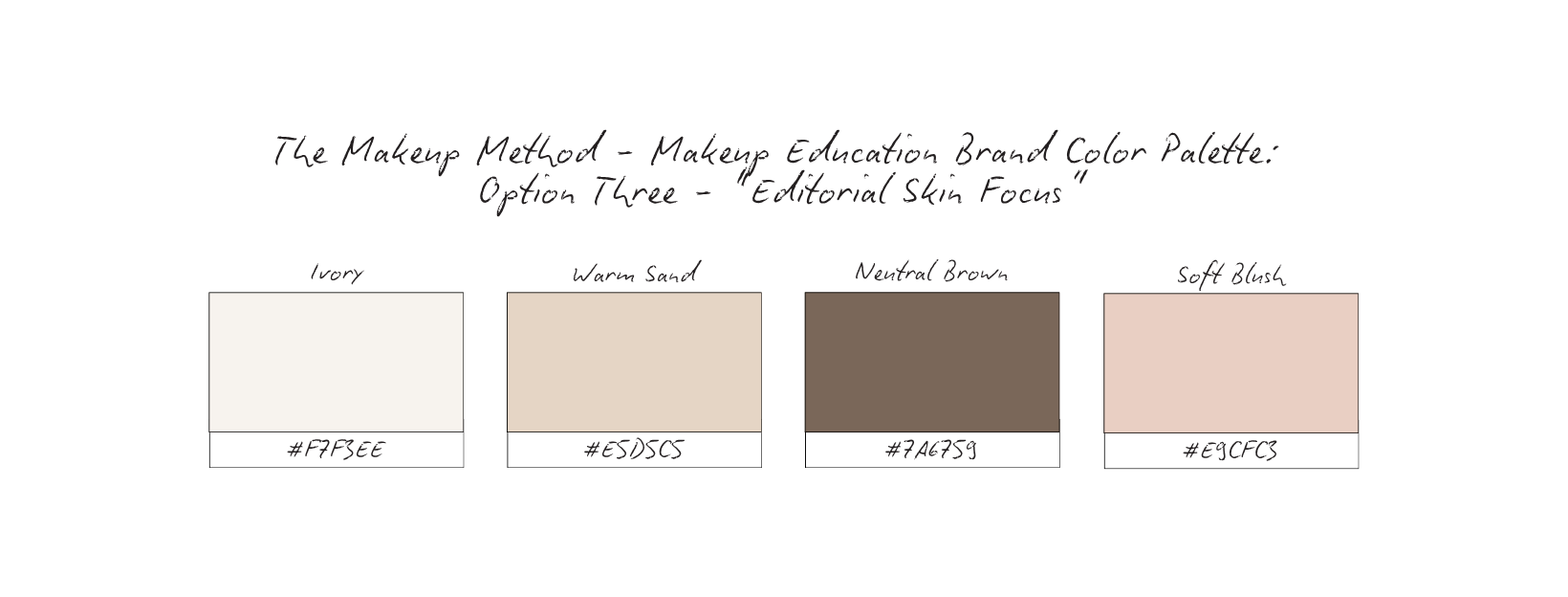
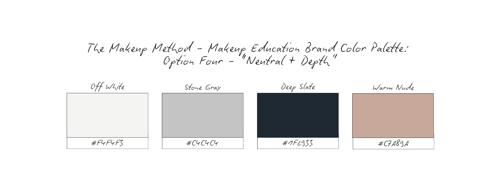
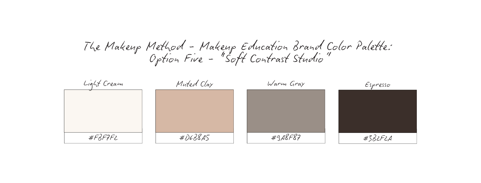
For The Makeup Method, several palette directions were explored before selecting a final system.
Each option is designed to support a slightly different tone while staying aligned with:
clarity > decoration, understanding > aesthetics, structure > stimulation
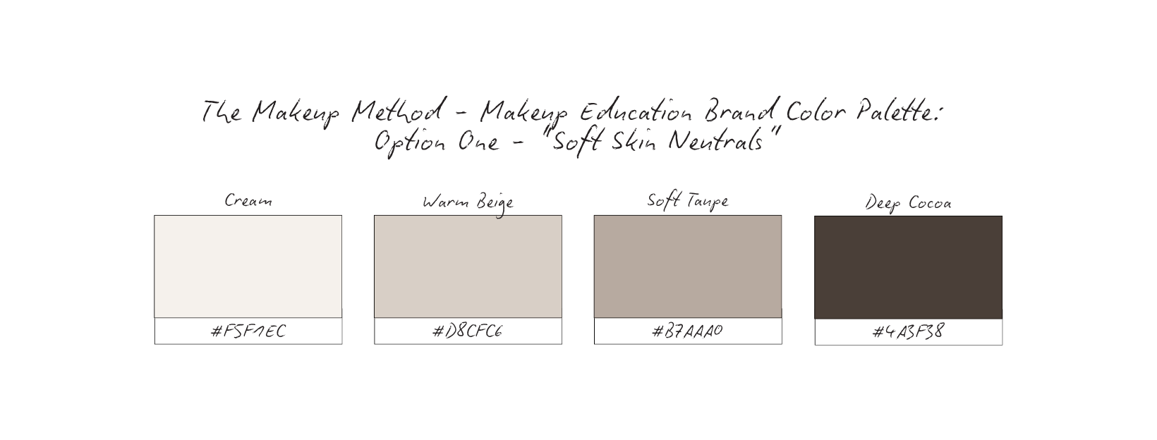
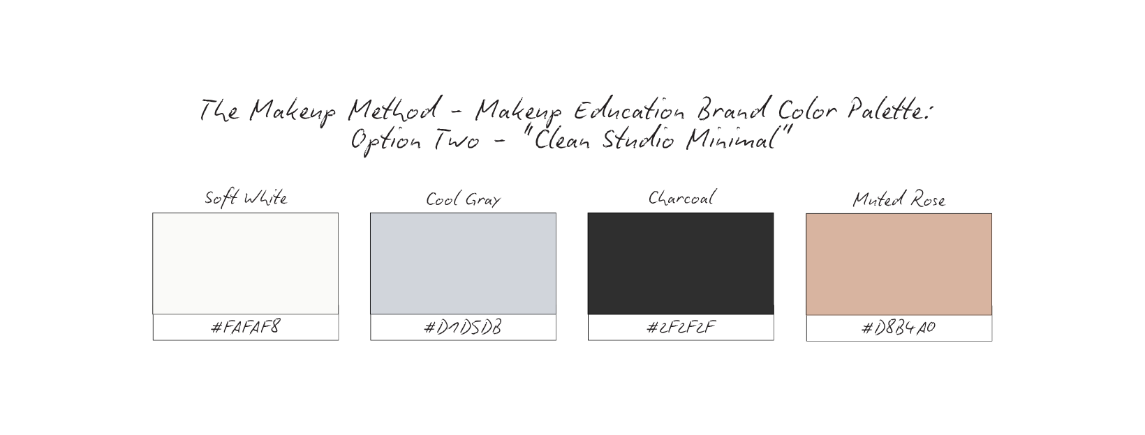
Emotional Cue: Warm, approachable, skin-aligned.
Emotional Cue: Clean, modern, instructional.
Emotional Cue: Editorial, refined, beauty-forward.
Emotional Cue: Structured, calm, slightly more serious.
Emotional Cue: Balanced, warm, and slightly richer.
The best palette isn’t the most aesthetic.
It’s the one that allows your audience to:
see clearly, focus easily, and understand faster.
Why The Palette Works: Editorial Skin Focus
The Editorial Skin Focus palette was selected to support one core idea:
makeup should be seen clearly, not competed with.
This palette reflects the way an education-based makeup brand operates —
through clarity, tone, and intentional detail.
Built Around Skin, Not Trend
Every color in this palette is rooted in natural skin tones.
This allows:
foundation shades to stand out accurately, blending to be visible, texture to be understood
Nothing distracts from the technique.
Everything supports it.
Neutral Foundation = Professional Credibility
The gray tones act as a stabilizing base.
They remove unnecessary visual noise and allow the brand to feel:
grounded, dependable, professional.
This prevents the brand from feeling overly styled or trend-driven, reinforcing long-term credibility.
Editorial, But Not Intimidating
The ivory and warm sand tones create a clean, studio-like base, while still feeling soft and approachable.
This gives the brand:
a refined, elevated feel
without becoming overly clinical, or visually cold
It mirrors the feeling of a well-produced beauty editorial —
but designed for learning.
Soft Contrast for Focus
The neutral brown introduces depth without harsh contrast.
This ensures: text remains readable, hierarchy feels clear, the overall system stays calm
The palette guides the eye, rather than overwhelming it.
Subtle Warmth Through Blush
The soft blush tone brings in a connection to:
complexion, color theory, makeup application
But in a controlled, understated way.
It reinforces the subject matter — without becoming decorative.
Designed for Learning Environments
This palette avoids:
overly bright tones, high-saturation color, trend-driven combinations
Instead, it prioritizes:
consistency, softness, visual clarity
Which mirrors the environment needed for education: focused, calm, and easy to follow.
Together, these colors create a system that feels:
refined, instructional, skin-first, quietly elevated
Nothing pulls attention away from the lesson.
Everything works together to support one goal:
helping the audience understand what they’re seeing.
Content Strategy Breakdown
For The Makeup Method, content is not created to impress.
It’s created to teach, clarify, and repeat.
Because in an education-based brand, the goal isn’t just attention.
It’s understanding.
Every format is used intentionally to guide the audience from:
watching → understanding → applying
Reels: Technique in Motion
Reels are used to demonstrate how makeup works in real time.
Instead of fast transformations or trend-based edits, the focus is on:
brush placement, blending technique, product control, step-by-step movement
The pacing is intentional.
Nothing is rushed. Nothing is hidden.
Reels allow the audience to see the method in action, not just the result.
Carousels: Structured Learning
Carousels act as the brand’s teaching framework.
They are used to:
break down techniques step-by-step, explain the “why” behind each decision
simplify complex processes, reinforce repeatable methods
Each slide builds on the last, creating a sense of progression.
This turns content into something that feels closer to a lesson than a post.
Static Imagery: Clarity + Focus
Static posts reinforce the brand’s visual and educational tone.
They focus on:
close-up skin detail, product placement, tool positioning, text-led insights or key takeaways
These posts slow the viewer down.
They remove distraction and allow the audience to study what they’re seeing.
Stories: Reinforcement + Repetition
Stories support the learning process through:
quick reminders, small technique tips, repetition of core concepts, behind-the-scenes practice moments
They keep the brand feeling:
present, consistent, supportive
Without overwhelming the audience.
Each format serves a specific role in the learning process:
Reels → demonstrate
Carousels → explain
Static → focus
Stories → reinforce
Nothing is random.
Everything is designed to help the audience:
understand, retain, and apply.
The feed no longer feels like a portfolio.
It feels like a learning environment.
A place where makeup isn’t just seen, it’s understood.
And that’s what transforms an artist into an educator.
High-Converting Content Ideas For Virtual Assistants
Each content pillar is designed to reinforce one core idea:
This is a brand you learn from, not just watch.
These aren’t random post ideas.
Each one builds understanding, trust, and repeatability, which is what turns content into education — and education into a scalable brand.
Technique Breakdown Series
Type: Carousel
What it is: Step-by-step breakdowns of one specific technique (blending, brush pressure, placement, etc).
Why it converts: It simplifies what often feels complex and makes the method feel approachable. This builds clarity, authority, and trust.
Micro CTA: Save this for your next practice session.
“Why this Works” Education
Type: Carousel or Static
What it is: Explaining the reasoning behind a technique, product placement, or finish.
Why it converts: Moves the audience from copying to understanding. This builds authority and deeper trust.
Micro CTA: Save this so you remember the reasoning.
Real-Time Application (Slow Reels)
Type: Reel
What it is: Unrushed application showing each step clearly. No cuts that hide the process.
Why it converts: Builds credibility and allows viewers to follow along and learn visually. This builds trust and transparency.
Micro CTA: Watch this twice and try it.
Common Mistakes → Corrections
Type: Carousel
What it is: Side-by-side comparisons or step-by-step corrections of common errors.
Why it converts: Helps the audience immediately identify what they’ve been doing wrong. This builds clarity, value, and engagement.
Micro CTA: Save this. This is where most people get stuck.
Product Purpose (Not Just Product Use)
Type: Reel or Carousel
What it is: Explaining what a product actually does and when to use it.
Why it converts: Shifts focus from buying products to understanding them. This builds authority and trust.
Micro CTA: Save this before your next product purchase.
Repetition Series (“Practice This”)
Type: Reel or Story
What it is: Encouraging viewers to repeat one technique multiple times.
Why it converts: Reinforces that mastery comes from repetition, not one-time viewing. This builds consistency and learning behavior.
Micro CTA: Practice this today.
Student Perspective / Learning Moments
Type: Carousel or Static
What it is: Reflections on what students struggle with or common learning breakthroughs.
Why it converts: Builds connection and shows understanding of the audience’s journey. This builds trust and relatability.
Micro CTA: If this sounds like you, keep learning with me.
“This vs That” Technique Comparisons
Type: Carousel
What it is: Comparing two techniques, placements, or approaches.
Why it converts: Helps the audience understand nuance and make better decisions. This builds clarity and authority.
Micro CTA: Save this for reference.
Micro Lessons (Single Insight Posts)
Type: Static
What it is: One clear, concise takeaway ("ex: “Blend here, not here”).
Why it converts: Quick, digestible, and highly saveable. This builds retention and engagement.
Micro CTA: Save this. It makes a difference.
Watch → Learn → Repeat” Framework
Type: Story + Reel Combo
What it is: Reel demonstrates → Stories reinforce → Audience repeats.
Why it converts: Creates a structured learning loop inside your content. This builds consistency and deeper engagement.
Micro CTA: Watch, then try it yourself.
Each pillar supports a different stage of learning:
Breakdown → understanding
Demonstration → visualization
Repetition → master
Reflection → connection
Together, they create a feed that feels:
intentional, instructional, and structured.
The audience doesn’t just scroll.
They study. They save. They return.
Because the content doesn’t just show makeup — it teaches it.
Grid Logic & Visual Rhythm
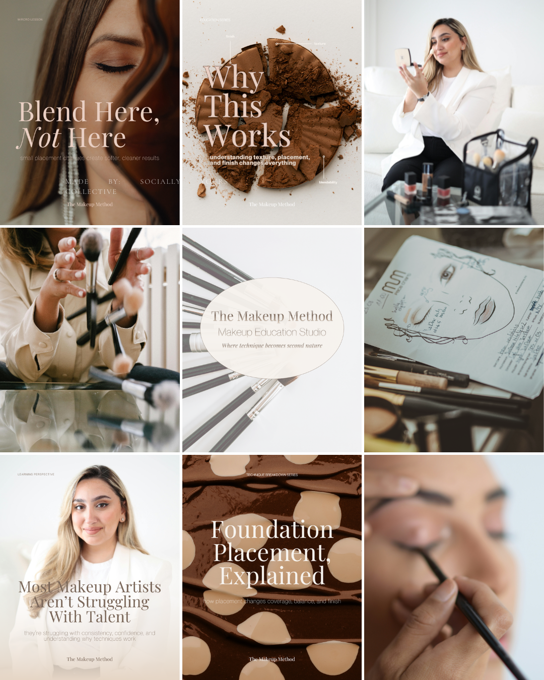
Educational Editorial, Not Beauty Content
The grid for The Makeup Method is intentionally structured to feel less like a traditional beauty page…
and more like an educational editorial publication.
This distinction matters.
Most makeup feeds are built around: transformations, trends, finished looks, constant visual stimulation
But this grid is built around: understanding.
The goal is not to overwhelm the audience with content.
It’s to create an environment where people can:
pause, observe, study, retain information more clearly
The restraint is intentional.
The Grid Uses Contrast Strategically
The visual rhythm alternates between:
text-led educational covers, soft human moments
technique-focused close-ups, process imagery, visual breathing space
This creates movement without visual chaos.
Instead of every post competing for attention, each one supports the next.
A detailed educational cover is followed by:
softer imagery, neutral spacing, quieter visual moments
Which prevents the feed from feeling:
too heavy, too academic, or visually exhausting
The balance keeps the educational content approachable.
Educational Covers Create Recognition
One of the strongest structural elements in the grid is the use of recurring educational covers.
Posts like:
“Blend Here, Not Here”, “Why This Works”, “Foundation Placement, Explained”
act as visual anchors throughout the feed.
These covers immediately communicate:
this is instructional, this is method-based, this is something to learn from
The repetition trains the audience to recognize the brand instantly.
Over time, the typography, spacing, and layouts become part of the identity itself.
The structure becomes recognizable before the username does.
Photography Supports the Teaching
The photography is intentionally restrained and detail-focused.
Rather than relying heavily on:
glam shots, highly edited beauty imagery, trend-driven poses
the visuals prioritize:
skin texture, placement, tools
brushwork, concentration, process moments
Even the portraits feel calm and instructional.
Nothing feels performative.
Everything feels connected to: learning, observation, and technique.
Space Creates Clarity
One of the most important elements in this grid is the use of space.
The layouts are not overcrowded with:
excessive text, bright graphics, competing elements
There is room to breathe.
That breathing room does something subtle but important:
It slows the audience down.
And slowing the audience down increases:
focus, comprehension, retention
The feed reflects the same qualities required for mastering technique:
patience, precision, intentionality
Message-First, Always
Every post in the grid exists to serve a clear purpose.
The content rotates intentionally between:
micro lessons, educational breakdowns
teaching reflections, visual demonstrations, process-focused imagery
Nothing feels random.
Nothing feels like filler.
Even the more aesthetic imagery supports the educational tone of the brand.
The visuals are never separate from the message.
They reinforce it.
Because education-based brands require trust.
And trust is built through:
consistency, clarity, structure, repetition
This grid removes distraction and creates a visual environment that feels:
calm, capable, refined, instructional
The audience quickly understands:
what the brand teaches, how it teaches, and why it feels different from traditional beauty content
The Makeup Method no longer feels like a makeup portfolio.
It feels like:
a framework, a learning space, a trusted educational brand
The audience doesn’t just consume the content passively.
They return to it. They save it. They study it.
Because the grid isn’t built to impress for a moment.
It’s built to teach something that lasts.
Why This Brand Works
Because it positions makeup as something to be understood, not just admired.
That shift changes the entire brand experience.
Most beauty brands focus on the final result:
the transformation, the product, the aesthetic outcome
But education-based brands operate differently.
They build trust by helping people understand:
why a technique works, how placement changes the result, what creates consistency over time
This brand is not built around chasing attention.
It’s built around building comprehension.
And comprehension creates trust.
The Brand Prioritizes Clarity Over Performance.
Nothing about the brand feels rushed or overly performative.
The visuals are restrained. The layouts are intentional. The messaging is structured.
That restraint communicates expertise.
Because true authority doesn’t need to overwhelm the audience with information or constant stimulation.
It simplifies.
The Makeup Method consistently communicates:
“This can be learned clearly.”
And that feeling makes the audience stay.
The Educational Positioning Creates Longevity.
Service-based beauty brands often rely heavily on:
trends, transformations, constant visibility
But education-led brands create a different kind of value.
They become:
reference points, trusted resources, repeat learning environments
The audience returns not just for inspiration, but for understanding.
That creates deeper trust, stronger retention, and more long-term brand growth.
The Brand Feels Structured and Repeatable.
One of the strongest elements of this brand is that everything feels connected.
The typography, color palette, content structure, and educational formats all reinforce the same idea:
there is a method behind the work.
Nothing feels random. Nothing feels trend-dependent.
That consistency builds recognition quickly because the audience begins to associate the brand with:
clarity, technique, calm authority
What This Means For Your Brand
If you’re a makeup artist who wants to move into education, your brand cannot rely on visuals alone.
Beautiful work may attract attention.
But teaching requires: structure, communication, clarity, repeatability
People are not just looking for someone talented.
They’re looking for someone who can help them:
understand, improve, recreate results consistently
That means your content should not only show: what you do
It should explain: how and why it works.
Your Brand Should Feel Teachable.
Education-based brands succeed when the audience feels:
guided, capable, supported, informed
This changes how you create content.
Instead of focusing only on:
transformations, polished outcomes, viral moments
you begin focusing on:
explanation, breakdown, process, repetition
Because trust is built when people feel they are learning something useful, not just watching something impressive.
Positioning Changes Perception.
When your brand communicates:
structure, consistency, instructional clarity
people stop viewing you as:
“someone who does makeup”
and begin viewing you as:
“someone who teaches makeup well.”
That distinction matters.
Because educators build:
scalable brands, stronger authority, long-term audience trust
The Result
The Makeup Method becomes more than a beauty brand.
It becomes:
a learning environment, a repeatable framework, a trusted educational resource
The audience doesn’t just engage with the content emotionally.
They engage with it intentionally.
They: save it, revisit it, apply it, learn from it
Because the brand creates something deeper than inspiration: understanding.
And when people consistently learn from a brand… they begin to trust it.
Not just as an artist.
But as an authority.
That’s what creates longevity.
That’s what creates scalability.
And that’s what transforms a makeup artist into an educator brand people return to again and again.
This study isn’t meant to give you answers overnight.
It’s meant to give you clarity.
If this resonated, take a moment to ask yourself:
Does your brand reflect how you actually work — or just what you post?
From here, you can go a few different directions:
Explore more Brand Studies to see how positioning shifts across industries
Reflect on your own brand systems — what’s intentional, what’s reactive, what’s outdated
Work with me if you’re ready to align your brand with your thinking, not just your aesthetics
Follow along for upcoming Industry Spotlights, where I break down brands from the inside out, every Saturday
No pressure. No urgency tactics.
Just the next right step, when you’re ready.