

Brand Studies: Social Media Managers
A strategic brand breakdown built from the inside out.
This is not a trend report.
It’s not a Canva template gallery.
And it’s definitely not a “just post more” playbook.
This Brand Study is a strategic brand build created to help social media managers move beyond surface-level aesthetics and into clear positioning, credibility, and long-term trust.
Inside, you’ll see how intentional design, messaging, and content structure work together to communicate expertise before a client ever clicks “book a call.” From typography and color psychology to grid logic and content flow, every decision is made with one goal in mind: positioning social media managers as professionals, not placeholders.
This study is for social media managers who want their brand to reflect how they actually think and work — with clarity, confidence, and intention.
The Industry Reality: Manager vs Strategist
Not all social media managers do the same work — and that’s okay.
Some social media managers focus on content execution.
They plan posts, write captions, schedule content, and help brands stay visible and consistent online. This work is valuable, necessary, and keeps many businesses moving forward.
Others operate in a more strategy-led role.
They think beyond what’s being posted and focus on why it’s being posted. They consider brand positioning, audience psychology, content pillars, long-term growth, and how social media supports larger business goals.
Both roles are valid.
Both require skill.
Both deserve respect.
But branding should match the level of responsibility you hold.
When a manager doing strategic work brands themselves the same way as someone offering execution-only services, their value gets diluted. Their expertise becomes harder to see. And the right clients — the ones looking for guidance, not just posting — often scroll right past.
Clear positioning isn’t about hierarchy.
It’s about alignment.
When your brand reflects how you actually think and work, clients understand your role faster, trust builds sooner, and conversations shift from “what do you post?” to “how do you think?”
Brand Concept Overview: Clarke Social Co.
Clarke Social Co. is a conceptual brand built to represent what happens when a social media manager positions themselves with intention, clarity, and strategic depth.
The brand is rooted in calm authority — confident without being loud.
It’s strategy-forward, designed to signal thinking before execution.
And it’s professional, not performative, prioritizing credibility over constant visibility.
Clarke Social Co. doesn’t rely on trends, viral language, or high-output energy to prove its value. Instead, the brand communicates trust through restraint, consistency, and thoughtful design — mirroring the way strategic social media work actually happens behind the scenes.
This brand is built for social media managers who operate as strategic partners, not just content executors.
For managers who think in terms of long-term growth, positioning, and alignment — not post-to-post survival.
Clarke Social Co. represents the evolution many social media managers experience as their expertise deepens: when the work becomes quieter, more intentional, and far more impactful.
Brand Voice & Tone
For a strategy-led social media brand, how you communicate matters just as much as what you say.
The voice of Clarke Social Co. is designed to feel steady, thoughtful, and intentional — never rushed, reactive, or performative. It speaks with clarity rather than urgency, confidence rather than hype.
Brand Voice: Clear and articulate, Insight-driven, Grounded in experience, Calmly confident
This is a voice that explains why, not just what. It anticipates questions, reframes complexity, and communicates strategy in a way that feels accessible without ever feeling watered down.
The tone reflects a social media manager who doesn’t need to convince — because their thinking is evident in the way they communicate.
Clarke Social Co. avoids buzzwords, exaggerated claims, and trend-heavy language. Instead, it prioritizes clarity, structure, and thoughtful pacing — mirroring how strategic decisions are actually made behind the scenes.
When voice and tone align this way, clients don’t feel sold to.
They feel guided.
And that’s difference between a brand that chases attention and one that earns trust.
Brand Tone: Professional but human, Direct, never defensive, Warm without over-familiarity, Assured, not salesy
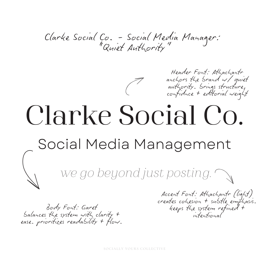
Typography System: Why This Works
Typography plays a quiet but powerful role in how a brand is perceived — especially for service providers whose work relies on trust, clarity, and long-term relationships.
The typography for Clarke Social Co. was chosen to communicate strategy before a single word is read.
Athachantr anchors the brand with quiet authority. As the header typeface, it brings structure, confidence, and editorial weight without feeling rigid or dated. It signals leadership and long-term thinking — the kind that feels considered, not performative.
Garet balances the system with clarity and ease. As the body font, it prioritizes readability and flow, making long-form content feel approachable and digestible. This supports the way strategic social media managers actually work: explaining complex ideas simply, without overselling or overwhelming.
A lighter weight of Athachantr is used as an accent to create cohesion and subtle emphasis. Instead of introducing a decorative script, the system stays refined and intentional — allowing nuance without disrupting credibility.
Together, this typography system:
Builds trust through visual restraint
Supports long-form authority without fatigue
Reinforces the brand’s calm, strategic presence
Feels professional, not performative
Nothing here is decorative for decoration’s sake.
Every font choice supports clarity, structure, and confidence.
Because in a strategy-led brand, how you communicate is part of the strategy.
Fonts aren’t decoration. They’re communication.
Color Palette Psychology
Before locking anything in, multiple directions were explored.
Each option was evaluated not by trend appeal, but by how well it supported clarity, credibility, and long-term positioning for a social media manager operating as a strategic partner.
The goal wasn’t to choose what felt loud or eye-catching —
it was to choose what felt stable, intelligent, and enduring.
After reviewing how each option translated across client touchpoints, long-form content, and strategic communication, one direction stood out.
Not because it tried harder —
but because it didn’t need to.
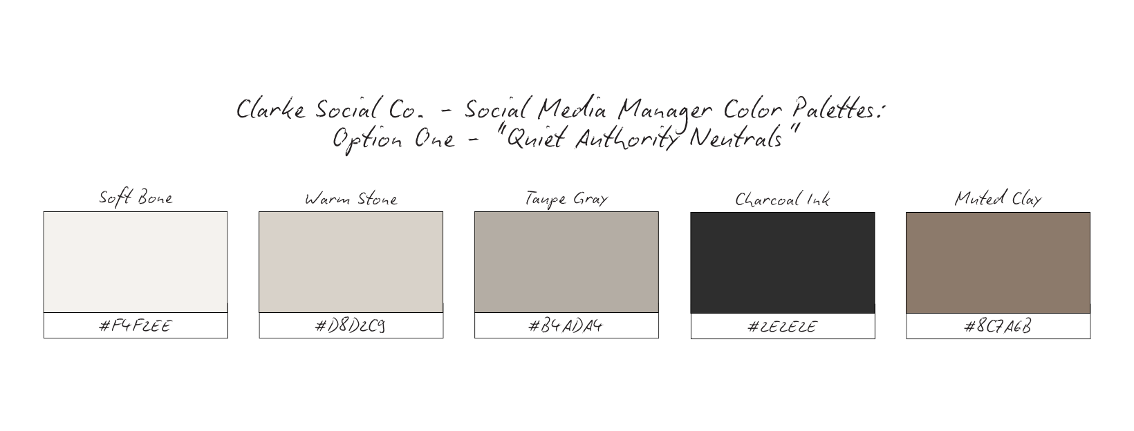
This palette feels grounded, steady, and mature. It doesn’t chase attention — it earns it.
Emotional impact: Calm and composed, Trustworthy and professional, Signals long-term thinking
Best for: Strategic social media managers who want to be seen as partners, not vendors.
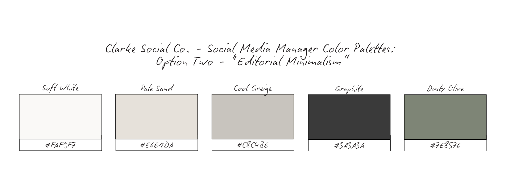
Feels like an editorial brand study rather than a “content creator” feed. Clean, spacious, and intelligent.
Emotional impact: Clarity, Professional confidence, Mental breathing room
Best for: Managers who work with founders, agencies, or established brands.
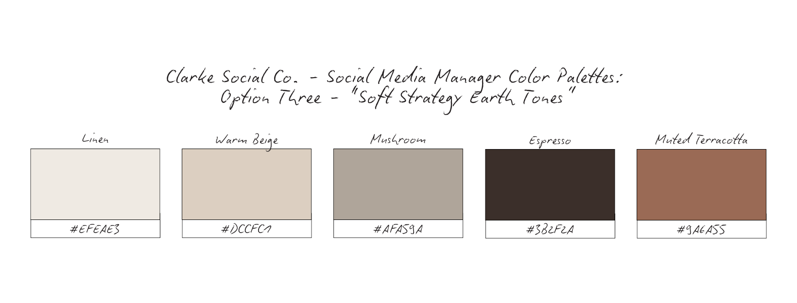
Adds warmth and humanity without losing professionalism. Ideal if you want strategy to feel approachable.
Emotional impact: Grounded, Human, Steady reassurance
Best for: Strategists who work closely with clients long-term and value relationships.
Maintains contrast for clarity while staying calm and elevated — never loud.
Emotional impact: Confidence, Structure, Clear leadership
Best for: Social media managers stepping into advisory or consulting roles.

The Editorial Minimalism palette (option 2) was chosen for Clarke Social Co. because it communicates clarity, professionalism, and trust without relying on visual noise.
Built around soft whites, muted sands, refined greiges, and grounded dark tones, this palette creates space — for ideas, for strategy, and for credibility to lead. Nothing here competes for attention. Instead, every color supports focus and legibility, allowing the work itself to speak.
Emotionally, this palette feels composed and intelligent.
It signals maturity, thoughtfulness, and long-term thinking — qualities that matter deeply in strategic roles where decisions impact growth over time.
For service providers, Editorial Minimalism creates instant reassurance.
For strategic social media managers, it mirrors the way they work: intentional, structured, and clear.
This palette avoids trend-driven hues and high-contrast combinations that date quickly. Instead, it leans into restraint — ensuring the brand feels current now and credible years from now.
In an industry that often equates visibility with volume, Clarke Social Co. chooses clarity over clutter.
Because when trust is the goal, minimalism isn’t empty — it’s deliberate.
Content Strategy Breakdown
For Clarke Social Co., content isn’t created to keep up — it’s created to communicate clearly, consistently, and with purpose.
This strategy is designed to support positioning first, visibility second. Every format plays a specific role, ensuring the brand builds trust over time instead of chasing short-term attention.
Reels: Connection + Visibility
Reels are used to humanize the brand and create entry points for new audiences.
Rather than fast trends or high-pressure hooks, Clarke Social Co.’s reels focus on: Thoughtful perspective, Behind-the-scenes thinking, Calm, confident commentary
This allows potential clients to experience how the strategist thinks, not just what they post. Visibility is earned through clarity, not volume.
Carousels: Education + Authority
Carousels carry the weight of the strategy.
They are used to: Explain concept, Reframe industry conversation, Demonstrate strategic thinking
This is where long-form authority lives. The goal isn’t to overload — it’s to articulate ideas clearly and intentionally, allowing the audience to slow down and engage with substance.
Carousels position Clarke Social Co. as a guide, not a content machine.
Stories: Intimacy + Consistency
Stories support trust-building in real time.
They show: Process over performance, Context behind decisions, Ongoing presence without pressure
This keeps the brand feeling human and accessible, without diluting its professionalism. Stories aren’t used to sell aggressively — they’re used to maintain connection and reinforce consistency.
Together, these formats create balance: Reels invite discovery, Carousels deepen trust, Stories sustain relationships
Nothing exists in isolation. Each piece of content supports the others, creating a cohesive system where the brand feels steady, intentional, and aligned.
This approach reflects how strategic social media managers actually work — thoughtfully, methodically, and with long-term outcomes in mind.
High-Converting Content Ideas For Social Media Managers
Strategy Diaries
Type: Reel (talking head) or Carousel
What it is: “Here’s what I considered before posting this.”
Why it converts: Shows your brain, not just your work — instantly positions you as a strategic partner.
Micro CTA: Comment “DIARY” if you want more behind-the-strategy posts.
Client Work Without the Aesthetic Reveal
Type: Carousel
What it is: Break down the strategy shift (positioning, pillars, messaging) without flashy before/after.
Why it converts: Attracts clients who value thinking and results — filters out “just make it pretty” leads.
Micro CTA: Save this if you want clients who respect strategy.
Behind-the-Scenes of Restraint
Type: Reel or Story sequence
What it is: “Why I didn’t post today — and why that was strategic.”
Why it converts: Restraint reads as confidence. Mature clients trust calm brands.
Micro CTA: Reply “CALM” if you’re done chasing constant output.
Industry Reframes
Type: Carousel
What it is: Correct common advice with a calmer, smarter take (no dragging people).
Why it converts: Establishes authority without being polarizing — you become the “safe expert.”
Micro CTA: Drop the worst social media advice you’ve heard.
The Thinking Behind the Caption
Type: Carousel (with caption screenshots) or Reel (voiceover)
What it is: Explain tone, structure, and intent behind one caption.
Why it converts: Educates prospects on what they’re paying for: messaging that moves people.
Micro CTA: Comment “CAPTION” and I’ll break down another.
Quiet Wins
Type: Carousel or Reel
What it is: Wins that aren’t viral: better inquiries, clearer offers, stronger DMs, easier content flow.
Why it converts: Attracts long-term clients who value sustainability and ROI over vanity metrics.
Micro CTA: Save this if you’re building for longevity.
Process Over Performance
Type: Reel (screen recording) or Carousel
What it is: Walk through your audit, planning doc, or workflow (blur sensitive info).
Why it converts: People hire process. This makes your work feel tangible and premium.
Micro CTA: Want a template? Comment “PROCESS.”
Strategic Boundaries
Type: Reel (talking head) or Typography post + caption
What it is: What you don’t do (and why): “I don’t promise X without Y.”
Why it converts: Boundaries signal expertise. It repels misaligned leads and attracts serious clients.
Micro CTA: What’s one boundary you want to set this year?
Long-Game Positioning Posts
Type: Carousel
What it is: Speak to the future version of your client: “If you’re tired of explaining your value…”
Why it converts: Calls in clients ready to evolve — these are higher-ticket, higher-trust buyers.
Micro CTA: Share this with a friend who’s ready to level up.
Grid Logic & Visual Rhythm

Purposeful Minimalism, Not Empty Space
This grid is intentionally restrained.
Not because there’s nothing to say — but because clarity requires space.
By limiting visual noise, the brand allows each message to land without competition. No overcrowded graphics. No constant visual resets. Every post has room to breathe, which immediately signals calm authority and confidence.
This isn’t a feed built to shout.
It’s built to be understood.
Repetition Builds Repetition
The grid relies on consistent visual cues: Neutral backgrounds, Controlled typography, Repeating compositions (hands, devices, workspace details), A steady balance between imagery and text-led posts
This repetition isn’t accidental — it trains the viewer’s eye.
Over time, followers don’t need to read the username to know who the content belongs to. The structure itself becomes the brand.
That’s how recognition is built without relying on trends or gimmicks.
Spacing Signals Authority
White space and visual restraint do something subtle but powerful:
they slow people down.
Instead of scrolling past, viewers pause — because the content feels intentional, not desperate for attention. This pacing mirrors the way a strategist works: thoughtfully, deliberately, with purpose.
The grid reflects how the brand thinks, not just how it looks.
Message-First, Always
Notice how the grid alternates between: Clear brand statements, Behind-the-scenes context, Strategic insight, Process-driven visuals
There’s no filler content.
Each post exists to either: Clarify positioning, Build trust, Reinforce expertise
This creates a feed that feels cohesive without being repetitive — and educational without being overwhelming.
Because people understand brands faster when there’s less to decode.
This grid helps viewers quickly grasp:
What Clarke Social Co. values
How it approaches client work
Why strategy leads the aesthetic — not the other way around
The result is a brand presence that feels grounded, credible, and intentional — exactly what strategic social media managers want to be associated with.
Why This Brand Works
This brand works because every decision was made with intention — not trends.
The typography establishes calm authority and long-form credibility, signaling that this brand is built for strategy-led work, not surface-level posting. The color palette avoids loud or reactive tones, reinforcing trust, consistency, and professionalism over performance.
The content mix prioritizes clarity, education, and systems thinking, positioning the brand as a strategic partner rather than a content executor. The grid logic supports this by balancing whitespace, editorial pacing, and restrained messaging — allowing the brand to feel confident without overexplaining.
Nothing here is accidental.
Each element supports the same message: this brand thinks before it speaks.
What This Means For Your Brand
If your brand feels scattered, inconsistent, or visually polished but strategically unclear — this is why.
Your audience isn’t confused because you’re “not posting enough” or “not trendy enough.”
They’re confused because your brand isn’t clearly communicating how you think, decide, and lead.
When your branding reflects your actual role — strategist, partner, long-term thinker — it does the heavy lifting for you. It filters inquiries, attracts aligned clients, and sets expectations before the first call.
This is what happens when branding stops trying to impress and starts trying to clarify.
The Result
Clarke Social Co. becomes more than a social media brand.
It becomes a signal of steadiness in a noisy industry.
A brand that feels grounded, intelligent, and quietly confident.
One that doesn’t chase virality — it builds trust.
Clients don’t just see content.
They see systems. Thoughtfulness. Long-term thinking.
And when every detail aligns — from typography to tone to strategy — the brand doesn’t need to convince.
It’s already understood.
This study isn’t meant to give you answers overnight.
It’s meant to give you clarity.
If this resonated, take a moment to ask yourself:
Does your brand reflect how you actually work — or just what you post?
From here, you can go a few different directions:
Explore more Brand Studies to see how positioning shifts across industries
Reflect on your own brand systems — what’s intentional, what’s reactive, what’s outdated
Work with me if you’re ready to align your brand with your thinking, not just your aesthetics
Follow along for upcoming Industry Spotlights, where I break down brands from the inside out, every Saturday
No pressure. No urgency tactics.
Just the next right step, when you’re ready.