

Brand Studies: Virtual Assistant
A strategic brand breakdown built from the inside out.
Most branding advice for virtual assistants focuses on visibility — what to post, how often to post, and how to package your services.
But visibility alone doesn’t build trust.
And it certainly doesn’t communicate the level of responsibility many virtual assistants actually hold inside a business.
This study is not about productivity hacks.
Not about listing every task you can complete.
And not about posting Canva graphics and hoping clients inquire.
This is a strategic brand build designed to position virtual assistants as trusted operational partners — not interchangeable task-takers.
Because the truth is, many VAs are doing far more than checking boxes on a task list.
They are managing systems, protecting timelines, organizing moving pieces, and helping businesses run smoothly behind the scenes.
Your brand should reflect that level of trust.
This study explores how virtual assistants can build brands that communicate clarity, reliability, and strategic value — visually, verbally, and structurally.
This study is for virtual assistants who want their brand to reflect the role they actually play in a business: organized, dependable, and essential.
The Industry Reality: Task Support vs. Operational Partnership
The virtual assistant industry has expanded quickly over the past decade.
With that growth has come a wide range of service models — from task-based support to high-level operational partnership.
Both exist.
Both serve different types of businesses.
And both can be valuable.
But the way a virtual assistant positions their brand should reflect the level of responsibility they actually hold.
Task-Based Virtual Assistant Brands
Many virtual assistant brands present themselves primarily through long service lists.
They emphasize tasks such as: inbox management, scheduling, document formatting, social media posting, basic administrative work.
The messaging tends to focus on what gets done, rather than the outcomes those tasks support.
Because many brands describe similar task lists, differentiation becomes difficult.
When positioning stays task-focused, VAs often find themselves competing on price, availability, or speed rather than expertise.
Strategic / Operational Virtual Assistants
Other virtual assistants operate as operational partners inside a business.
Instead of presenting themselves through task lists, they highlight their strengths in: systems and organization, process improvement, project coordination, communication management, operational clarity.
In this model, clients aren’t simply hiring someone to check off tasks.
They’re hiring someone whose thinking, structure, and reliability help keep the business functioning smoothly.
The relationship often becomes long-term, because the VA becomes integrated into how the business operates.
Both models exist.
Both attract different clients.
But branding should match the level of responsibility you hold.
When a virtual assistant communicates their value clearly — through language, positioning, and visual identity — perception shifts.
And when perception shifts, so do: pricing, trust, and the types of clients who inquire.
Positioning doesn’t just affect how your brand looks.
It affects how seriously your role is taken.
Brand Concept Overview: The Back Office Co.
To explore how virtual assistants can position themselves with clarity and authority, this study is anchored in a concept brand: The Back Office Co.
The name itself communicates the role many virtual assistants truly play — the steady operational presence behind a business that keeps things organized, moving, and functioning smoothly.
Rather than emphasizing individual tasks, the brand positions the virtual assistant as the infrastructure behind the scenes — the systems, organization, and reliability that allow the visible parts of a business to thrive.
Brand Positioning
The Back Office Co. is built around three core ideas:
Calm, capable authority
The brand communicates competence without noise or urgency. Its presence feels steady and reliable — the kind of support business owners trust to keep operations running smoothly.
Organized, reliable, professional
Visual and verbal language reflect structure, clarity, and professionalism. The brand feels dependable, thoughtful, and detail-oriented.
Supportive without feeling invisible
While the work happens behind the scenes, the brand still communicates value and expertise. It positions the virtual assistant as an essential operational partner rather than background help.
Who This Brand Is Built For
This concept brand is designed to represent virtual assistants who operate as trusted operational support inside a business, including:
Virtual assistants
Online business managers
Administrative support professionals
Operations-minded service providers
These are professionals who bring organization, structure, and clarity to growing businesses.
Who This Brand Is Not Built For
The Back Office Co. is intentionally not designed for:
High-volume gig-style VA work
Low-cost task marketplaces
“Do everything for everyone” positioning
Instead, the brand reflects virtual assistants who want to be perceived as steady, capable partners in a business’s day-to-day operations.
Brand Voice & Tone
For virtual assistants, trust often begins before the first task is ever assigned.
Clients are inviting someone into the inner workings of their business — their inbox, calendar, systems, and daily operations.
Because of this, the way a brand sounds matters just as much as the services it offers.
The voice of The Back Office Co. is designed to communicate calm competence and quiet authority — the sense that things are organized, understood, and under control.
Brand Voice
The brand voice reflects the qualities clients want from operational support:
Clear - communication is simple and direct. Instructions, explanations, and messaging avoid unnecessary complexity.
Calm - the voice never feels rushed or chaotic. It reinforces the idea that the brand brings order to moving parts.
Organized - language is structured and intentional. Information is presented in a way that feels thoughtful and easy to follow.
Professional without being stiff - the tone remains polished and credible while still feeling human and approachable.
Brand Tone
While voice describes the overall personality of the brand, tone adjusts how that voice is expressed in different situations.
For The Back Office Co., tone is:
Supportive, not subservient - the brand communicates partnership rather than hierarchy. The VA is there to support the business, but not to diminish their expertise.
Direct, not overly casual - clarity is prioritized over slang or overly conversational language.
Helpful without over-explaining - information is delivered confidently and efficiently, respecting the client’s time.
Why It Matters
Virtual assistants operate behind the scenes of someone else’s business.
Clients need to feel immediate confidence in the person managing their systems, communication, and day-to-day logistics.
Language should communicate one simple message: “I’ve got this handled.”
Ideally, clients feel that reassurance before they ever ask the first question.
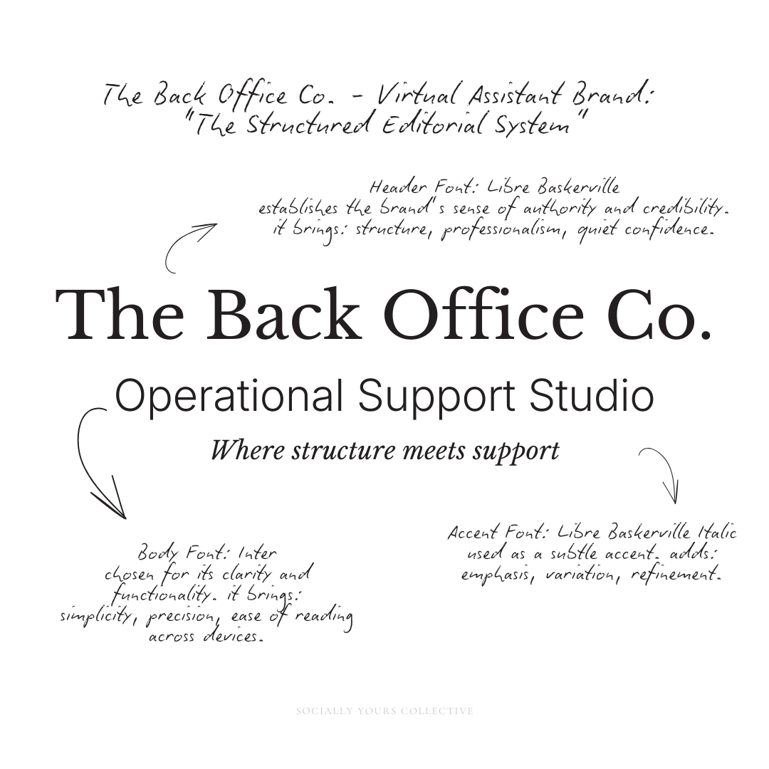
Typography System: Why This Works
Typography for The Back Office Co. is intentionally restrained and structured.
It’s designed to communicate clarity, professionalism, and reliability before any content is read.
Because in operational work, presentation matters.
If something looks organized, it’s trusted faster.
Header Typography: Libre Baskerville
The header font establishes the brand’s sense of authority and credibility.
Libre Baskerville is a classic serif with a balanced, editorial feel. It brings:
structure, professionalism, quiet confidence.
It doesn’t feel trendy or decorative.
It feels established, thoughtful, and dependable — which mirrors how a strong virtual assistant should be perceived.
Used in headings and key statements, it helps the brand communicate:
“This is handled.”
“This is organized.”
“This can be trusted.”
Body Typography: Inter
Inter was chosen for its clarity and functionality.
As a modern sans-serif, it creates contrast against the serif while keeping the overall system clean and highly readable.
It brings:
simplicity, precision, ease of reading across devices.
This is especially important for:
long-form content, educational carousels, service explanations.
Inter ensures that information is easy to process, not overwhelming, reinforcing the brand’s role as a source of clarity.
Accent Typography: Libre Baskerville Italic
The italic version of Libre Baskerville is used as a subtle accent.
Instead of introducing a script font, which could feel too decorative or soft for this brand, the italic serif adds:
emphasis, variation, refinement.
It highlights key phrases, reflections, or supporting thoughts without disrupting the system.
This keeps the brand feeling cohesive, intentional, and controlled.
Together, this typography system creates balance:
Serif → authority and structure
Sans-serif → clarity and readability
Italic → emphasis without distraction
Nothing competes. Nothing feels excessive.
Every element supports the same goal:
clear communication.
Organization begins with clarity — and typography communicates that before a single word is read.
Color Palette Psychology
For The Back Office Co., color is not used to stand out — it’s used to create trust.
Virtual assistants are responsible for the parts of a business that require consistency and structure:
systems, communication, timelines, operations.
Because of this, the color palette should feel steady, controlled, and intentional — never chaotic or overly expressive.
The goal is simple:
calm competence.
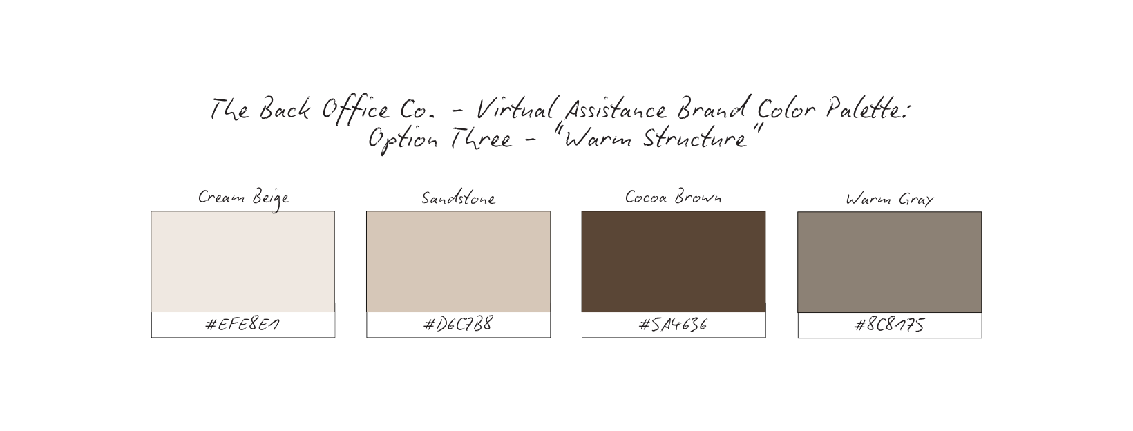
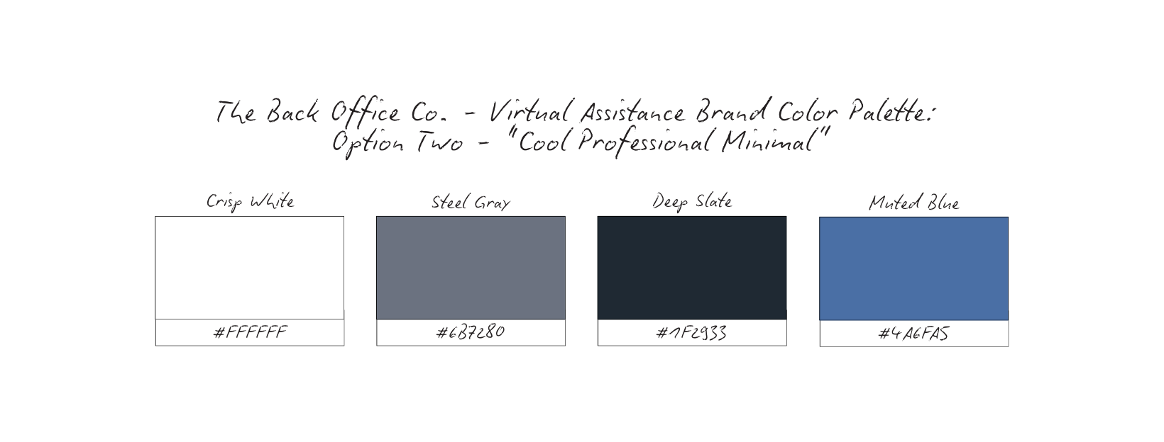
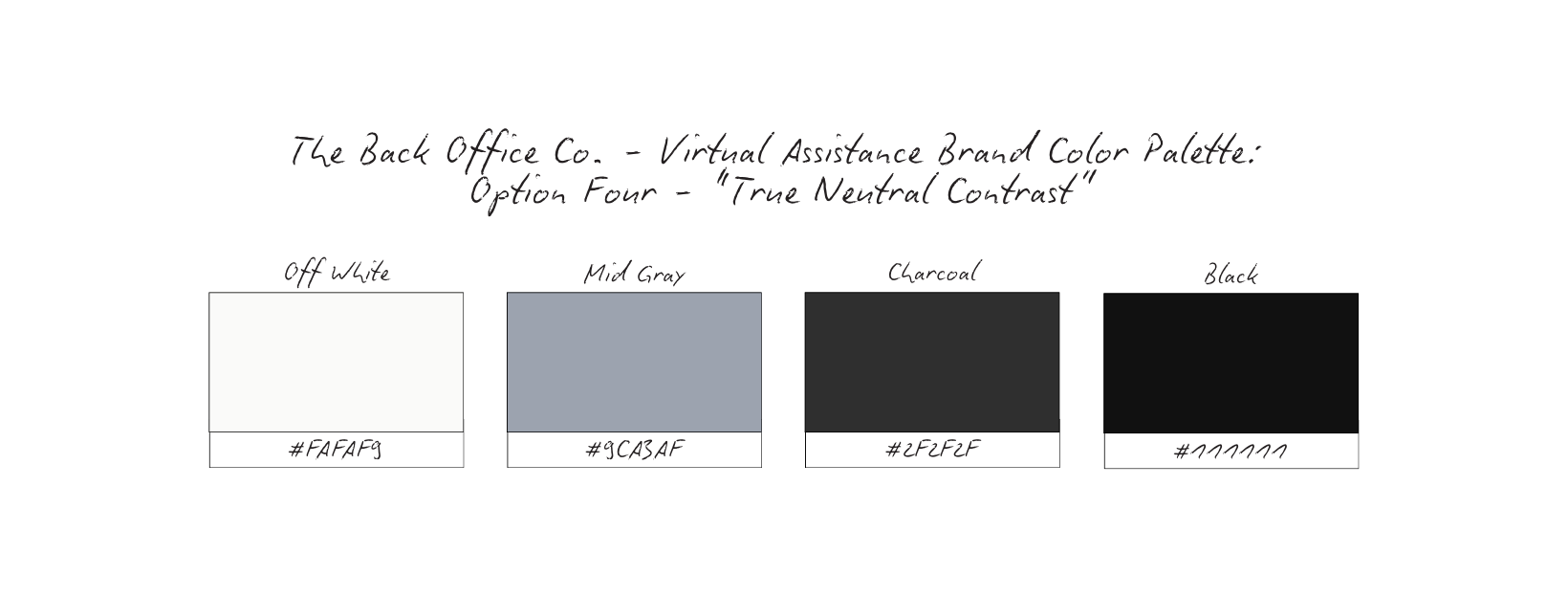
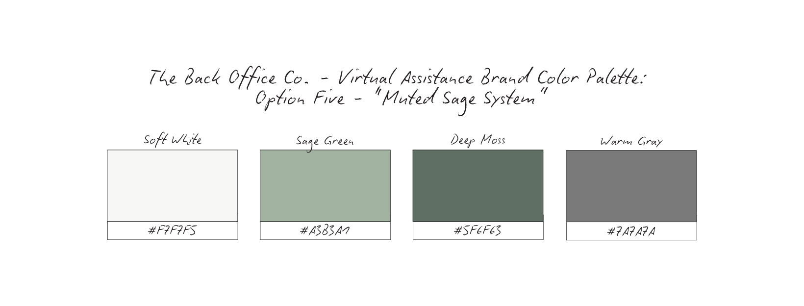
For The Back Office Co., several palette directions were explored before selecting a final system.
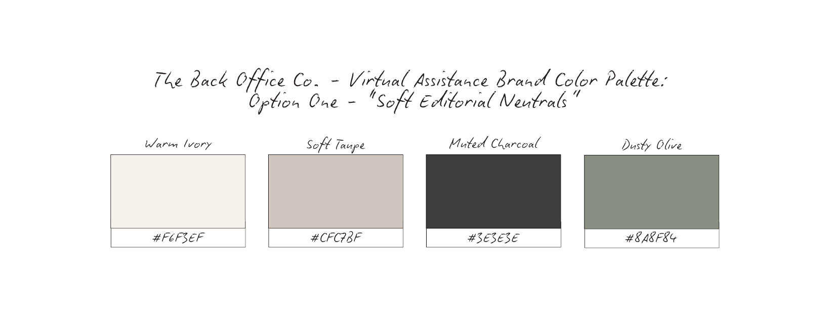
Emotional Cue: Feels grounded, approachable, and quietly professional.
Emotional Cue: Clean, efficient, and structured.
Emotional Cue: Calm, stable, and quietly elevated.
Emotional Cue: Minimal, controlled, and highly structured.
Emotional Cue: Balanced, steady, and subtly calming.
Why Palette Choice Matters for Virtual Assistants
Each palette works — but they communicate slightly different versions of the same idea.
The right choice depends on how the brand wants to feel:
more editorial, more corporate, more warm, or more minimal.
With multiple strong directions, the goal isn’t to find the most eye-catching palette.
It’s to choose the one that best reflects how the brand operates:
clear, consistent, and reliable.
Clarity > decoration
Trust > trend
Consistency > stimulation
Why The Palette Works: Cool Professional Minimal
The Cool Professional Minimal palette was selected for its ability to communicate clarity, structure, and trust without distraction.
At its core, this palette reflects how strong virtual assistants operate:
clean, organized, and consistent.
Clarity Through Contrast
The use of crisp white paired with deep slate creates strong, readable contrast.
This ensures that:
information is easy to scan, content feels structured, nothing feels visually overwhelming.
In a role where clarity is everything, the palette supports quick understanding and ease of use.
Neutral Foundation = Professional Credibility
The gray tones act as a stabilizing base.
They remove unnecessary visual noise and allow the brand to feel:
grounded, dependable, professional.
This prevents the brand from feeling overly styled or trend-driven, reinforcing long-term credibility.
Muted Blue = Trust Without Noise
The muted blue introduces just enough color to signal:
trust, reliability, calm communication.
Unlike brighter blues often used in corporate branding, this tone is softened — allowing the brand to feel approachable without losing professionalism.
Designed for Systems, Not Stimulation
This palette intentionally avoids high contrast color combinations or decorative tones.
Instead, it prioritizes:
consistency, readability, visual control.
Which mirrors the experience clients are looking for when hiring a virtual assistant:
organized, steady, and handled.
Together, these colors create a visual system that feels:
calm but capable, minimal but intentional, professional without being cold.
Nothing competes for attention.
Everything works together to reinforce one message:
this brand is structured, reliable, and easy to trust.
Content Strategy Breakdown
For The Back Office Co., content is not created to keep up or stay visible for the sake of it.
It’s built to communicate something much more important: reliability.
This strategy prioritizes clarity over volume and consistency over trends, ensuring that every piece of content reinforces the brand’s role as a trusted operational partner.
Reels: Process + Perspective
Reels are used to give insight into how the work happens, not just what gets done.
Instead of fast-paced trends or surface-level tips, content focuses on:
systems thinking
organization processes
behind-the-scenes workflow
decision-making in real time.
This allows potential clients to experience the VA’s approach to operations, not just their task list.
Reels build familiarity and trust by showing that the brand is methodical, thoughtful, and in control.
Carousels: Education + Clarity
Carousels carry the weight of the strategy.
They are used to:
explain workflows
break down operational concepts
clarify services and boundaries
reframe what virtual assistants actually do
This is where the brand establishes authority.
Rather than overwhelming the audience, the goal is to present information in a way that feels:
structured, digestible, immediately useful.
Carousels position The Back Office Co. as a clear thinker and reliable guide, not just a service provider.
Static Imagery: Presence + Professionalism
Static posts create visual consistency and reinforce the brand’s tone.
They focus on:
calm, minimal workspace visuals
organized systems (planners, screens, tools)
text-led graphics with clear messaging
These posts act as visual anchors in the feed.
They don’t compete for attention — they reinforce it.
The result is a brand presence that feels:
steady, intentional, professionally grounded.
Stories: Consistency + Trust
Stories support the day-to-day visibility of the brand.
They show:
workflow in progress
task updates
small operational wins
real-time presence without pressure
This keeps the brand feeling accessible and human, while still maintaining professionalism.
Stories are not used for constant selling.
They are used to reinforce:
“This is handled. This is moving. This is consistent.”
Each format serves a distinct role:
Reels → show how the VA thinks
Carousels → explain and position
Static → reinforce presence and clarity
Stories → maintain trust over time
Nothing exists in isolation.
Together, they create a system where the brand feels:
organized, dependable, easy to understand.
The feed feels like a calm, capable operations partner — not a productivity influencer.
And that difference is what attracts clients who are looking for long-term, reliable support — not just help with tasks.
High-Converting Content Ideas For Virtual Assistants
Each content pillar is designed to reinforce one core idea:
This brand is organized, reliable, and capable.
These aren’t random post ideas.
Each one serves a purpose — to build trust, communicate value, and attract clients who are looking for operational support, not just task completion.
“How I Think About Operations” Series
Type: Carousel
What it is: Breakdowns of how you approach systems, workflows, and organization — not just what tools you use, but how you think through problems.
Why it converts: Clients don’t just hire for tasks. They hire for decision-making and structure. This builds authority, trust, and alignment.
Micro CTA: Save this for your workflow setup.
Before & After: Systems Edition
Type: Carousel
What it is: Show a messy process (inbox, task system, calendar) then the organized, structured version.
Why it converts: Visual transformation makes intangible work feel tangible and valuable. This builds trust, credibility, and proof.
Micro CTA: Imagine this for your business — inquire to work together.
Behind the Scenes: A Day in Operations
Type: Reel
What it is: Clips of your workflow (checking systems, updating tasks, organizing schedules, communicating with clients).
Why it converts: Shows consistency and real-time execution, not just polished outcomes. This builds trust, familiarity, connection.
Micro CTA: Follow for a look inside real operations support.
“You Don’t Need More, You Need This” Reframe
Type: Carousel
What it is: Reframing common client struggles (ex: “You don’t need more tools, you need better systems.”)
Why it converts: Positions you as a strategic thinking, not just support. This builds authority and clarity.
Micro CTA: Save this for your next reset.
Process Over Task Content
Type: Reel or Carousel
What it is: Breaking down how a task is handled from start to finish (onboarding a client, managing a launch, organizing a calendar).
Why it converts: Shows depth of work and removes the “simple task” perception. This builds trust and expertise.
Micro CTA: Want this handled for you? Let’s connect.
Workspace / System Details
Type: Static
What it is: Clean visuals of your workspace, tools, dashboards, or systems in use.
Why it converts: Reinforces the brand visually as organized and intentional. This builds perception and professionalism.
Micro CTA: Save for workspace inspiration.
Client Experience Insights
Type: Carousel or Static
What it is: Short reflections or anonymous insights about what clients gain from having support (less stress, more clarity, smoother operations).
Why it converts: Connects your work to real outcomes, not just tasks. This builds trust and emotional connection.
Micro CTA: Explore what support could look like for you.
Boundaries & Scope Clarity
Type: Carousel
What it is: Clear communication about what you do, don’t do, and how you work.
Why it converts: Filters inquiries and positions you as professional and structured. This builds clarity, authority, and respect.
Micro CTA: Save this if you’re refining your own services.
Micro Systems Tips
Type: Carousel or Reel
What it is: Simple, actionable tips (how to structure a task list, organize. a calendar, streamline communication).
Why it converts: Provides immediate value while showcasing expertise. This builds trust and engagement.
Micro CTA: Save this for later.
“This Is What Support Looks Like”
Type: Story
What it is: Real-time updates: tasks completed, systems cleaned up, schedules finalized.
Why it converts: Reinforces consistency and presence without needing heavy production. This builds trust and reliability.
Micro CTA: Follow along for more behind-the-scenes.
Each pillar supports a different layer of the brand:
Education → builds authority
Process → builds trust
Visuals → build perception
Insights → build connection
Together, they create a feed that feels:
structured, intentional, and dependable.
Not busy. Not overwhelming.
Just clear — exactly what clients are looking for in a virtual assistant.
Grid Logic & Visual Rhythm

Structured Clarity, Not Visual Noise
This grid is intentionally structured.
Not because the brand lacks creativity — but because clarity requires control.
For The Back Office Co., visual restraint reflects the nature of the work itself: organized, methodical, and dependable. Every post is designed to feel considered, not rushed. There are no chaotic layouts, no competing elements, and no unnecessary decoration.
Each piece of content has space to land.
And that space communicates something immediately:
this brand is in control.
This isn’t a feed built to keep up.
It’s built to create order.
Repetition Builds Trust
The grid relies on consistent visual cues that reinforce reliability:
neutral, clean backgrounds
controlled, editorial typography
recurring compositions (hands, keyboards, documents, workspace details)
a steady mix of human presence and system-focused visuals
These patterns aren’t accidental. They mirror the experience of working with a strong virtual assistant.
Over time, the audience begins to recognize the brand not just by name, but by how it presents information.
The consistency becomes the signal.
And that signal builds trust.
Structure Signals Competence
Unlike visually busy feeds that demand attention, this grid creates visual order.
Alignment, spacing, and layout are consistent across posts. Text is placed with intention. Visual hierarchy is clear.
This does something subtle but powerful:
It shows the brand doesn’t just talk about organization,
it embodies it.
The pacing of the grid reflects how the business operates: steady, structured, reliable.
Nothing feels last-minute.
Nothing feels reactive.
Everything feels handled.
Message First, Always
Across the grid, content rotates intentionally between:
clear positioning statements
process-driven insights
behind-the-scenes workflow
structured educational content
There is no filler.
Each post exists to:
clarify what the brand does
build trust in how it works
reinforce the value of operational support.
Even visual posts serve a purpose — they reinforce the feeling of organization and professionalism.
Because when a brand is easy to understand, it becomes easy to trust.
This grid allows viewers to quickly grasp:
what The Back Office Co. represents
how it approaches client work
why structure and clarity are central to its value
There’s nothing to decode.
No confusion.
Just a clear, consistent experience.
The brand doesn’t feel like just another virtual assistant.
It feels like a calm, capable presence behind the business —
the person who keeps everything organized, on track, and under control.
And that is exactly what the right clients are looking for.
Why This Brand Works
Because it aligns perception with responsibility.
The Back Office Co. isn’t positioned as someone who “helps out.”
It’s positioned as someone who holds things together.
Everything — from the typography to the spacing to the messaging — reinforces the same idea:
This is a brand built on clarity, structure, and reliability.
There’s no over-explaining.
No long lists of tasks trying to prove value.
No visual chaos competing for attention.
Instead, the brand communicates:
“I understand what needs to happen — and I handle it.”
That shift changes everything.
Clients aren’t evaluating a list of services.
They’re responding to a sense of competence and trust.
And that’s what converts.
What This Means For Your Brand
If you’re a virtual assistant, your value isn’t in how many things you can do.
It’s in how clearly you can show:
how you think, how you organize, how you support.
Because clients aren’t just outsourcing tasks —
they’re outsourcing responsibility.
Your brand should reflect that.
That means:
simplifying your messaging instead of expanding it
showing structure instead of listing services
creating content that demonstrates how you work — not just what you offer
When your brand feels organized, your services feel more valuable.
When your content feels clear, your process feels trustworthy.
And when your presence feels steady, clients feel safe handing things over.
The Result
Instead of attracting one-off, task-based inquiries…
You begin attracting clients who are looking for:
long-term support, operational partnership, someone they can rely on without constant oversight
Your brand starts doing the filtering for you.
You’re no longer competing on price or availability.
You’re chosen for:
how you think, how you work, how you make things feel easier, calmer, and more structured
The result is a business that feels:
more aligned, more sustainable, and significantly more respected.
Because when your brand communicates structure…
Clients trust you to create it.
This study isn’t meant to give you answers overnight.
It’s meant to give you clarity.
If this resonated, take a moment to ask yourself:
Does your brand reflect how you actually work — or just what you post?
From here, you can go a few different directions:
Explore more Brand Studies to see how positioning shifts across industries
Reflect on your own brand systems — what’s intentional, what’s reactive, what’s outdated
Work with me if you’re ready to align your brand with your thinking, not just your aesthetics
Follow along for upcoming Industry Spotlights, where I break down brands from the inside out, every Saturday
No pressure. No urgency tactics.
Just the next right step, when you’re ready.