
Brand Studies: Candle Brands
A strategic brand breakdown built from the inside out.
This is not trend forecasting for candle labels.
Not aesthetic moodboards without meaning.
And not “pick a scent and hope it sells.”
This Brand Study breaks down how candle brands can be built with intention — where every detail works together to create emotion, memory, and recognition. From brand voice and typography to color psychology, content strategy, and grid logic, this is about positioning candles as experiences people return to — not products they scroll past.
This is a strategic brand build designed to position candle brands as emotional touchpoints, not interchangeable home goods.
This study is for candle brands that want their products to feel intentional, memorable, and emotionally rooted — not just seasonal or trendy.
The Industry Reality: Aesthetic vs. Emotional Positioning
The candle industry is visually saturated.
Scroll long enough and you’ll see beautiful packaging, seasonal launches, and trend-driven scents everywhere. And to be clear — both approaches exist, and both attract buyers.
But they attract different kinds of relationships.
Aesthetic-Led Candle Brands
These brands often lead with visuals first:
Beautiful packaging and styling
Trend-driven scent profiles
Vague emotional language that sounds good but says little
Strong first impressions, but limited long-term distinction
They sell well in moments — but struggle to build memory beyond the season.
Emotion-Led Candle Brands
These brands lead with experience:
Clear sensory and emotional storytelling
Scents rooted in mood, memory, and meaning
Language that names how the product fits into a person’s life
Repeat buyers who connect beyond the scent itself
They aren’t chasing trends — they’re creating familiarity.
Both exist.
Both attract different buyers.
But branding should match the depth of experience you want to create.
For candle brands built on ritual, presence, and emotional connection, clarity matters more than aesthetics alone. Because loyalty isn’t built through visuals — it’s built through resonance.
Brand Concept Overview: Sunday Burn
To bring this study to life, we anchor it in a conceptual brand example — one that reflects what intentional candle branding can look like when emotion leads the strategy.
Sunday Burn is built around the idea that candles aren’t decor — they’re atmosphere. A quiet moment. A shift in pace. Something you return to when you want to feel grounded, present, or held.
Brand Positioning
Sunday Burn is positioned as:
Sensory-forward — scent is experienced, not explained
Emotion-led, not trend-led — meaning over novelty
Intimate, intentional, and grounded — never loud, never rushed
This brand doesn’t ask for attention. It earns it through familiarity and feeling.
Who This Brand Is Built For
Sunday Burn represents brands built for:
Independent candle makers
Founder-led businesses that value storytelling
Brands focused on ritual, mood, and emotional resonance
It’s designed for customers who don’t just light candles — they build moments around them.
This concept intentionally avoids:
Mass-market novelty candles
Fast-trend, seasonal churn
Scent-first, story-last branding
Because when the story is clear, the product doesn’t have to shout.
Brand Voice & Tone
Before a candle is ever lit, language sets the mood.
For candle brands rooted in emotion and ritual, words aren’t decoration — they’re the first sensory touchpoint. They shape how a product is felt, remembered, and returned to.
Brand Voice
Sunday Burn’s voice is:
Warm — familiar and comforting, never distant
Reflective — inviting pause, not urgency
Grounded — present and intentional
Poetic without being abstract — evocative, but always clear
The voice doesn’t try to impress. It tries to connect.
Brand Tone
The tone supports intimacy without performance:
Inviting, not salesy
Descriptive, not over-explained
Sensory, not performative
Each line of copy is written to feel like a moment — not a pitch.
Why This Matters
People don’t just buy candles — they buy how they want to feel in their space.
Tone determines whether a brand feels personal or forgettable, lived-in or staged. When language reflects emotion with restraint, customers don’t just remember the scent — they remember the feeling tied to it.
Typography System: Why This Works
Typography in a sensory brand sets the pace.
For Sunday Burn, type isn’t used to decorate or demand attention. It’s used to slow the experience down — allowing scent, story, and emotion to lead.
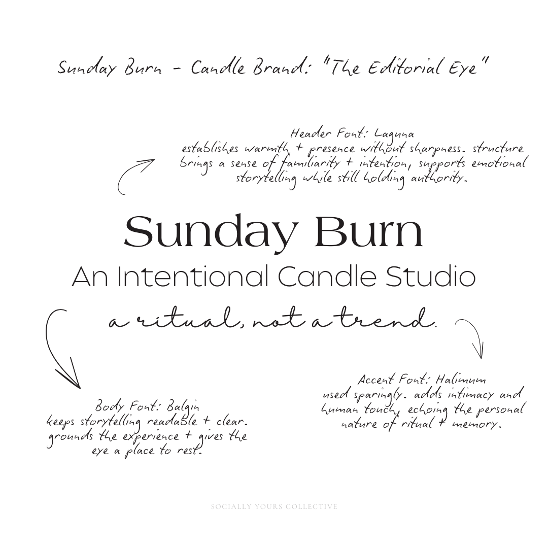
Header Typography: Laguna
Laguna is used for headers to establish warmth and presence without sharpness.
Its soft serif structure brings a sense of familiarity and intention, making each headline feel considered rather than promotional. Laguna supports emotional storytelling while still holding authority — perfect for naming moods, collections, and moments without feeling theatrical.
This choice reinforces the brand’s grounded, reflective tone.
Body Typography: Balgin
Balgin anchors the brand’s longer-form copy.
As a clean, modern sans-serif, it keeps storytelling readable and clear — allowing emotional language to land without becoming abstract or overwhelming. Balgin provides contrast to the serif headers, grounding the experience and giving the eye a place to rest.
This balance ensures the brand feels thoughtful, not heavy.
Accent Typography: Halimum
Halimum is used sparingly as an accent — for short phrases, quiet reflections, or subtle emphasis.
Its handwritten quality adds intimacy and human touch, echoing the personal nature of ritual and memory. By limiting its use, the brand preserves restraint — letting these moments feel special rather than decorative.
Together, these fonts create a rhythm:
Emotion without excess
Authority without stiffness
Clarity without coldness
Typography supports the experience — it never competes with it.
Typography sets the pace. In a sensory brand, slower is often stronger.
Color Palette Psychology
Color is one of the strongest emotional cues a candle brand has.
Before scent notes are read or stories are understood, color sets the mood. It signals how a candle should feel, where it belongs in someone’s life, and whether it’s meant to be a quick purchase or a ritual.
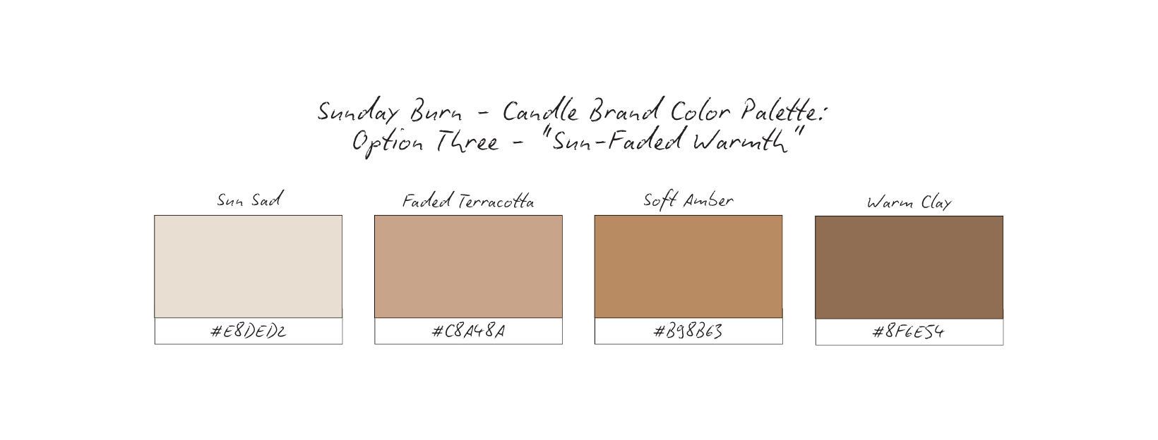
For Sunday Burn, several palette directions were intentionally explored — each rooted in emotion, memory, and atmosphere rather than trend or seasonality.

Emotional Cue: Comfort, familiarity, slow mornings, lived-in warmth
Emotional Cue: Stillness, introspection, grounding, evening rituals.
Emotional Cue: Golden hour, nostalgia, memory, softness without brightness.
Emotional Cue: Quiet confidence, restraint, depth, timeless calm.
Why Palette Choice Matters for Candle Brands
Candle buying is emotional — not urgent.
Color plays a subconscious role in:
How a scent is perceived
Whether a product feels seasonal or enduring
If a brand feels like a ritual or a novelty
This is why palette selection comes after positioning — not before.
Core Focus Across All Options: Calm > stimulation, Depth > brightness, Atmosphere > attention.
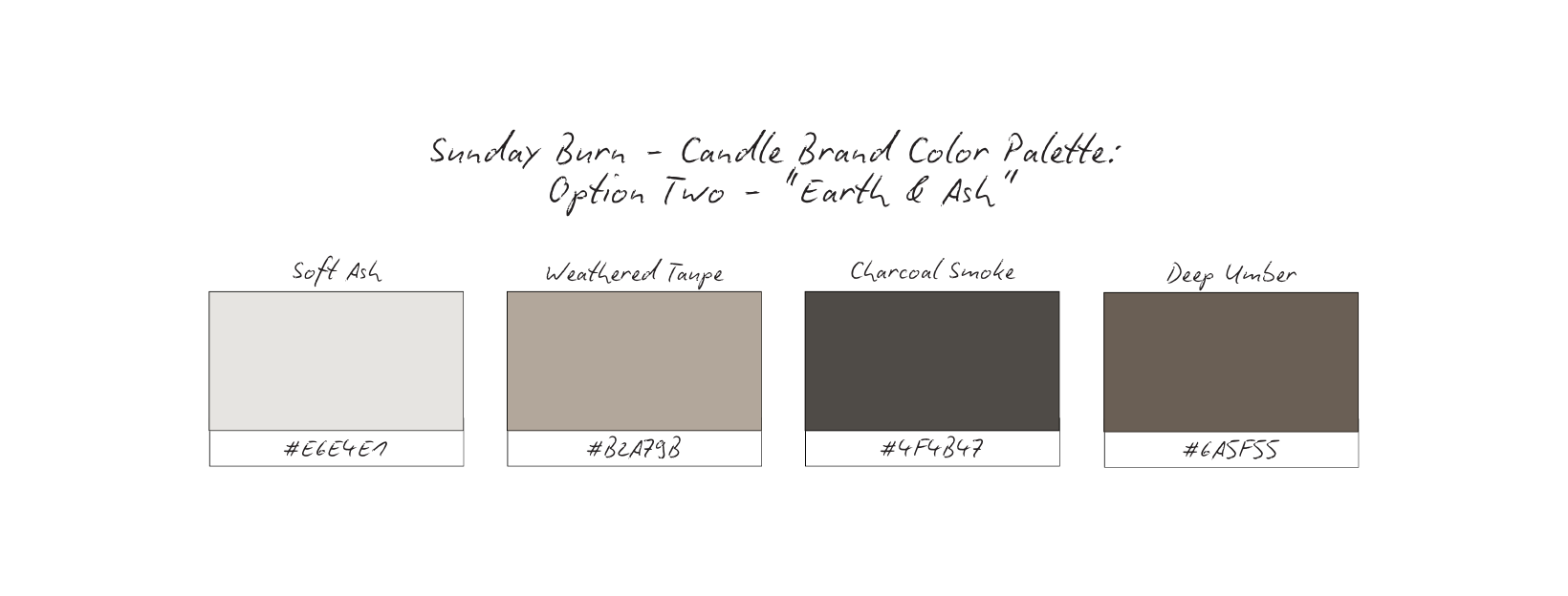
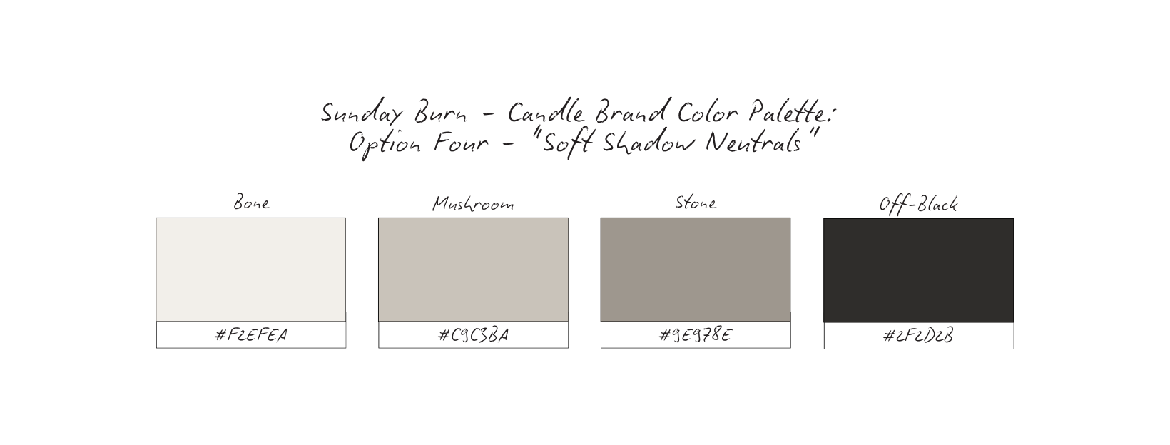
Why The Palette Works: Earth & Ash
The Earth & Ash palette was chosen because it supports how candle brands are meant to be experienced — slowly, emotionally, and with intention.
This palette doesn’t try to sell through brightness or novelty.
It creates atmosphere first.
Soft Ash — clean, calm, and grounding
Weathered Taupe — warmth without sweetness
Charcoal Smoke — depth, contrast, and emotional weight
Deep Umber — earthiness, stability, and quiet richness
Together, these tones feel lived-in rather than styled. Familiar rather than flashy.
Emotional Impact
This palette evokes:
Evening light instead of midday brightness
Stillness instead of stimulation
Presence instead of performance
It mirrors the emotional state candle buyers are often seeking — decompression, grounding, reflection, and ritual.
Nothing here feels rushed or seasonal.
Nothing feels disposable.
Why It Works for Candle Brands
Candle brands aren’t just selling scent — they’re selling how someone wants to feel in their space.
The Earth & Ash palette:
Allows scent names and storytelling to lead
Feels timeless across seasons, not trend-dependent
Supports repeat buying by building emotional familiarity
Reinforces ritual over impulse purchasing
This palette gives candles room to become part of someone’s life — not just part of their decor.
When visuals are calm and restrained, the brand feels confident.
And confidence is what turns: First-time buyers into repeat customers, Products into rituals, Candles into emotional anchors.
Earth & Ash doesn’t demand attention.
It earns loyalty.
Content Strategy Breakdown
For Sunday Burn, content is not created to push products.
It’s created to set a mood, tell a story, and invite ritual.
Before deciding how anything looks, the strategy defines what each format is responsible for. Every piece of content plays a role — not in selling harder, but in deepening emotional connection.
This approach ensures the brand feels immersive, not promotional.
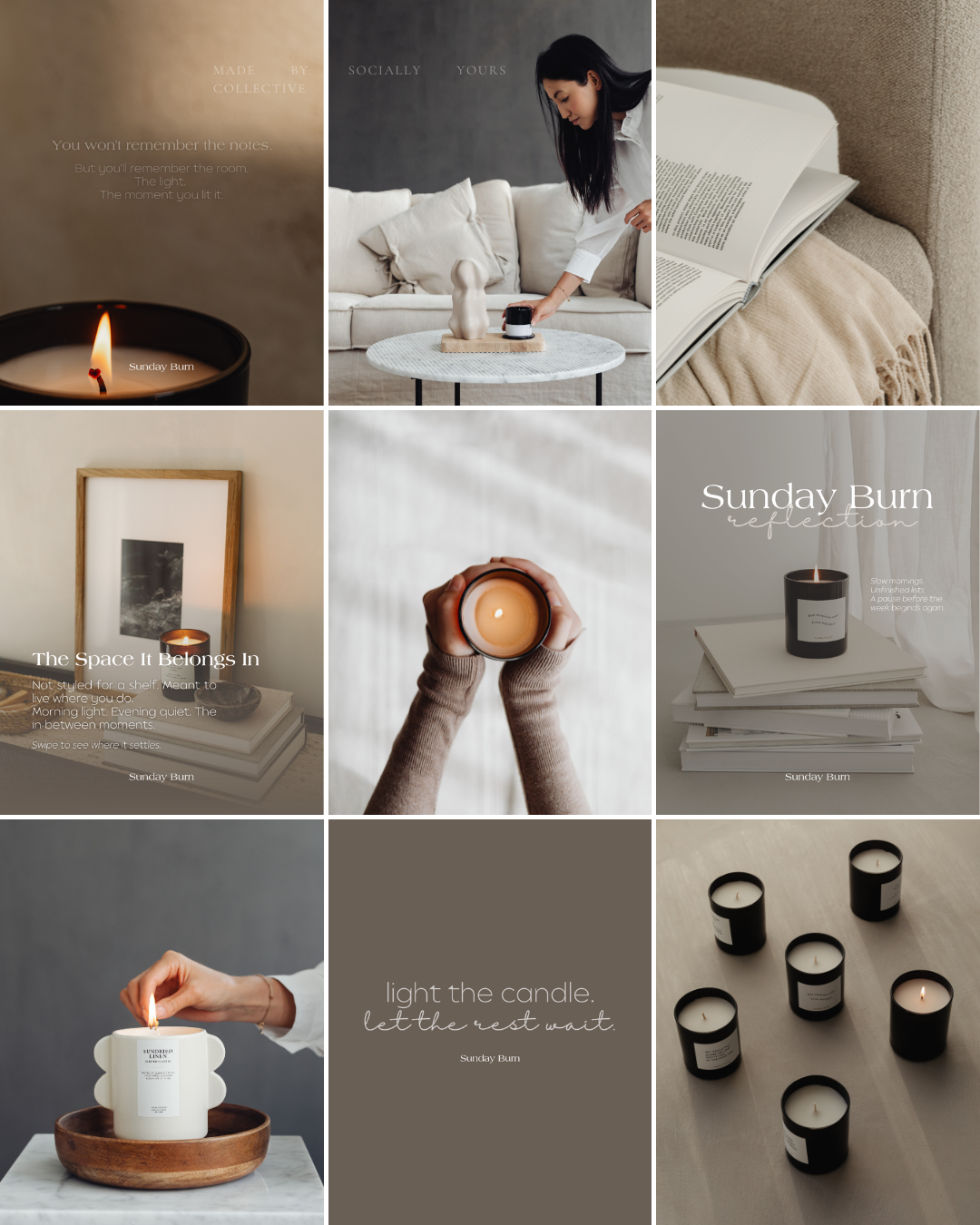
Reels: Sensory + Mood
Reels are used to place the audience inside the experience.
Rather than fast trends or aggressive hooks, Sunday Burn’s reels focus on:
Flame movement
Shifting light and shadow
Texture (wax, glass, hands, linen)
Slow, intentional pacing
These reels don’t explain — they let viewers feel.
By showing atmosphere instead of features, reels become an entry point for emotional connection. People don’t just see the candle — they imagine themselves lighting it.
Carousels:Storytelling + Education
Carousels carry the narrative depth of the brand.
They’re used to:
Share scent inspiration
Explain the meaning behind names
Introduce rituals and moments
Educate without overwhelming
This is where Sunday Burn builds understanding and memory.
Instead of listing notes or benefits, carousels invite reflection. They slow the audience down and give context — turning a candle into a story someone wants to return to.
Static Imagery: Brand World + Desire
Static posts define the visual universe of the brand.
They focus on:
Stillness over stimulation
Texture over polish
Atmosphere over composition perfection
These images aren’t meant to convince — they’re meant to linger.
They establish what Sunday Burn feels like at a glance, allowing desire to build quietly and naturally.
Stories: Intimacy + Consistency
Stories support connection in real time.
They show:
The making and packing process
Quiet moments in the studio
Daily rituals and pauses
Presence without performance
Stories keep the brand human and accessible without disrupting its calm tone. They maintain consistency without urgency, reminding the audience that Sunday Burn exists — gently, steadily, and intentionally.
Together, these formats create balance: Reels invite immersion, Carousels deepen meaning, Static imagery builds desire, Stories sustain intimacy.
Nothing competes for attention.
Everything supports the experience.
The result is content that feels less like marketing — and more like an invitation to slow down, light a candle, and stay awhile.
High-Converting Content Ideas For Candle Brands
The Mood Before the Flame
Type: Reel
What it is: Soft, slow clips of light shifting across a room. Curtains moving. Morning or dusk light. An unlit candle placed intentionally in the space.
Why it converts: It sells the feeling before the product. Viewers aren’t being asked to buy, they’re being asked to imagine a moment they want more of. This builds desire, emotional resonance, and brand recognition.
Micro CTA: Save this mood for later.
Scent Stories(Without Notes)
Type: Carousel
What it is: Text-led slides describing memories, environments, or emotions tied to a scent without listing fragrance notes or technical details.
Why it converts: People remember stories longer than specifications. This positions scent as an experience, not a formula. This builds trust, differentiation, and emotional loyalty.
Micro CTA: Swipe to step inside this scent.
The Ritual of Lighting
Type: Static or Reel
What it is: A hand striking a match. The wick catching. The first curl of smoke. Quiet, unhurried framing.
Why it converts: It reframes lighting a candle as an intentional act, not an afterthought. This makes the product feel meaningful rather than decorative. This builds recognition and habit-forming loyalty.
Micro CTA: Return to this moment tonight.
Stillness as a Statement
Type: Static
What it is: Minimal imagery of the candle alone. No props, no clutter, no copy or a single line of text.
Why it converts: In a loud feed, restraint stands out. Stillness signals confidence and lets the brand breathe. This builds brand authority and visual recognition.
Micro CTA: Pause here.
Sunday Burn Reflections
Type: Static or Carousel
What it is: Short reflections or affirmations paired with soft imagery. This are thoughts about rest, slowing down, or presence.
Why it converts: It creates emotional alignment without selling. Followers associate the brand with how they want to feel. This builds emotional trust and long-term loyalty.
Micro CTA: Save this for when you need it.
Behind the Pour
Type: Story or Reel
What it is: Clips of wax melting, pouring, trimming wicks, packing orders. Quiet process moments.
Why it converts: Process builds credibility. It reassures customers that care, time, and intention go into each candle. This builds trust and brand transparency.
Micro CTA: See how it’s made.
The Space It Belongs In
Type: Static or Carousel
What it is: Candles placed in lived-in spaces: bedside tables, baths, desks, kitchens at dusk.
Why it converts: It helps buyers visualize the candles as part of their daily rhythm, not just a styled object. This builds desire and purchase confidence.
Micro CTA: Explore the ritual.
The Quiet Return
Type: Story
What it is: Subtle reminders of restocking, seasonal returns, or rest days. Never urgent, never loud.
Why it converts: Scarcity without pressure builds trust. Customers return because they feel invited, not rushed. This builds loyalty and repeat purchases.
Micro CTA: Return when you’re ready.
Each pillar reinforces the same message from a different angle:
Reels immerse
Carousels deepen meaning
Static posts establish the world
Stories maintain intimacy
Together, they create a brand presence that feels felt, not forced — turning Sunday Burn into something customers come back to, not just something they try once.
Grid Logic & Visual Rhythm
Atmosphere Over Noise
This grid is intentionally slow.
Not because there’s nothing to sell —
but because presence can’t be rushed.
By limiting visual clutter and resisting constant variation, Sunday Burn allows each post to settle. There’s no urgency baked into the layout. No visual shouting. Every frame feels like an invitation to pause — which mirrors how the candle is meant to be experienced.
This isn’t a feed built to interrupt.
It’s built to accompany.
Repetition Builds Recognition
The grid relies on consistent visual language:
Soft, neutral backdrops
Earthy, low-contrast tones
Repeating motifs (flame, hands, books, vessels, still rooms)
A steady rhythm between product, environment, and text-led reflection
This repetition isn’t accidental — it creates familiarity.
Over time, followers recognize the brand not by logo placement, but by feeling. The imagery becomes synonymous with a certain pace, mood, and emotional temperature.
That’s how Sunday Burn becomes recognizable without ever needing to announce itself.
Spacing Sets the Pace
Negative space does the emotional work here.
Breathing room between elements slows the scroll and lowers cognitive load. Instead of demanding attention, the grid earns it by feeling calm and composed.
This restraint signals confidence:
the brand trusts that its presence is enough.
The pacing reflects ritual — not consumption.
Light the candle. Sit with it. Let the moment stretch.
Mood-First, Always
Notice how the grid alternates between:
Quiet product moments
Text-led reflections
Lifestyle scenes that feel lived-in, not styled
Process glimpses (lighting, holding, placing, returning)
Nothing feels filler.
Each post exists to either:
Deepen emotional association
Reinforce atmosphere and ritual
Build brand memory
Invite return, not urgency
The feed functions less like a catalog and more like a mood journal.
Because candle brands aren’t chosen logically — they’re remembered emotionally.
This grid helps viewers quickly understand: How Sunday Burn wants them to feel, When this candle belongs in their life, Why this brand feels different from seasonal or trend-driven alternatives.
The result is a brand presence that feels intentional, intimate, and enduring — the kind that people come back to when they want the room to feel a certain way.
Not louder.
Just warmer.
Why This Brand Works
Sunday Burn works because every decision is made in service of feeling — not performance.
The typography slows the reader down.
The color palette grounds the brand in warmth and depth.
The imagery prioritizes atmosphere over display.
The content strategy invites presence instead of urgency.
Nothing exists in isolation. Each element reinforces the same message:
this candle is not a product you rush through — it’s an experience you return to.
By aligning scent, story, visuals, and pacing, the brand creates coherence. That coherence builds trust. And trust is what turns a one-time purchase into a ritual.
Sunday Burn doesn’t try to convince people to buy.
It creates a world people want to step back into.
What This Means For Your Brand
If you’re building a candle brand, this study shows that clarity is more powerful than novelty.
You don’t need: Constant launches, Trend-chasing scents, Over-styled visuals, Aggressive selling.
You need alignment.
When your brand knows how it wants people to feel — and communicates that consistently — the product becomes memorable. The buying decision becomes emotional. And loyalty forms naturally.
This approach works for brands that want longevity. Brands that want to be remembered beyond seasons. Brands that understand that mood is strategy.
The Result
The result is a candle brand that feels:
Grounded, not generic
Emotional, not performative
Intentional, not impulsive
Sunday Burn doesn’t compete for attention — it creates presence.
Followers don’t just scroll past.
They pause.
They remember.
They return.
And when they’re ready to light a candle again, they don’t look for what’s trending.
They look for this feeling.
This study isn’t meant to give you answers overnight.
It’s meant to give you clarity.
If this resonated, take a moment to ask yourself:
Does your brand reflect how you actually work — or just what you post?
From here, you can go a few different directions:
Explore more Brand Studies to see how positioning shifts across industries
Reflect on your own brand systems — what’s intentional, what’s reactive, what’s outdated
Work with me if you’re ready to align your brand with your thinking, not just your aesthetics
Follow along for upcoming Industry Spotlights, where I break down brands from the inside out, every Saturday
No pressure. No urgency tactics.
Just the next right step, when you’re ready.